5 Māui’s Dolphin
We have a survey open right now that we invite you to fill out.
This lesson looks at the measurements of Māui’s dolphins from the North and South Islands to see if these form separate species. This research is presented by Adam N. H. Smith (NIWA).
Data
There is 1 file associated with this presentation. It contains the data you will need to complete the lesson tasks.
Video
Objectives
Tasks
0. Read and Format data
0a. Read in the data
First check you have installed the package readxl (see Section 2.6) and set the working directory (see Section 2.1), using instructions in Getting started with R.
Load the data into R.
The code has been hidden initially, so you can try to load the data yourself first before checking the solutions.
Code
#loads readxl package
library(readxl)

#loads the data file and names it dolphin
dolphin<-read_xls("Dolphins data.xls")

#view beginning of data frame
head(dolphin)
Code
#loads readxl package
library(readxl)
Warning: package 'readxl' was built under R version 4.2.2Code
#loads the data file and names it dolphin
dolphin<-read_xls("Dolphins data.xls")

#view beginning of data frame
head(dolphin)
# A tibble: 6 × 7
Island X1 X2 X3 X4 X5 X6
<dbl> <dbl> <dbl> <dbl> <dbl> <dbl> <dbl>
1 1 284 57 143 148 232 83
2 1 287 59 147 154 236 84
3 1 296 57 146 153 238 82
4 1 300 61 146 153 246 85
5 1 302 62 153 162 248 86
6 1 302 57 155 153 241 81This opens the “Dolphins data.xls” dataset. This dataset contains the measurements (X1-X6) of 6 bones in the skulls of 59 dolphins.
0b. Format the data
Rename the measurement variables to indicate what they actually represent (“SkullLength”, “RostrumMidWidth”, “RostrumLength”, “SkullWidth”, “MandibleLength”, “RostrumBaseWidth”), see the video for variable definitions.
Recode Island as a factor variable. The column Island is coded as a character variable, but actually represents a factor variable which indicates where the dolphin originated from, either the North or South Island of New Zealand.
Code
colnames(dolphin)<-c("Island","SkullLength","RostrumMidWidth","RostrumLength",
                     "SkullWidth", "MandibleLength","RostrumBaseWidth")

#recode the Island variable as a factor
dolphin$Island<-as.factor(dolphin$Island)
Code
colnames(dolphin)<-c("Island","SkullLength","RostrumMidWidth","RostrumLength",
                     "SkullWidth", "MandibleLength","RostrumBaseWidth")

#recode the Island variable as a factor
dolphin$Island<-as.factor(dolphin$Island)
1. Summary Statistics, Histogram
1a. Summary Statistics
Calculate some summary statistics (mean, standard deviation, standard error) for the measurements by Island.
The tapply() function can group a variable of interest according to values for an index factor variable, then apply a function to each of these groups.
To find the standard errors of the measurements by Island we will need to write our own function to calculate standard error (as R does not have an inbuilt function for this).
Code
#group **SkullLength** by **Island**, and find the STANDARD DEVIATION of **SkullLength** for each **Island**.
tapply(dolphin$SkullLength,INDEX=dolphin$Island,FUN=mean)

#group **SkullLength** by **Island**, and find the STANDARD DEVIATION of **SkullLength** for each **Island**.
tapply(dolphin$SkullLength,INDEX=dolphin$Island,FUN=sd)
Code
se<-function(data){
  se<-sd(data)/sqrt(length(data))
  return(se)
}

#use tapply() with our new function
tapply(dolphin$SkullLength,INDEX=dolphin$Island,FUN=se)
Code
#group **SkullLength** by **Island**, and find the MEAN **SkullLength** for each **Island**.
tapply(dolphin$SkullLength,INDEX=dolphin$Island,FUN=mean)
1 2
304.5385 281.6087 Code
#group **SkullLength** by **Island**, and find the STANDARD DEVIATION of **SkullLength** for each **Island**.
tapply(dolphin$SkullLength,INDEX=dolphin$Island,FUN=sd)
1 2
10.959132 9.974363 Code
se<-function(data){
  se<-sd(data)/sqrt(length(data))
  return(se)
}

#use tapply() with our new function
tapply(dolphin$SkullLength,INDEX=dolphin$Island,FUN=se)
1 2
3.039516 1.470640 North Island dolphins have a higher mean SkullLength than the South Island population. They have comparable standard deviations, but when taking into account sample size and calculating the standard error we can see there is more uncertainty in estimates for the North Island than the South.
Calculate the mean, standard deviation, and standard error measurements of the other variables by Island.
1b. Histograms
To examine the data, various graphics can be displayed. First construct a histogram of SkullLength.
As you have seen in previous lessons, R plots come with default labels but these are often not tidy or informative.
Here we relabel the axes xlab= " " and have changed the main title main= " ".
The number of breaks in the histogram can also change the look of the histogram considerably. You can delete these changes and rerun the code to compare.
Code
hist(dolphin$SkullLength,breaks=12,xlab="Skull Length",main="Dolphin Skull Length measurements")As you have seen in previous lessons, R plots come with default labels but these are often not tidy or informative.
Here we relabel the axes xlab= " " and have changed the main title main= " ".
The number of breaks in the histogram can also change the look of the histogram considerably. You can delete these changes and rerun the code to compare.
Code
hist(dolphin$SkullLength,breaks=25,xlab="Skull Length",main="Dolphin Skull Length measurements")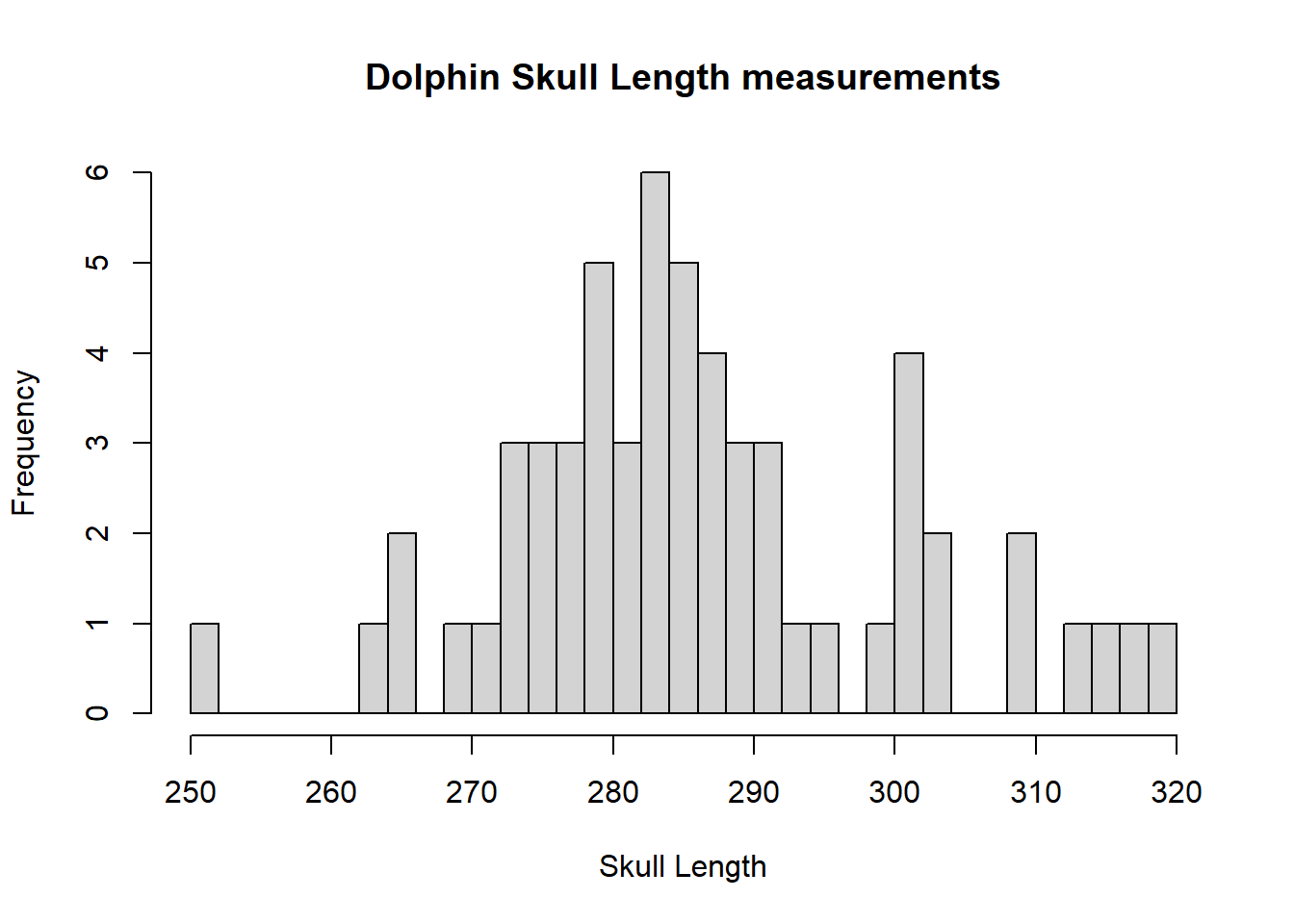
The histogram is bimodal, you can see most measurements are around 280 and there is a slight bump of observations above 300. There are reasonably symmetric decreases around the 2 modes.
2. Box Plots
A box plot allows the distribution of the data to be looked at in a simpler manner and allows a number of variates or groups to be displayed side by side.
2a. Box Plots (response)
For the first box plot, include all 6 measurement variables to create 6 boxes on a single plot.
We have specified the y axis label and main title in the same way as for the histogram above.
We also label each of the boxes by providing a vector of labels to the names= argument, with \n used to indicate a new line.
las=2 orients the labels vertically so they all fit.
Code
boxplot(dolphin$SkullLength,dolphin$RostrumMidWidth,dolphin$RostrumLength,dolphin$SkullWidth,dolphin$MandibleLength,dolphin$RostrumBaseWidth,main="Box plots of Dolphin measurements", ylab="Measurement",names=c("Skull \n Length","Rostrum \n Mid Width","Rostrum \n Length", "Skull \n Width","Mandible \n Length","Rostrum \n Base Width"),las=2)We have specified the y axis label and main title in the same way as for the histogram above.
We also label each of the boxes by providing a vector of labels to the names= argument, with \n used to indicate a new line.
las=2 orients the labels vertically so they all fit.
Code
boxplot(dolphin$SkullLength,dolphin$RostrumMidWidth,dolphin$RostrumLength,dolphin$SkullWidth,dolphin$MandibleLength,dolphin$RostrumBaseWidth,main="Box plots of Dolphin measurements", ylab="Measurement",names=c("Skull \n Length","Rostrum \n Mid Width","Rostrum \n Length", "Skull \n Width","Mandible \n Length","Rostrum \n Base Width"),las=2)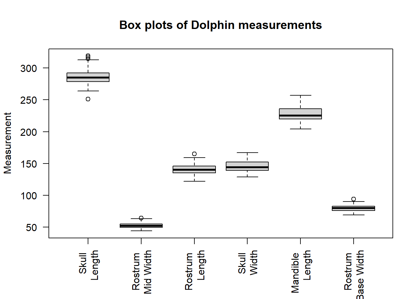
This shows RostrumMidWidth and RostrumBaseWidth are shorter and less variable than the other measurements and that SkullLength has perhaps more outlying values (shown as open points outside the box plot).
2b. Box Plots (response by predictor)
There are many possible box plot combinations. Produce a box plot of SkullLength for the two Islands.
Code
boxplot(dolphin$SkullLength~dolphin$Island,main="Boxplots of Skull Length measurement by Island",ylab="Measurement",xlab="Island")Code
boxplot(dolphin$SkullLength~dolphin$Island,main="Boxplots of Skull Length measurement by Island",ylab="Measurement",xlab="Island")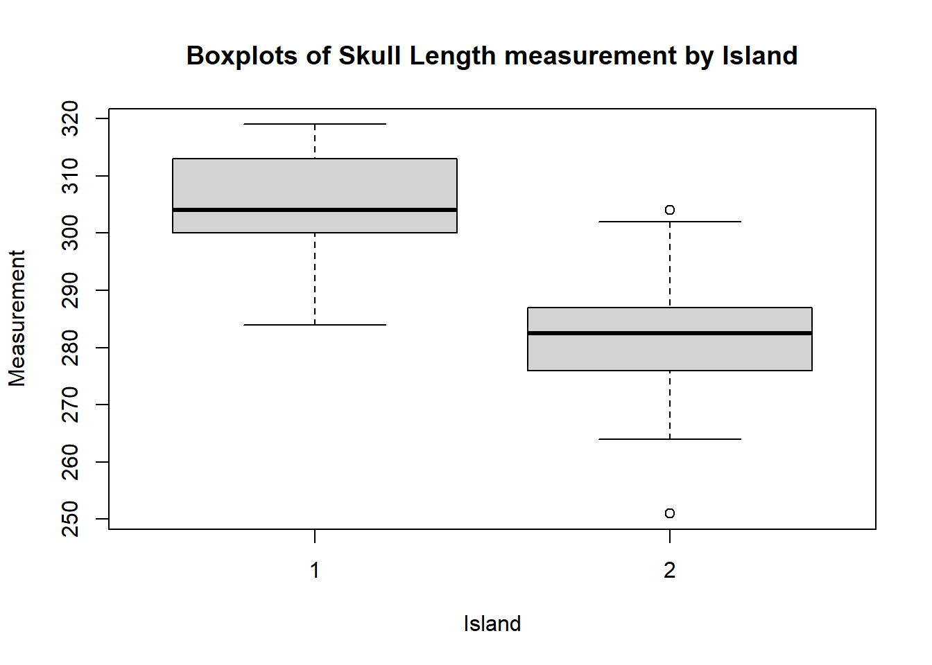
You can see that there is not much overlap between the values of SkullLength for the two Islands.
Produce box plots for the other measurement variables.
Do you see the same pattern in all the variates? Which variate has the largest difference between the two Islands?
2c. Box Plots (reformat data)
You can create a box plot of all 6 variates for North vs. South at once, by converting the data into long format. The data is currently in wide format, with one row per subject (dolphin) and one column per observation (measurement). This format makes it easy to get a good overview of the data set, however it reduces the range of models which can be fitted and can make plotting more complex.
Data in long format has a row for each observation (measurement) and a column for each variable (dolphin body part being measured).
To convert the data from wide to long format, we can use the tidyr package.
The key that all our variables (e.g. SkullLength,RostrumMidWidth, etc) could be levels of is something like "BodyPart", but note that you can use any key=" " that makes sense. The values of these variables are "Measurement" so that is what we will call our second new column, but again you can use any name that is sensible. Finally, we select columns 2 to 7 of the original data set to gather into long format, leaving the Island variable as a unique column as it is not a measurement.
Code
library(tidyr)
dolphinLong<-gather(data=dolphin,key="BodyPart",value="Measurement",2:7)
Create a box plot of Measurement for each BodyPart and Island combination using the long data. Add some names, axis labels and a title to this plot.
Is this a better display than the single plots?
The key that all our variables (e.g. SkullLength,RostrumMidWidth, etc) could be levels of is something like "BodyPart", but note that you can use any key=" " that makes sense. The values of these variables are "Measurement" so that is what we will call our second new column, but again you can use any name that is sensible. Finally, we select columns 2 to 7 of the original data set to gather into long format, leaving the Island variable as a unique column as it is not a measurement.
Code
library(tidyr)
dolphinLong<-gather(data=dolphin,key="BodyPart",value="Measurement",2:7)
Now we can use create box plots of Measurement for each BodyPart and Island combination. Add some names, axis labels and a title to this plot.
Code
boxplot(dolphinLong$Measurement~dolphinLong$Island*dolphinLong$BodyPart,main="Boxplots of Dolphin measurements by Island",ylab="Measurement",xlab="",names=c("1:Mandible \n Length","2:Mandible \n Length","1:Rostrum \n Base Width","2:Rostrum \n Base Width","1:Rostrum \n Length","2:Rostrum \n Length","1:Rostrum \n Mid Width","2:Rostrum \n Mid Width","1:Skull \n Length","2:Skull \n Length","1:Skull \n Width","2:Skull \n Width"),las=2)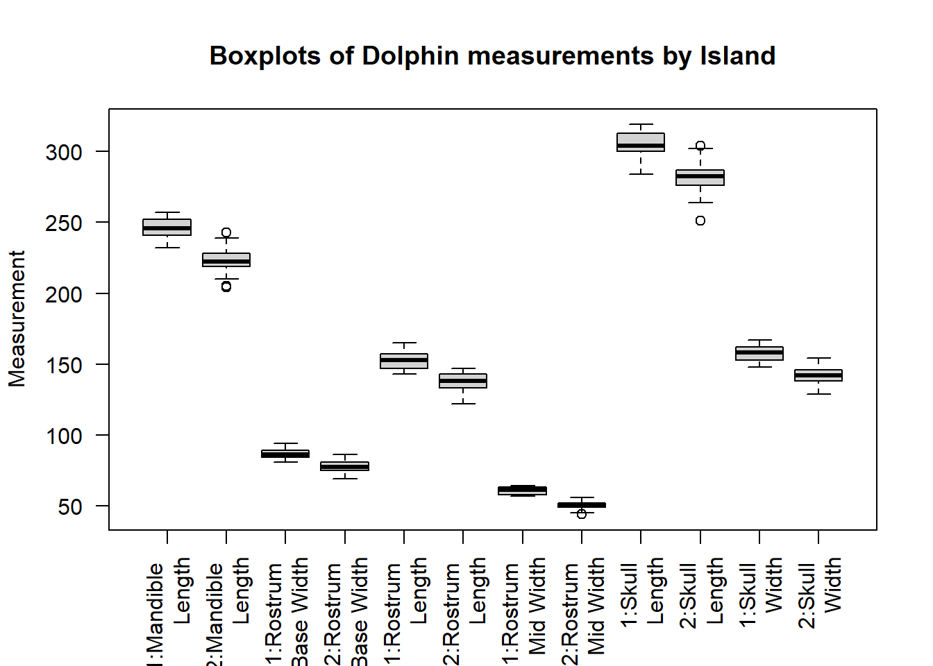
This plot allows us to easily compare measurements between islands, due to the relatively small number of variables it is not too cluttered.
3. Scatter Plots
We can examine how the measurements relate to each other using plots of multiple variables.
3a. Single Plot
plot() the values of SkullLength against RostrumMidWidth to make a scatter plot. Make sure to add axis labels and a title.
We use the col="dolphin$Island " argument to make the points for the North and South Island distinct colours. The pch= argument specifies the point character (taking values between 0 and 25), you can play around with this to see the different options.
We will also add a legend(), to indicate which colour points correspond to each island.
Code
#plot
plot(dolphin$SkullLength,dolphin$RostrumMidWidth,pch=20,col=dolphin$Island,ylab="Rostrum Mid Width",xlab="Skull Length", main="Skull Length against Rostrum Mid Width, coloured by Island")

#legend
#the first argument specifies the position of the legend, the second is a vector of the text to be displayed.
#pch= and col= provide the point character and colours to match the points plotted.
legend("topleft",legend=c("North","South"),pch=20,col=1:2)
We use the col="dolphin$Island " argument to make the points for the North and South Island distinct colours. The pch= argument specifies the point character (taking values between 0 and 25), you can play around with this to see the different options.
We will also add a legend(), to indicate which colour points correspond to each island.
Code
#plot
plot(dolphin$SkullLength,dolphin$RostrumMidWidth,pch=20,col=dolphin$Island,ylab="Rostrum Mid Width",xlab="Skull Length", main="Skull Length against Rostrum Mid Width, coloured by Island")

#legend
#the first argument specifies the position of the legend, the second is a vector of the text to be displayed.
#pch= and col= provide the point character and colours to match the points plotted.
legend("topleft",legend=c("North","South"),pch=20,col=1:2) 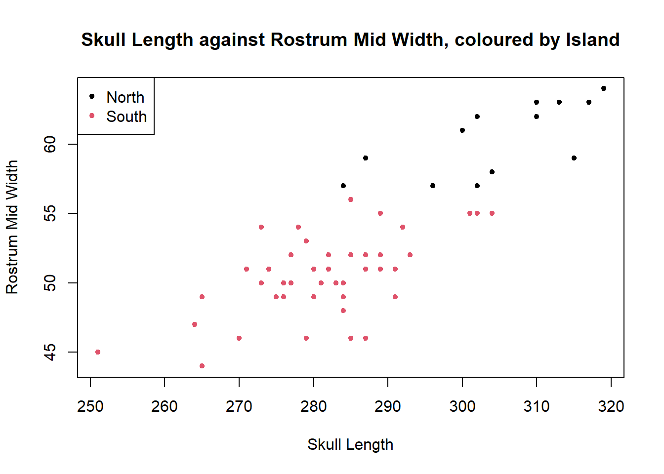
It can be seen that there is a moderate positive linear relationship between SkullLength and RostrumMidWidth, although there is a reasonable amount of scatter. The two islands entirely separate so that there is no overlap between the sets of points, with all North Island dolphins having longer skull length and rostrum mid width than South Island dolphins.
3b. Multiple Plots
Plots of all other combinations of the measurement variables could be produced one by one, but R will do this automatically if we tell it to plot the entire dolphin data set at once.
We subset out the Island column (column 1) as this is a factor variable and not very informative when directly plotted. We can then colour the points in the plots of measurement variables corresponding to the Island on which they were collected.
You can enlarge this plot by clicking the leftmost button in its top right corner.
Code
plot(dolphin[,-1],col=dolphin$Island)We subset out the Island column (column 1) as this is a factor variable and not very informative when directly plotted. We can then colour the points in the plots of measurement variables corresponding to the Island on which they were collected.
You can enlarge this plot by clicking the leftmost button in its top right corner.
Code
plot(dolphin[,-1],col=dolphin$Island)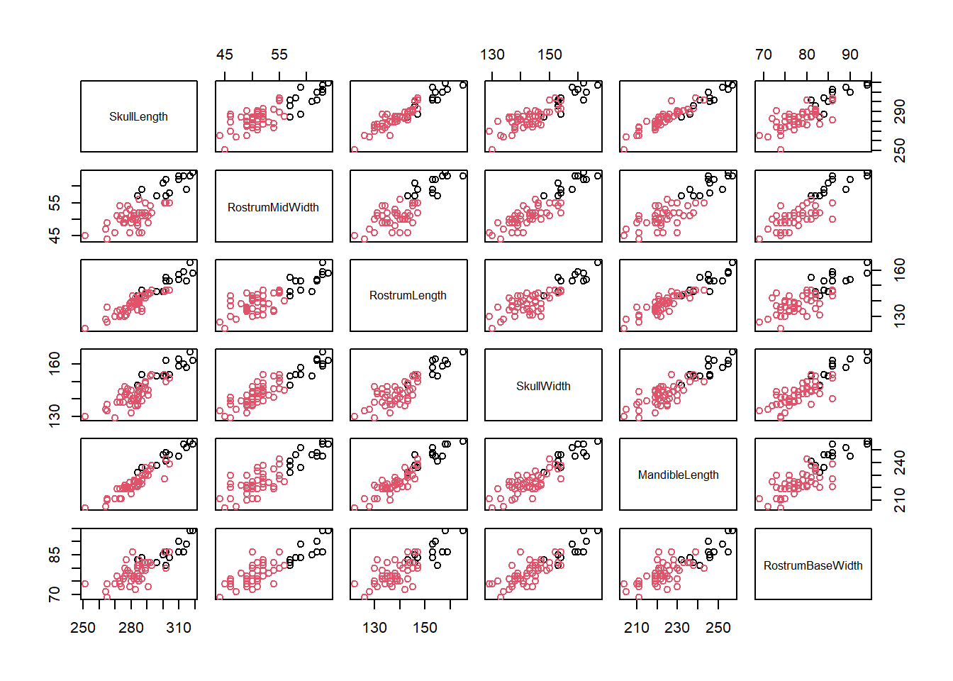
Two variables that have a perfect linear increasing relationship have correlation of 1, and decreasing a correlation of -1. If there is no relationship so that the points show a random scatter around a flat line, then the correlation is 0.
This plot shows the correlation of all measurements visually, and it can be seen that Skull Length, Rostrum Length and Mandible Length have a higher level of correlation with each other than with Rostrum Mid Width and Skull Width.
However all measurements show a positive linear correlation and separation of the two islands, with North Island dolphins being larger.
4. 3D Plot
A 3 dimensional plot can be produced using the rgl package.
Plot the variates SkullLength, RostrumMidWidth and RostrumLength, with Island as a grouping factor to colour the points.
Code
library(rgl)
plot3d(dolphin$SkullLength,dolphin$RostrumMidWidth,dolphin$RostrumLength,col=dolphin$Island)
Code
library(rgl)
plot3d(dolphin$SkullLength,dolphin$RostrumMidWidth,dolphin$RostrumLength,col=dolphin$Island)
This plot isn’t very informative on the surface. However it can be rotated in the graphics window by clicking on the plot and dragging the points around in 3d. Cool!
5. Confidence Interval, Hypothesis Test (difference in means)
To formally test whether there is a difference between the two islands on one of the measurements, we can use an unpaired t-test.
Code
#first test if variances are equal
var.test(dolphin$RostrumMidWidth[dolphin$Island=="1"],
dolphin$RostrumMidWidth[dolphin$Island=="2"], alternative = "two.sided")

#no significant evidence against null hypothesis that variances are equal
#use var.equal=T in t test
t.test(dolphin$RostrumMidWidth[dolphin$Island=="1"],dolphin$RostrumMidWidth[dolphin$Island=="2"],var.equal = T,paired=F)
Code
#first test if variances are equal
var.test(dolphin$RostrumMidWidth[dolphin$Island=="1"],
dolphin$RostrumMidWidth[dolphin$Island=="2"], alternative = "two.sided")
    F test to compare two variances

data:  dolphin$RostrumMidWidth[dolphin$Island == "1"] and dolphin$RostrumMidWidth[dolphin$Island == "2"]
F = 0.85726, num df = 12, denom df = 45, p-value = 0.8123
alternative hypothesis: true ratio of variances is not equal to 1
95 percent confidence interval:
 0.3813469 2.4749113
sample estimates:
ratio of variances
         0.8572572
Code
#no significant evidence against null hypothesis that variances are equal
#use var.equal=T in t test
t.test(dolphin$RostrumMidWidth[dolphin$Island=="1"],dolphin$RostrumMidWidth[dolphin$Island=="2"],var.equal = T,paired=F)
    Two Sample t-test

data:  dolphin$RostrumMidWidth[dolphin$Island == "1"] and dolphin$RostrumMidWidth[dolphin$Island == "2"]
t = 11.194, df = 57, p-value = 5.119e-16
alternative hypothesis: true difference in means is not equal to 0
95 percent confidence interval:
  8.080747 11.601527
sample estimates:
mean of x mean of y
 60.38462  50.54348
The confidence interval for the true difference in means is entirely positive, and the p-value is highly significant (<0.001). We conclude that there is evidence against the null hypothesis of no difference in mean RostrumMidWidth value by Island, so reject it in favour of alternative hypothesis (true difference in mean RostrumMidWidth between the North and South Island dolphins, with North Island dolphins having a larger mean RostrumMidWidth).
From this evidence it was concluded that the dolphins from the North and South Islands were in fact two species. The southern dolphins are named Hector’s dolphin and the northern named Māui’s dolphin.
Try doing t-tests on the other measurements by Island. Are they all significant?
6. Simple Linear Regression, ANOVA, Residual Plots
In Task 3b we observed that there is strong linear correlation between the measurements. We can utilise this linear correlation to estimate values of one measurement from values of another measurement, using a regression method.
Because the correlation observed in the North Island sample is not different from the correlation in the South Island sample, we put both samples together and treat them as a single sample for the regression method.
(In an advance regression method, we can also estimate the differences between the two samples if any. You will learn such advanced regression methods at university, typically in a second year-level Statistics course.)
Fit a linear model with the response RostrumMidWidth and the predictor SkullLength and then carry out an ANOVA on this object. Construct residual plots to check your model.
Interpret your findings.
Code
dolphinMod<-lm(dolphin$RostrumMidWidth~dolphin$SkullLength)
summary(dolphinMod)

anova(dolphinMod)
Code
plot(dolphinMod)In the first scatter plot, we need to check that the residuals are randomly scattered around the mean of 0 (linear relationship between variables), and there is no systematic pattern in the spread of the residuals across the fitted values (constant variance) when excluding outliers.
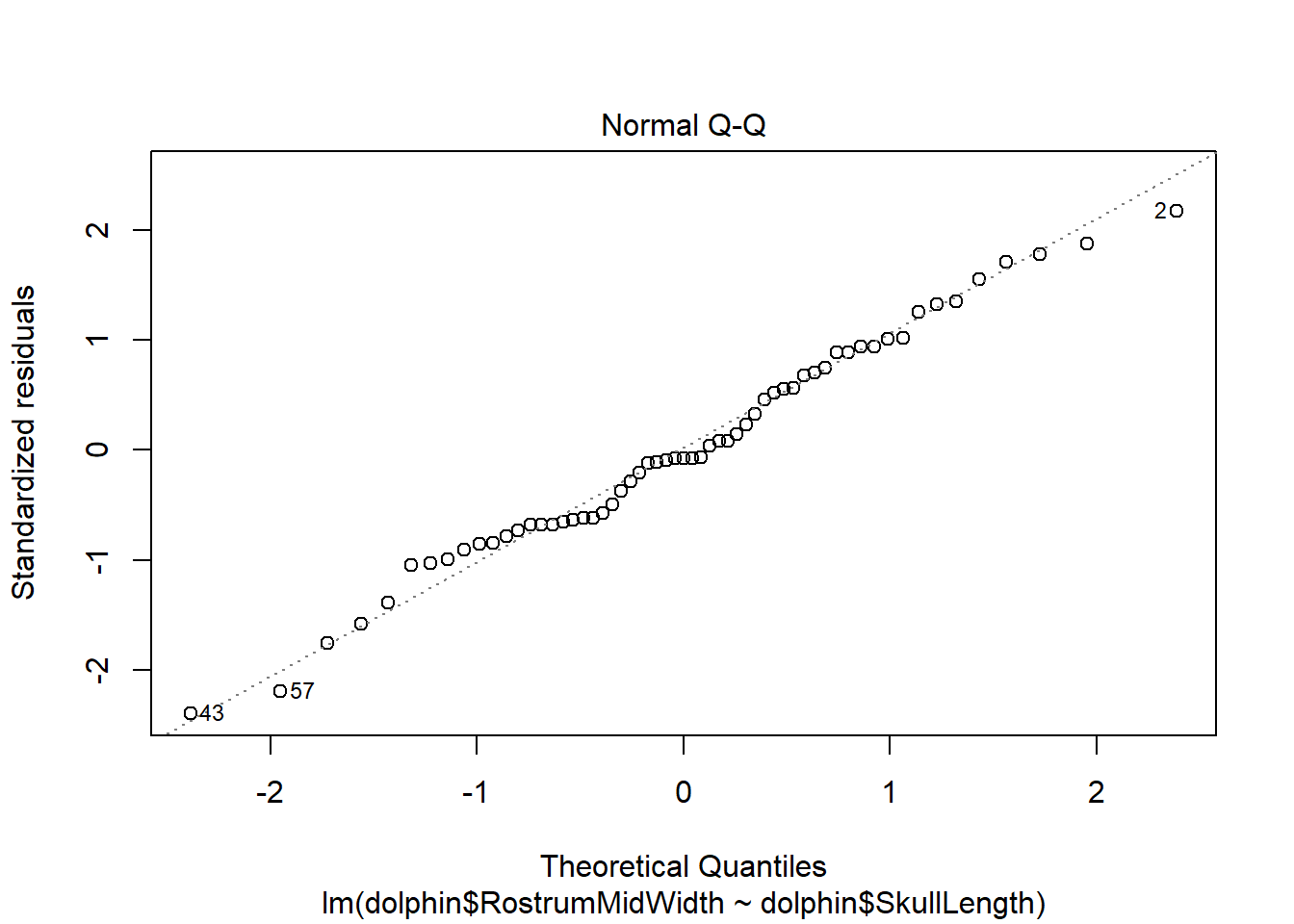
In the second plot we check that the points follow the standard normal quantile line (residuals are standard normally distributed).
The third plot can be used to check the spread of standardised residuals, these should fall between -2 and +2. This corresponds to <1.4 when the square root is taken.
The fourth plot shows the influence of each observation on parameter estimates, with highly influential points automatically labelled. Influence is due to a combination of leverage and the value of standardised residuals. Leverage is a measure of how much an observation affects the fitted line (due to its position in the data set) and the standardised residual value indicates the extent to which the observation is an outlier. Points with high influence potentially require further investigation.
If any of the above assumptions are not met, it indicates that there is a problem with the estimated regression equation. Although there are ways to solve such problems, unfortunately they are beyond Year 13 level. You can learn these and a lot more about advanced regression methods at university, typically in a second year. Statistics course.
Code
dolphinMod<-lm(dolphin$RostrumMidWidth~dolphin$SkullLength)
summary(dolphinMod)
Call:
lm(formula = dolphin$RostrumMidWidth ~ dolphin$SkullLength)

Residuals:
    Min      1Q  Median      3Q     Max
-6.8109 -1.9184 -0.2264  2.0502  6.1891

Coefficients:
                    Estimate Std. Error t value Pr(>|t|)
(Intercept)         -31.0709     7.7487   -4.01 0.000179 ***
dolphin$SkullLength   0.2923     0.0270   10.82  1.9e-15 ***
---
Signif. codes:  0 '***' 0.001 '**' 0.01 '*' 0.05 '.' 0.1 ' ' 1

Residual standard error: 2.863 on 57 degrees of freedom
Multiple R-squared:  0.6728,    Adjusted R-squared:  0.667
F-statistic: 117.2 on 1 and 57 DF,  p-value: 1.899e-15
Code
anova(dolphinMod)Analysis of Variance Table
Response: dolphin$RostrumMidWidth
Df Sum Sq Mean Sq F value Pr(>F)
dolphin$SkullLength 1 960.76 960.76 117.18 1.899e-15 ***
Residuals 57 467.34 8.20
---
Signif. codes: 0 '***' 0.001 '**' 0.01 '*' 0.05 '.' 0.1 ' ' 1The \(\verb!Multiple R-squared!\) value of 0.673 indicates that 67.3% of the variation observed in the RostrumMidWidth values are explained by the RostrumMidWidth’s linear relationship with SkullLength.
The \(\verb!F-statistic!\) of 117.2 has a \(\verb!p-value!\) of 1.899E-15 (= 1.899× 10-15 = 0.000000000000001899 < 0.05). This indicates that RostrumMidWidth values change along with SkullLength values, and hence, indeed we are able to estimate values of RostrumMidWidth using the values of SkullLength.
The \(\verb!Coefficients!\) are the estimated values of the regression equation, i.e.
\[\text{Rostrum Mid Width} = − 31.071 + 0.292 × \text{Skull Length}\]
This means that if the value of SkullLength is, say, 300, we can estimate the corresponding RostrumMidWidth value as \[− 31.071 + 0.292 × 300 = 56.529 ≅ 56.53. \]
It is always very important for us to check our model fit, using residual plots. The plot() function automatically creates these if we give it our model object as shown in Cockles Task 4. Section 3.0.5.
Code
plot(dolphinMod)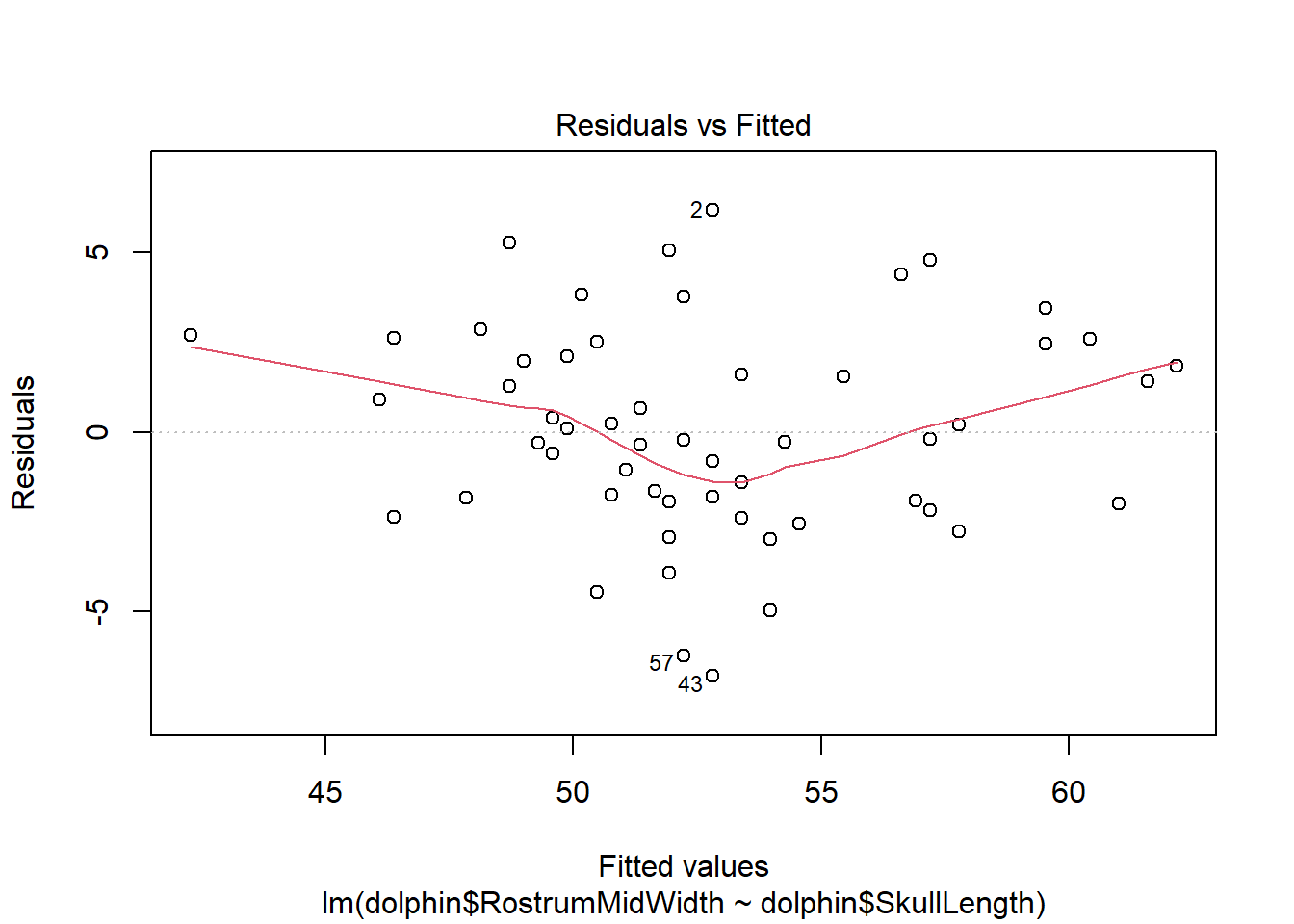
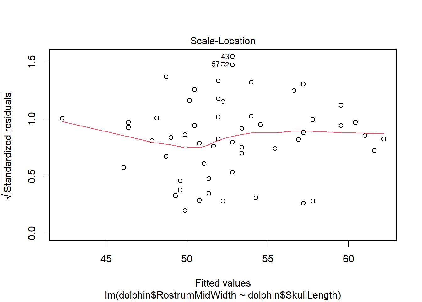
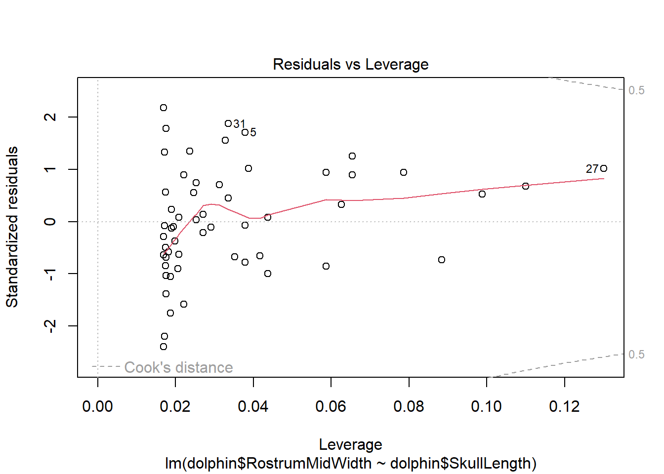
There is evidence of a non-linear relationship between RostrumMidWidth and SkullLength, as the red mean line through the residuals is curved. Aside from this, there appears to be relatively constant variance.
The normal qq plot indicates no cause for concern as the standardised residuals closely follow the standard normal quantiles.
There are a few outliers with square root standardised residuals around 1.5 (corresponding to 2.25 when squared).
The fourth plot indicates a couple of highly influential points - observations 5, 27 and 31. The influence of points 5 and 31 is due to large standardised residual values (they are outliers). This may be due to measurement or transcription errors, however their values are not dramatically different from the other observations. It is more likely that there is additional natural variation that has not been accounted for by our model. Observation 27 has an acceptable residual value, but has the position of highest leverage within the data set so is influential as a result.
Repeat this analysis for some other pairs of measurements. For example, try estimating MandibleLength using RostrumLength.