21 Economic Analysis
We have a survey open right now that we invite you to fill out.
This lesson gives an overview of time series analysis. The accompanying video is presented by Barbara Clendon from Statistics New Zealand, who discusses the time series work carried out in this department which focuses on explaining past data. The trend, seasonal and irregular time series components are examined and interpreted within the contexts of clothing sales and dwelling consents.
Data
There are 2 files associated with this presentation, containing the data you will need to complete the lesson tasks. The first contains time series data for quarterly clothing sales between 1995 and 2005. The second contains time series data for monthly new dwelling consents issued between 1992 and 2005.
Video
Objectives
Economic Analysis Tasks
0. Read Data
First check you have installed the package readxl (see Section 2.6) and set the working directory (see Section 2.1), using instructions in Getting started with R.
Load the data into R.
The code has been hidden initially, so you can try to load the data yourself first before checking the solutions.
Code
#loads readxl package
library(readxl)

#loads the data file and names it clothing
clothing<-read_xlsx("Clothing_Sales.xlsx")

#view beginning of data frame
head(clothing)
Code
#loads the data file and names it dwelling
dwelling<-read_xlsx("New Dwelling Consents Issued.xlsx")

#view beginning of data frame
head(dwelling)
Code
#loads readxl package
library(readxl)
Warning: package 'readxl' was built under R version 4.2.2Code
#loads the data file and names it clothing
clothing<-read_xlsx("Clothing_Sales.xlsx")

#view beginning of data frame
head(clothing)
# A tibble: 6 × 6
Year Quarter Year_No Actual_Sales Seasonal_Adjusted Trend
<dbl> <dbl> <dbl> <dbl> <dbl> <dbl>
1 1995 3 1996. 342. 365. 362.
2 1995 4 1996. 394. 356. 361.
3 1996 1 1996 329. 364. 361.
4 1996 2 1996. 376. 357. 357.
5 1996 3 1996. 324. 346. 348.
6 1996 4 1997. 380. 344. 343.Code
#loads the data file and names it dwelling
dwelling<-read_xlsx("New Dwelling Consents Issued.xlsx")

#view beginning of data frame
head(dwelling)
# A tibble: 6 × 7
Date Year Month Year_No Dwelling_Actuals DW_Seasonal…¹ DW_Mo…²
<dttm> <dbl> <dbl> <dbl> <dbl> <dbl> <dbl>
1 1992-01-01 00:00:00 1992 1 1992 1166 1372. 1433.
2 1992-02-01 00:00:00 1992 2 1992. 1374 1455. 1443.
3 1992-03-01 00:00:00 1992 3 1992. 1568 1431. 1453.
4 1992-04-01 00:00:00 1992 4 1992. 1517 1596. 1456.
5 1992-05-01 00:00:00 1992 5 1992. 1437 1414. 1451.
6 1992-06-01 00:00:00 1992 6 1992. 1410 1410. 1440.
# … with abbreviated variable names ¹DW_Seasonally_Adjusted, ²DW_MovingAv_121. Time Series Plot
1a. Raw Data
Display the clothing sales time series, by plotting Actual_Sales against Year_No.
Code
#plot actual sales. lwd=2 increases the thickness of the line so it is more visible
plot(clothing$Year_No,clothing$Actual_Sales,type="l",xlab="Year",
  ylab="Clothing sales (Million $)",main="Quarterly Clothing Sales",col="deeppink3",lwd=2)
Code
#plot actual sales. lwd=2 increases the thickness of the line so it is more visible
plot(clothing$Year_No,clothing$Actual_Sales,type="l",xlab="Year",
  ylab="Clothing sales (Million $)",main="Quarterly Clothing Sales",col="deeppink3",lwd=2)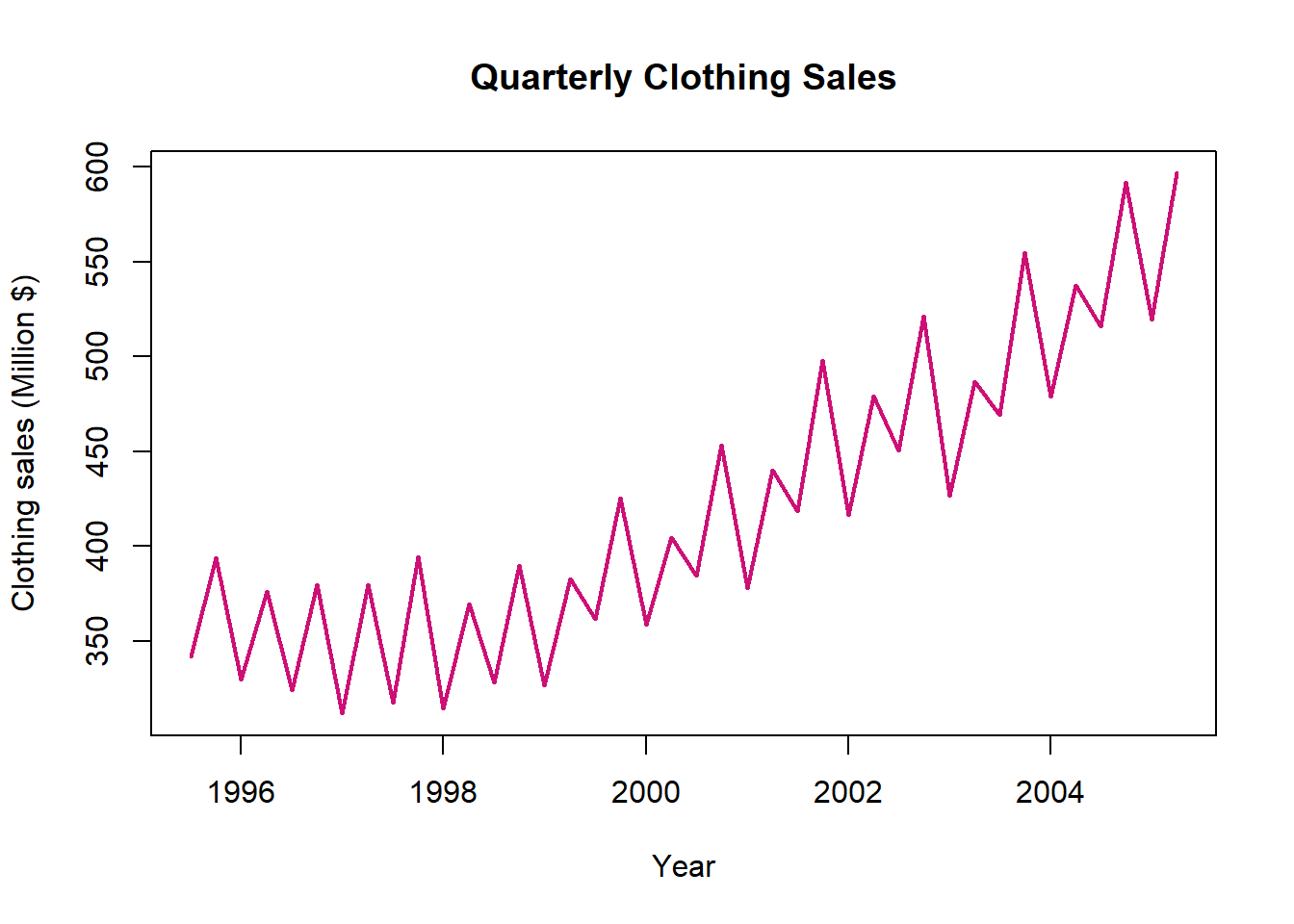
We can see an overall upwards trend in the number of new dwelling consents, as well as a cyclic component.
1b. Seasonally Adjusted Data
Copy-paste your code from the previous task to display the clothing sales time series. Use the lines() function to add the Seasonal_Adjusted data for each Year_No.
Code
#plot actual sales. lwd=2 increases the thickness of the line so it is more visible
plot(clothing$Year_No,clothing$Actual_Sales,type="l",xlab="Year",
ylab="Clothing sales (Million $)",main="Quarterly Clothing Sales",col="deeppink3",lwd=2)

#add seasonally adjusted line on top of plot
#lwd=2 increases the thickness of the line so it is more visible
lines(clothing$Year_No,clothing$Seasonal_Adjusted,col="goldenrod2",lwd=2)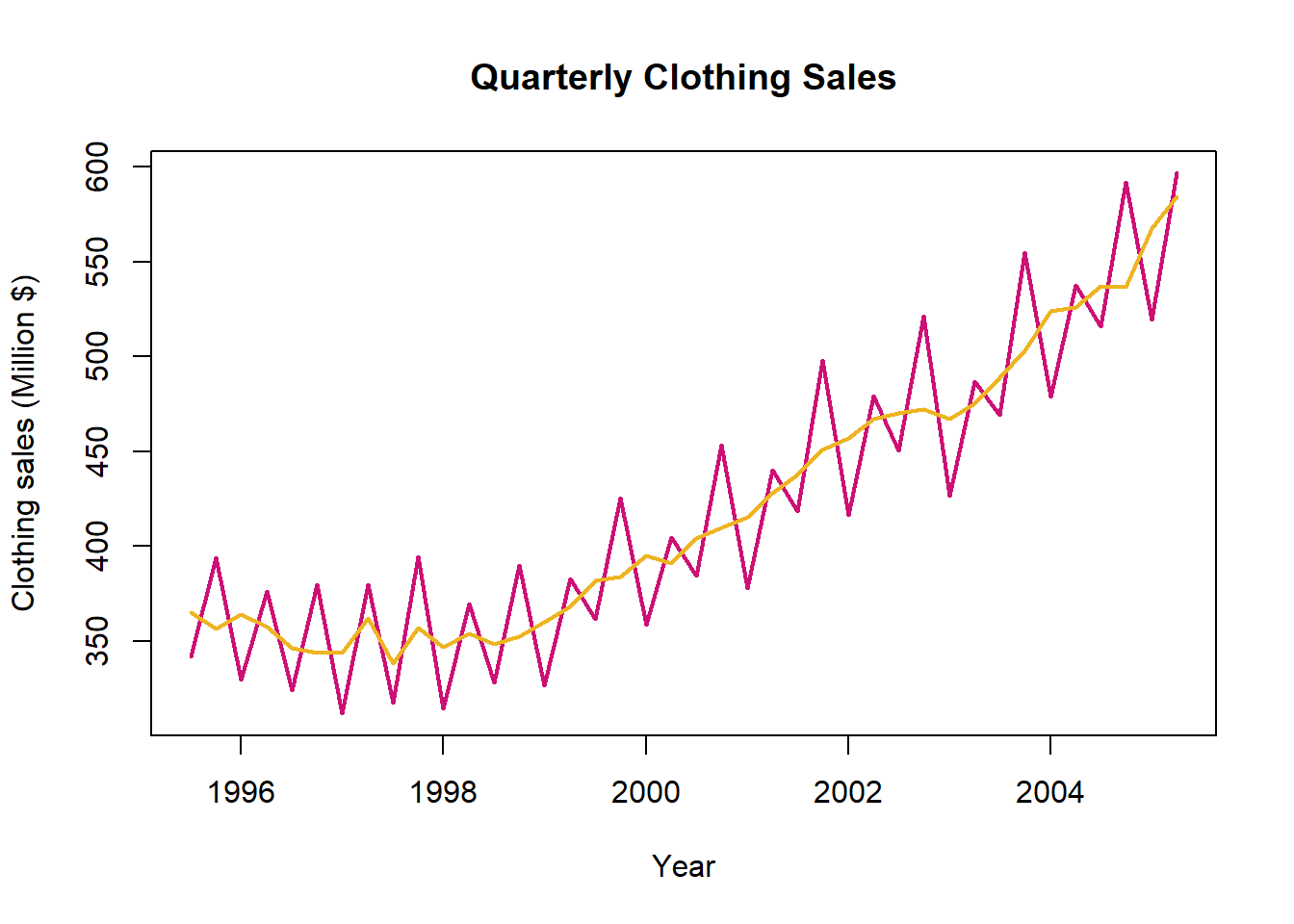
After adjusting for the seasonal cycles it becomes more obvious that there is a relatively stable number of new dwelling consents until 1999 when the upwards trend begins.
1c. Trend
Copy-paste your code from the previous task to display the clothing sales time series with the seasonally adjusted line on top. Add the Trend data for each Year_No.
Also add a legend to your plot to indicate the different lines.
Code
#plot actual sales. lwd=2 increases the thickness of the line so it is more visible
plot(clothing$Year_No,clothing$Actual_Sales,type="l",xlab="Year",
  ylab="Clothing sales (Million $)",main="Quarterly Clothing Sales",col="deeppink3",lwd=2)

#add seasonally adjusted line on top of plot.
#lwd=2 increases the thickness of the line so it is more visible
lines(clothing$Year_No,clothing$Seasonal_Adjusted,col="goldenrod2",lwd=2)

#add trend line on top of plot.
#lwd=2 increases the thickness of the line so it is more visible
lines(clothing$Year_No,clothing$Trend,col="green2",lwd=2)

#legend, specifying relevant lwd= and col= to match graph
legend("topleft",c("Actual","Seasonally Adjusted","Trend"),lwd=2,
      col=c("deeppink3","goldenrod2","green2"))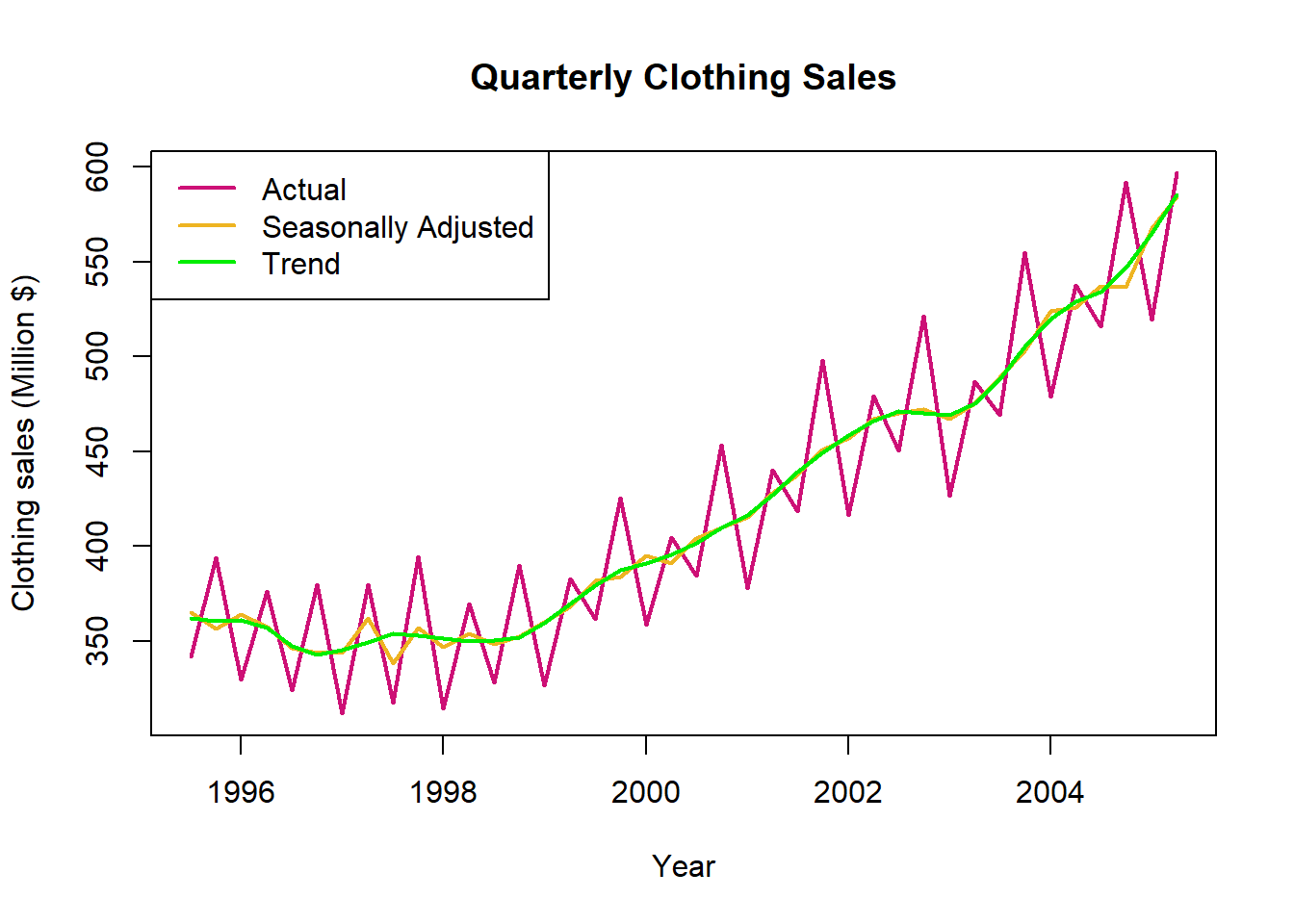
The trend provides a smoothed version of the seasonally adjusted line by eliminating small fluctuations.
2. Change between Quarters
Suppose we are interested in the change in clothing sales between the 3rd and 4th quarters of the year 2000.
2a. Indicate on Graph
Visually indicate these times on the plot from Task 1, using the function abline().
Code
#repeat plot with legend
plot(clothing$Year_No,clothing$Actual_Sales,type="l",xlab="Year",
ylab="Clothing sales (Million $)",main="Quarterly Clothing Sales",col="deeppink3",lwd=2)
lines(clothing$Year_No,clothing$Seasonal_Adjusted,col="goldenrod2",lwd=2)
lines(clothing$Year_No,clothing$Trend,col="green2",lwd=2)
legend("topleft",c("Actual","Seasonally Adjusted","Trend"),lwd=2,
      col=c("deeppink3","goldenrod2","green2"))

#add lines, v=c() gives vector of vertical lines, lty=3 makes line dashed
abline(v=c(2000.50,2000.75),lty=3)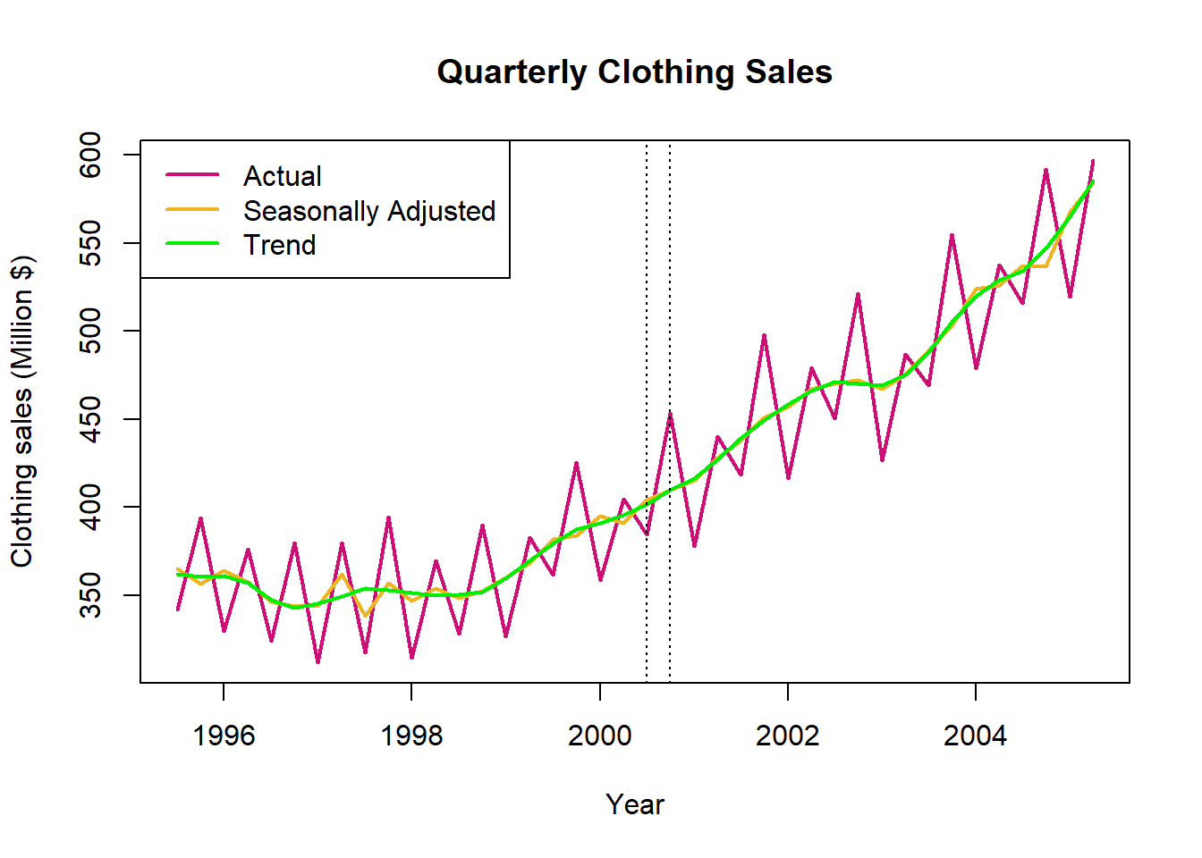
We can see that there is a large change in the raw data between the 3rd and 4th quarters of 2000, but this is mostly due to seasonal cycles and corresponds to only a slight increase in seasonally adjusted values or trend.
2b. Subsetting
To carry out a numerical comparison between sales in 2000 we need to extract the the relevant values from the data frame.
Try this using the subsetting techniques you have learnt in other lessons, a solution is available by un-hiding the code chunk. .
Code
#subset relevant rows of clothing data frame. | indicates OR
clothing[clothing$Year_No==2000.50|clothing$Year_No==2000.75,]
Code
#subset relevant rows of clothing data frame. | indicates OR
clothing[clothing$Year_No==2000.50|clothing$Year_No==2000.75,]
# A tibble: 2 × 6
Year Quarter Year_No Actual_Sales Seasonal_Adjusted Trend
<dbl> <dbl> <dbl> <dbl> <dbl> <dbl>
1 2000 3 2000. 385. 404. 402.
2 2000 4 2001. 453. 410. 410.2c. Numerical Comparison
Calculate the percentage change in Actual_Sales between 2000.50 and 2000.75. Compare this to the percentage change in Seasonal_Adjusted sales.
Why is the Seasonal_Adjusted a more reliable measure of comparison if we are interested in a meaningful increase/decrease in sales?
These calculations can be performed by hand or in R.
Code
#actual sales increase
((453.4307-384.5818)/384.5818)*100

#seasonally adjusted increase
((409.6261-404.0889)/404.0889)*100
Code
#actual sales increase
((453.4307-384.5818)/384.5818)*100
[1] 17.90228Code
#seasonally adjusted increase
((409.6261-404.0889)/404.0889)*100
[1] 1.370293The percentage change in actual sales is 17.9%, while the seasonally adjusted increase is only 1.4%.
The seasonally adjusted increase is more meaningful in terms of sales growth as it is corrected for the dramatic fluctuations in sales according to time of year. Otherwise we might conclude that there has been a massive jump in sales, when in reality the change is similar to what would be expected between these 2 quarters if business was as usual.
3. Seasonal and Random Components
3a. Seasonal Component
Calculate and plot the seasonal component of the clothing time series using the formula for a multiplicative time series model.
Actual Series = Trend Cycle \(\times\) Seasonal Component \(\times\) Irregular
Rearranging to solve for the seasonal component
Seasonal Component = Actual Series \(/\) (Trend Cycle \(\times\) Irregular), where (Trend Cycle \(\times\) Irregular) is the Seasonal_Adjusted series
Code
#create new variable equal to the seasonal component
clothing$Seasonal_Comp<-clothing$Actual_Sales/clothing$Seasonal_Adjusted
Code
#plot seasonal component.
#lwd=2 increases the thickness of the line so it is more visible
plot(clothing$Year_No,clothing$Seasonal_Comp,type="l",xlab="Year",
    ylab="Seasonal",main="",col="red3",lwd=2)
Code
#create new variable equal to the seasonal component
clothing$Seasonal_Comp<-clothing$Actual_Sales/clothing$Seasonal_Adjusted
Code
#plot seasonal component.
#lwd=2 increases the thickness of the line so it is more visible
plot(clothing$Year_No,clothing$Seasonal_Comp,type="l",xlab="Year",
    ylab="Seasonal",main="",col="red3",lwd=2)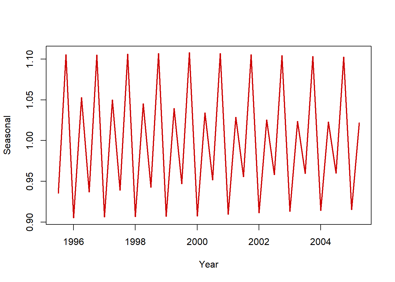
3b. Decompose Series
A more straightforward way to isolate the components of a time series is by using the decompose() function.
Code
#create time series object, freq=4 indicates that our data is quarterly
clothing_ts<-ts(clothing$Actual_Sales,freq=4)

#plot decomposed version of this time series object
#type="multiplicative" allows for seasonal component that changes in magnitude over time
plot(decompose(clothing_ts,type="multiplicative"))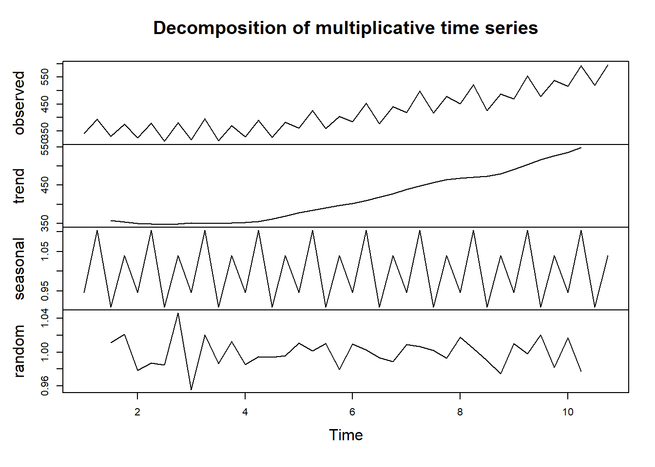
3c. Interpret Seasonal Component
Study the seasonal component of the clothing sales time series.
Which quarters are clothing sales the highest in, and which are they the lowest in?
Think of some reasons why this pattern might occur.
The highest sales are in the 2nd and 4th quarters, the 1st and 3rd quarters see the lowest sales.
The 2nd quarter is just before and during winter, people are likely to stock up on clothes for the cold.
The 4th quarter is Christmas, people are buying gifts and holiday outfits.
Other quarters therefore have comparatively lower sales.
3d. Interpret Random Component
Study the random component of the clothing sales time series.
Are there any concerning patterns or instances when the random component is particularly large?
There is a particularly high random component followed by particularly low random component in the year 1997. This was caused by a March Easter as discussed in the accompanying video.
There are no other notable random components.
4. Practice: Time Series Plots, Change between Years, Seasonal, Random Components
Carry out a time series analysis for the New Dwelling Consents data.
4a. Plot Time Series
Display the new dwelling time series, by plotting Dwelling_Actuals against Year_No.
How do the seasonally adjusted and trend components of the dwelling consents time series differ from the clothing sales time series?
Plot raw data
Code
#plot actual sales. lwd=2 increases the thickness of the line so it is more visible
plot(dwelling$Year_No,dwelling$Dwelling_Actuals,type="l",xlab="Year",
ylab="Dwelling numbers (Actual)",main="Monthly Dwelling Consents",col="deeppink3",lwd=2)
Use the lines() function to add the DW_Seasonally_Adjusted data for each Year_No.
Code
#plot actual sales. lwd=2 increases the thickness of the line so it is more visible
plot(dwelling$Year_No,dwelling$Dwelling_Actuals,type="l",xlab="Year",
ylab="Dwelling numbers (Actual)",main="Monthly Dwelling Consents",col="deeppink3",lwd=2)

#add seasonally adjusted line on top of plot.
#lwd=2 increases the thickness of the line so it is more visible
lines(dwelling$Year_No,dwelling$DW_Seasonally_Adjusted,col="goldenrod2",lwd=2)
Use the lines() function to add the DW_MovingAv_12 (Trend) data for each Year_No. Add a legend to the plot to indicate the different lines.
Code
#plot actual sales. lwd=2 increases the thickness of the line so it is more visible
plot(dwelling$Year_No,dwelling$Dwelling_Actuals,type="l",xlab="Year",
ylab="Dwelling numbers (Actual)",main="Monthly Dwelling Consents",col="deeppink3",lwd=2)

#add seasonally adjusted line on top of plot.
#lwd=2 increases the thickness of the line so it is more visible
lines(dwelling$Year_No,dwelling$DW_Seasonally_Adjusted,col="goldenrod2",lwd=2)

#add trend line on top of plot.
#lwd=2 increases the thickness of the line so it is more visible
lines(dwelling$Year_No,dwelling$DW_MovingAv_12,col="green2",lwd=2)

#legend, specifying relevant lwd= and col= to match graph
legend("topleft",c("Actual","Seasonally Adjusted","Trend"),lwd=2,
       col=c("deeppink3","goldenrod2","green2"))
Code
#plot actual sales. lwd=2 increases the thickness of the line so it is more visible
plot(dwelling$Year_No,dwelling$Dwelling_Actuals,type="l",xlab="Year",
ylab="Dwelling numbers (Actual)",main="Monthly Dwelling Consents",col="deeppink3",lwd=2)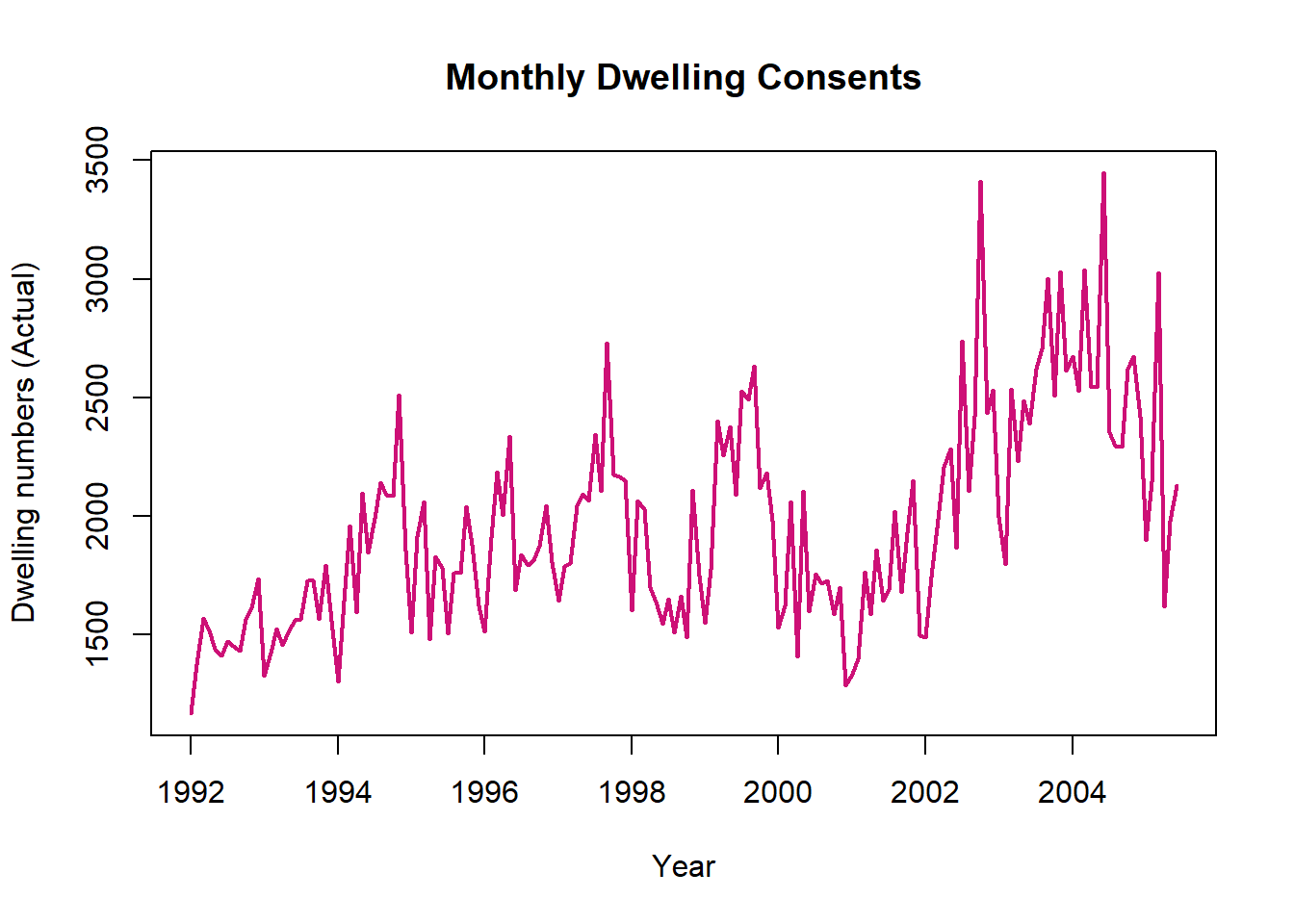
Code
#plot actual sales. lwd=2 increases the thickness of the line so it is more visible
plot(dwelling$Year_No,dwelling$Dwelling_Actuals,type="l",xlab="Year",
ylab="Dwelling numbers (Actual)",main="Monthly Dwelling Consents",col="deeppink3",lwd=2)

#add seasonally adjusted line on top of plot.
#lwd=2 increases the thickness of the line so it is more visible
lines(dwelling$Year_No,dwelling$DW_Seasonally_Adjusted,col="goldenrod2",lwd=2)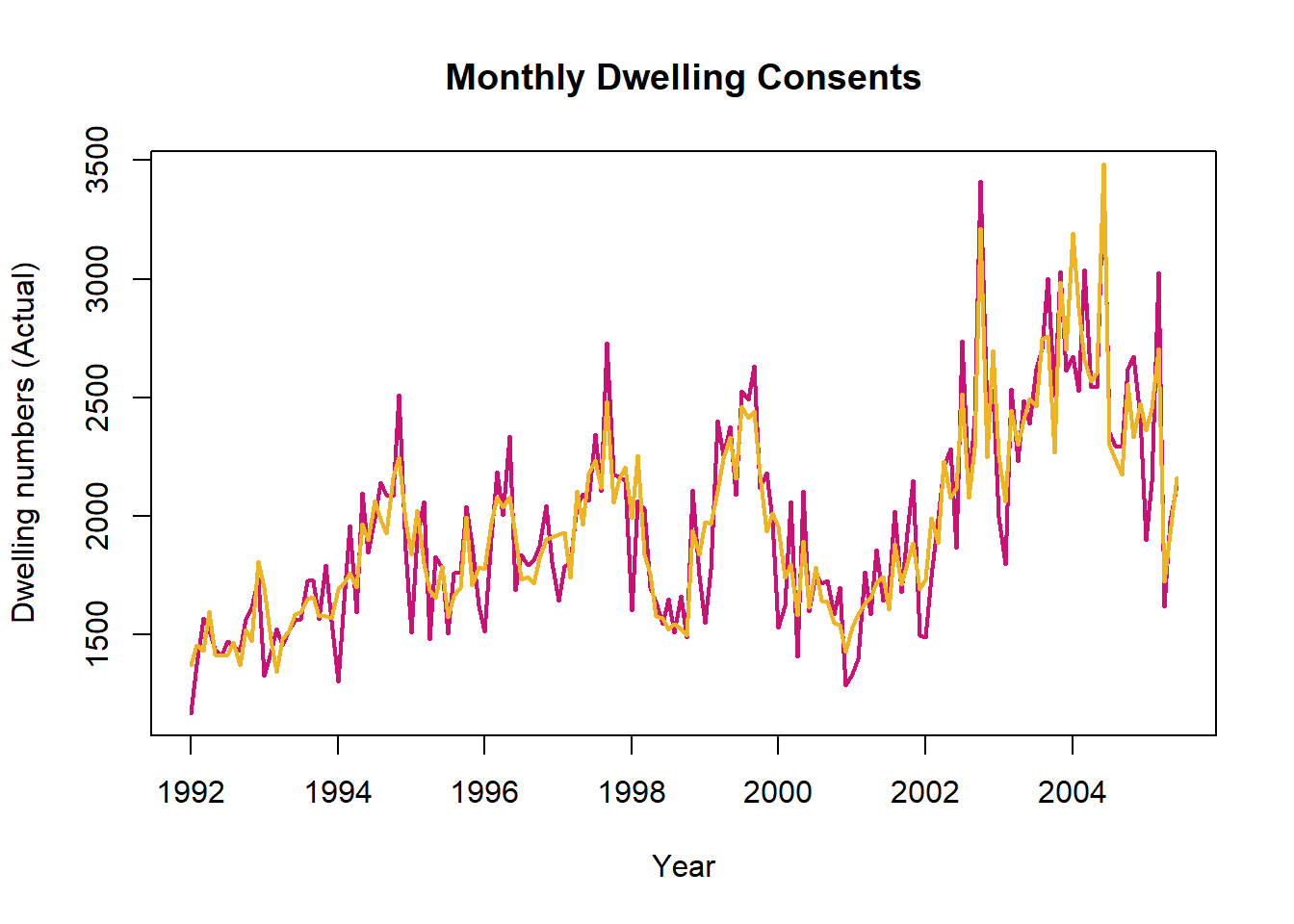

#add trend line on top of plot.
#lwd=2 increases the thickness of the line so it is more visible
lines(dwelling$Year_No,dwelling$DW_MovingAv_12,col="green2",lwd=2)

#legend, specifying relevant lwd= and col= to match graph
legend("topleft",c("Actual","Seasonally Adjusted","Trend"),lwd=2,
       col=c("deeppink3","goldenrod2","green2"))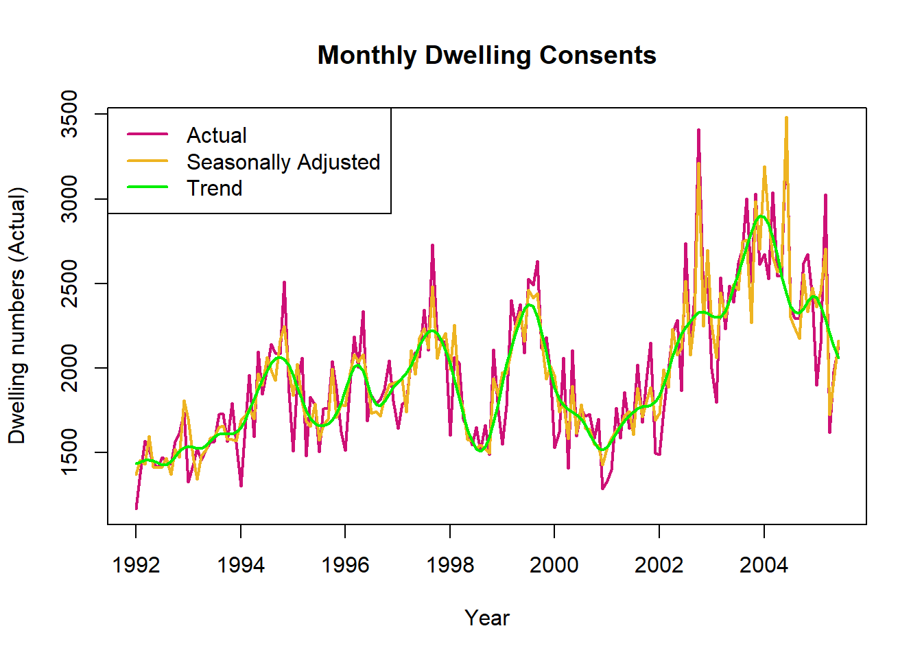
Seasonality does not account for as much variation in the dwelling consents data, the seasonally adjusted line is not much smoother than raw values.
The dwelling consents trend line has more turning points (increases and decreases), compared to the steady increase seen in clothing sales.
4b. Change Between Years
Suppose we are interested in the change in new dwelling consents across the 4 year period 1996 to 2000, we will use data from the last month of each year to compare.
Indicate these points on the time series plot, and calculate the percentage change in both the raw data and the trend.
Why have we used the trend rather than the seasonally adjusted values for this comparison of consents issued?
First visually indicate these times on the plot from Task 4a, using the function abline().
Code
#repeat plot with legend
plot(dwelling$Year_No,dwelling$Dwelling_Actuals,type="l",xlab="Year",
ylab="Dwelling numbers (Actual)",main="Monthly Dwelling Consents",col="deeppink3",lwd=2)
lines(dwelling$Year_No,dwelling$DW_Seasonally_Adjusted,col="goldenrod2",lwd=2)
lines(dwelling$Year_No,dwelling$DW_MovingAv_12,col="green2",lwd=2)
legend("topleft",c("Actual","Seasonally Adjusted","Trend"),lwd=2,
    col=c("deeppink3","goldenrod2","green2"))

#add lines, v=c() gives vector of vertical lines, lty=3 makes line dashed
abline(v=c(1996.917,2000.917),lty=3)
To carry out a numerical comparison between consents at the end of 1996 and 2000 extract the the relevant values from the data frame. .
Code
#subset relevant rows of dwelling data frame. | indicates OR
dwelling[dwelling$Year_No==1996.917|dwelling$Year_No==2000.917,]
Calculate the percentage change in Dwelling_Actuals between 1996.917 and 2000.917. Compare this to the percentage change in DW_MovingAv_12 sales.
Code
#actual sales change
((1285-1803)/1285)*100

#trend change
((1514.070-1885.573)/1514.070)*100
Code
#repeat plot with legend
plot(dwelling$Year_No,dwelling$Dwelling_Actuals,type="l",xlab="Year",
ylab="Dwelling numbers (Actual)",main="Monthly Dwelling Consents",col="deeppink3",lwd=2)
lines(dwelling$Year_No,dwelling$DW_Seasonally_Adjusted,col="goldenrod2",lwd=2)
lines(dwelling$Year_No,dwelling$DW_MovingAv_12,col="green2",lwd=2)
legend("topleft",c("Actual","Seasonally Adjusted","Trend"),lwd=2,
    col=c("deeppink3","goldenrod2","green2"))

#add lines, v=c() gives vector of vertical lines, lty=3 makes line dashed
abline(v=c(1996.917,2000.917),lty=3)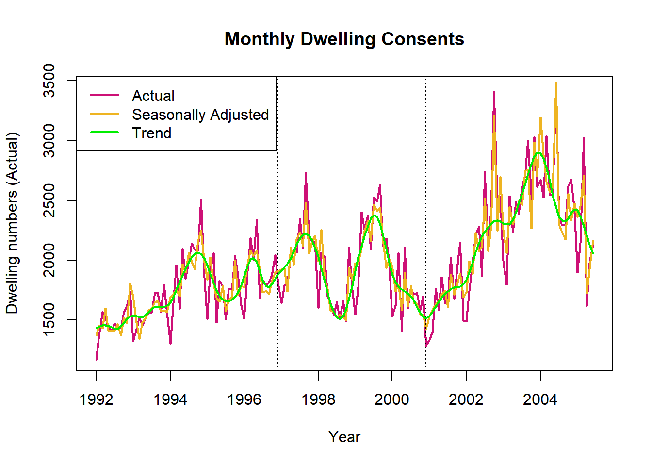
Code
#subset relevant rows of dwelling data frame. | indicates OR
dwelling[dwelling$Year_No==1996.917|dwelling$Year_No==2000.917,]
# A tibble: 2 × 7
Date Year Month Year_No Dwelling_Actuals DW_Seasonal…¹ DW_Mo…²
<dttm> <dbl> <dbl> <dbl> <dbl> <dbl> <dbl>
1 1996-12-01 00:00:00 1996 12 1997. 1803 1909. 1886.
2 2000-12-01 00:00:00 2000 12 2001. 1285 1425. 1514.
# … with abbreviated variable names ¹DW_Seasonally_Adjusted, ²DW_MovingAv_12Code
#actual sales change
((1285-1803)/1285)*100
[1] -40.31128Code
#trend change
((1514.070-1885.573)/1514.070)*100
[1] -24.53671It makes more sense to use the trend rather than the seasonally adjusted values as the seasonally adjusted values include lot of the variation in the raw data. The trend provides a better picture of overall change.
4c. Decompose Time Series, Interpret Seasonal and Random Components
Plot the decomposition of the dwelling consents time series.
Study the seasonal component of the dwelling consents time series. What time of year do dwelling consents tend to be issued in the highest numbers? Think of some reasons why this pattern might occur.
Study the random component of the dwelling consents time series. Are there any concerning patterns or instances when the random component is particularly large?
Code
#create time series object, freq=12 indicates that our data is monthly
dwelling_ts<-ts(dwelling$Dwelling_Actuals,freq=12)

#plot decomposed version of this time series object
#type="multiplicative" allows for seasonal component that changes in magnitude over time
plot(decompose(dwelling_ts,type="multiplicative"))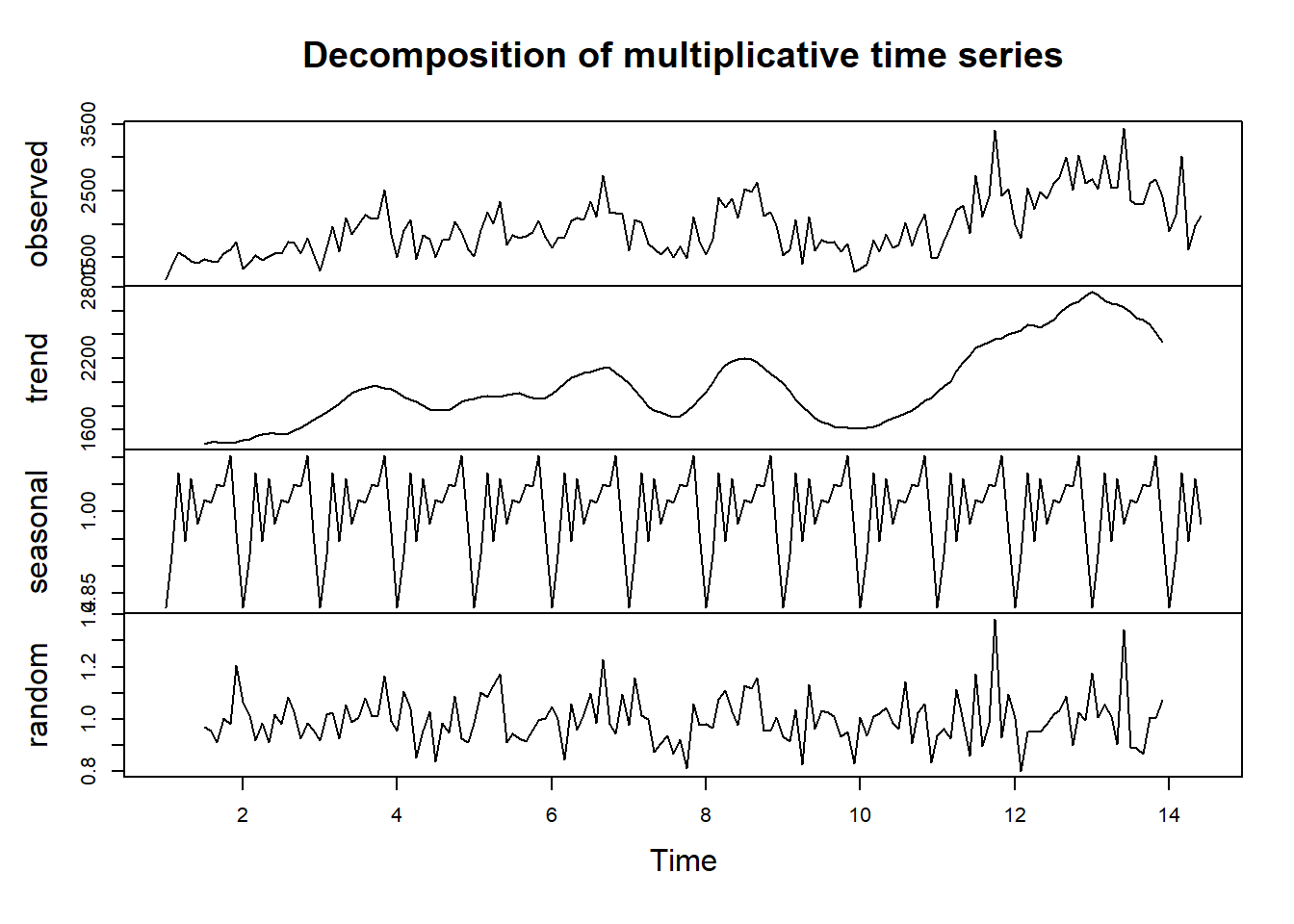
Interpret seasonal component: The lowest number of consents are issued at the beginning of the year. They are variable but generally increase throughout the year.
Building construction is easier in the summer so companies may be organising consents throughout the year to prepare for this.
The people responsible for submitting and approving consents also likely have time off over Christmas and New year.
Interpret random component: There was a particularly high random component in October 2002, this was caused by influx of apartment plans as discussed in the video.
There was another high random component in June 2004 as a result of plans being pushed through before the cost increase in July (also discussed in the video).