15 Satellite Transmitters and Tītī
We have a survey open right now that we invite you to fill out.
The Mutton bird (tītī) has one of the longest migration routes in the world, and breeds in the Southern Islands of New Zealand. The chicks are harvested, so sustainability of the population is an important issue.
This lesson investigates the possible adverse effects of attaching transmitters to tītī. This research was carried out by David Fletcher (Department of Mathematics & Statistics, University of Otago).
Data
There is 1 data file associated with this presentation. It contains the data you will need to complete the lesson tasks.
Video
Objectives
Tasks
In this study, tītī attendance at burrows was monitored over 30 days. The tītī were randomly allocated into two groups - those with satellite transmitters attached, and those without.
0. Read and Format data
0a. Read in the data
First check you have installed the package readxl (see Section 2.6) and set the working directory (see Section 2.1), using instructions in Getting started with R.
Load the data into R.
The code has been hidden initially, so you can try to load the data yourself first before checking the solutions.
Code
#loads readxl package
library(readxl)

#loads the data file and names it transmitter
transmitter<-read_xls("Titi Data.xls",range="A2:C32")

#view beginning of data frame
head(transmitter)
Code
#loads the data file and names it notransmitter
notransmitter<-read_xls("Titi Data.xls",range="D2:E32")

#copies the Day column to include in this data frame
notransmitter$Day<-transmitter$Day

#view beginning of data frame
head(notransmitter)
Code
#loads readxl package
library(readxl)
Warning: package 'readxl' was built under R version 4.2.2Code
#loads the data file and names it transmitter
transmitter<-read_xls("Titi Data.xls",range="A2:C32")

#view beginning of data frame
head(transmitter)
# A tibble: 6 × 3
Day Burrows `Attended Number`
<dbl> <dbl> <dbl>
1 1 3 0
2 2 4 2
3 5 5 3
4 6 5 2
5 7 6 4
6 8 8 4Code
#loads the data file and names it notransmitter
notransmitter<-read_xls("Titi Data.xls",range="D2:E32")

#copies the Day column to include in this data frame
notransmitter$Day<-transmitter$Day

#view beginning of data frame
head(notransmitter)
# A tibble: 6 × 3
Burrows `Attendede Number` Day
<dbl> <dbl> <dbl>
1 2 1 1
2 4 0 2
3 6 2 5
4 6 2 6
5 7 1 7
6 8 1 8The data recorded is Group (transmitter or no transmitter), Day, Burrows (the number of burrows monitored on each day), and Attended Number (the number of burrows for which tītī attendance was observed).
0b. Format the data
Rename the Attended Number variable in both groups to be a single word Attendance, for easier reference later.
Code
colnames(transmitter)<-c("Day","Burrows","Attendance")Repeat for the notransmitter data frame.
Code
colnames(transmitter)<-c("Day","Burrows","Attendance")
colnames(notransmitter)<-c("Burrows","Attendance","Day")
1. New Variables
Tītī attendance was measured with bounded counts (i.e. counts out of a possible total). Therefore we have binomial data and we should calculate the attendance proportions. These are the fraction of Burrows that were monitored where we observed a certain Attendance.
Calculate this for each data frame and add it as a new column.
Code
transmitter$Attended_Proportion<-transmitter$Attendance/transmitter$BurrowsRepeat for the notransmitter data frame.
Code
transmitter$Attended_Proportion<-transmitter$Attendance/transmitter$Burrows

notransmitter$Attended_Proportion<-notransmitter$Attendance/notransmitter$Burrows
2. Scatter Plot
To analyse the Attended_Proportion, begin by looking at the transmitter group data.
A good starting point for this analysis of the proportions is to draw a scatter plot of the data, with Attended_Proportion on the y axis and Day on the x axis for the transmitter group. Make sure to set axes and title labels, you can also investigate some different point characters and colours.
What patterns are visible from the graph - is there an overall trend visible for the transmitter group, and are there any outliers?
Code
plot(transmitter$Day,transmitter$Attended_Proportion,pch=17,col="cadetblue",
  xlab="Day",ylab="Attended Proportion",
  main = "Proportion of Burrows attended by Tītī each Day")
Code
plot(transmitter$Day,transmitter$Attended_Proportion,pch=17,col="cadetblue",
  xlab="Day",ylab="Attended Proportion",
  main = "Proportion of Burrows attended by Tītī each Day")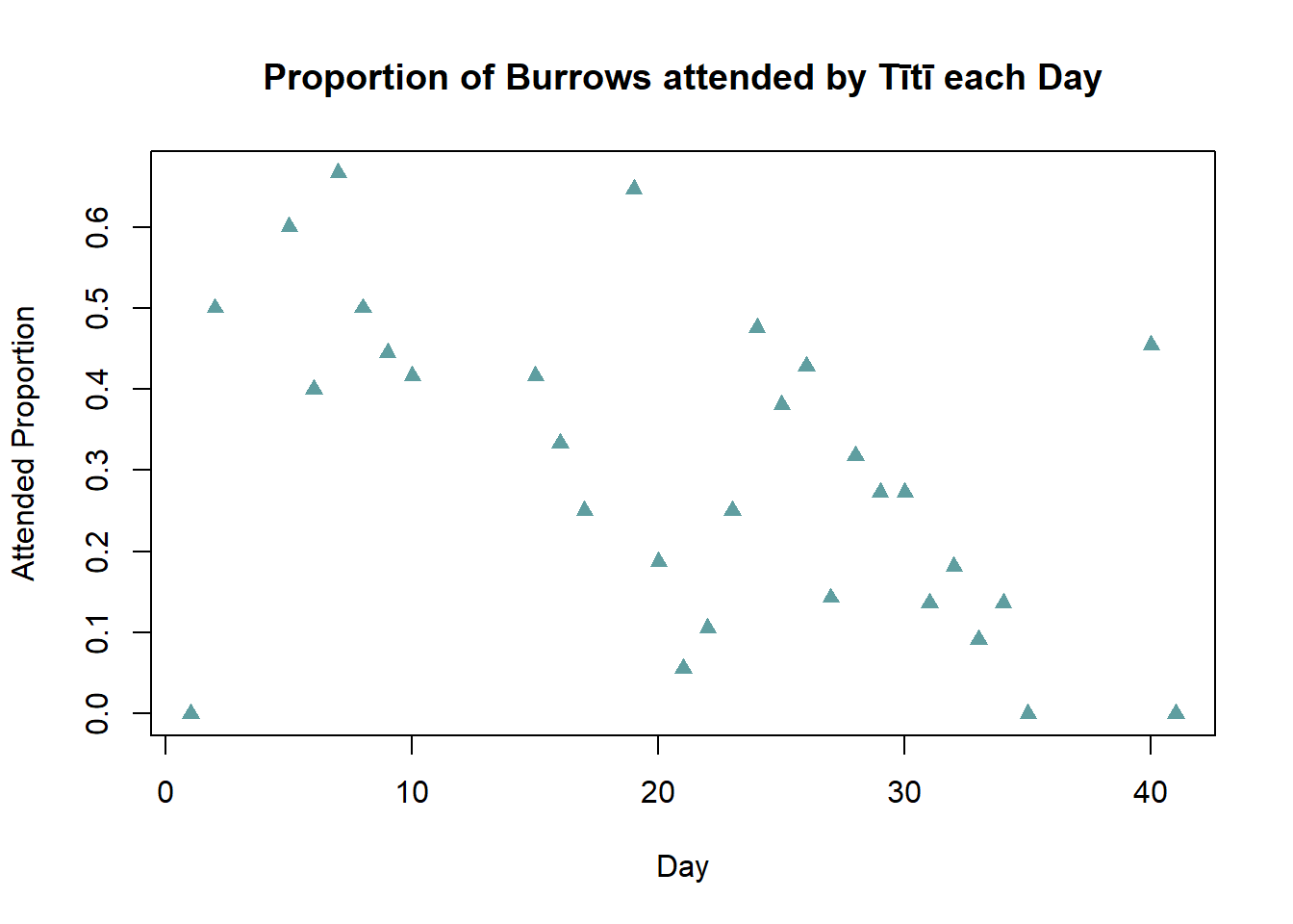
There appears to be a negative relationship between Day and Attended Proportion of burrows, for increasing days the proportion of attended burrows generally decreases. On day 40 nearly 50% of the burrows are attended, this departs from the overall trend and may be an outlier. Potentially due to recording error - 0.05 mis-recorded as 0.5.
3. Linear Regression, Plot Fitted Line and Confidence Interval Limits (Base R vs. GGplot), ANOVA, Residual Plots
3a. Simple Linear Regression
Despite the variability in the data exhibited in the scatter plot, there seemed to be an overall trend in the Attended_Proportion for the transmitter group over the six week period of the study.
Fit a linear regression of Attended_Proportion against Day to capture this trend.
Code
#fitting linear model
transModel<-lm(Attended_Proportion~Day,data=transmitter)

#view model output
summary(transModel)

#anova
anova(transModel)
Code
#fitting linear model
transModel<-lm(Attended_Proportion~Day,data=transmitter)

#view model output
summary(transModel)
Call:
lm(formula = Attended_Proportion ~ Day, data = transmitter)

Residuals:
     Min       1Q   Median       3Q      Max
-0.47026 -0.10508  0.00459  0.08414  0.32657

Coefficients:
             Estimate Std. Error t value Pr(>|t|)
(Intercept)  0.478579   0.067408   7.100    1e-07 ***
Day         -0.008321   0.002814  -2.957  0.00625 **
---
Signif. codes:  0 '***' 0.001 '**' 0.01 '*' 0.05 '.' 0.1 ' ' 1

Residual standard error: 0.1718 on 28 degrees of freedom
Multiple R-squared:  0.2379,    Adjusted R-squared:  0.2107
F-statistic: 8.742 on 1 and 28 DF,  p-value: 0.006251
Code
#anova
anova(transModel)
Analysis of Variance Table
Response: Attended_Proportion
Df Sum Sq Mean Sq F value Pr(>F)
Day 1 0.25816 0.258163 8.742 0.006251 **
Residuals 28 0.82688 0.029531
---
Signif. codes: 0 '***' 0.001 '**' 0.01 '*' 0.05 '.' 0.1 ' ' 13b. Interprete ANOVA
The F statistic in the ANOVA has a p-value of 0.006 - what does this tell us?
A p-value of 0.006 indicates that if there is truly no relationship between the response Attended_Proportion and the predictor Day, the probability of observing the data that we have is only 0.6%.
This presents significant evidence that there is in fact a relationship between Day and Attended_Proportion. That is, Attended_Proportion changes according to Day.
A cut-off of 0.05 is typically implemented for interpreting p-values, as a 5% chance of observing the data (if there is in fact no true relationship between the predictor and the response) is considered sufficiently unlikely.
3c. Plot Fitted Line (Base R)
Include the fitted linear model on the scatter plot from Task 2.
Calculate 95% confidence limits for this fitted line and add them to the plot.
Code
#repeat original plot
plot(transmitter$Day,transmitter$Attended_Proportion,pch=17,col="cadetblue",
  xlab="Day",ylab="Attended Proportion",
  main = "Proportion of Burrows attended by Tītī each Day")

#add fitted regression line. lwd=  controls the thickness of the line
abline(transModel,col="red3",lwd=2)
Calculate 95% confidence limits
Code
#add lower and upper ci boundaries

#generate a fine sequence of values for Day
daySeq<-seq(0,max(transmitter$Day)+5,length.out=200)

 #predict fitted values, along with lower and upper limits of confidence interval
#for each daySeq value using the fitted model
ci<-predict(transModel,newdata=data.frame(Day=daySeq),interval="confidence")

head(ci) #have a look at what is being calculated
Add confidence limits to the plot using the lines() function. Complete with a legend to distinguish the lines.
Code
#repeat plot with regression line
plot(transmitter$Day,transmitter$Attended_Proportion,pch=17,col="cadetblue",
  xlab="Day",ylab="Attended Proportion",
main = "Proportion of Burrows attended by Tītī each Day")

abline(transModel,col="red3",lwd=2)

#lty=  controls the line type (e.g dashed)
lines(daySeq,ci[,2],lty=2,col="red") #lower limit
lines(daySeq,ci[,3],lty=2,col="red") #upper limit

#add legend
legend("topright",c("Fitted line","Lower 95% CI","Upper 95% CI"),lwd=c(2,1,1),lty=c(1,2,2),col=c("red","red3","red3"))
Code
#repeat original plot
plot(transmitter$Day,transmitter$Attended_Proportion,pch=17,col="cadetblue",
  xlab="Day",ylab="Attended Proportion",
  main = "Proportion of Burrows attended by Tītī each Day")

#add fitted regression line. lwd=  controls the thickness of the line
abline(transModel,col="red3",lwd=2)

#add lower and upper ci boundaries

#generate a fine sequence of values for Day
daySeq<-seq(0,max(transmitter$Day)+5,length.out=200)

 #predict fitted values, along with lower and upper limits of confidence interval
#for each daySeq value using the fitted model
ci<-predict(transModel,newdata=data.frame(Day=daySeq),interval="confidence")

#lty=  controls the line type (e.g dashed)
lines(daySeq,ci[,2],lty=2,col="red") #lower limit
lines(daySeq,ci[,3],lty=2,col="red") #upper limit

#add legend
legend("topright",c("Fitted line","Lower 95% CI","Upper 95% CI"),lwd=c(2,1,1),lty=c(1,2,2),col=c("red","red3","red3"))
The fitted regression line confirms our earlier observation of a downwards trend in the proportion of attended burrows for increasing days in the transmitter data. The confidence limits indicate we can be confident the true relationship is negative, as any potential slope within these limits would be downwards.
3d. Plot Fitted Line (GGplot)
It is possible to construct the plot similar to the one above with only a single line of code. However, this involves installing a new package and thinking about plotting in a different way.
The ggplot2 package was designed for easily creating attractive plots. The information to be included on the plot is specified by layers of functions, which are joined by + signs. These functions correspond to certain components of the plot. We need to consider 3 components: data, aesthetics, and geometric objects, to replicate our confidence interval plot.
The data component is the data we wish to include in the plot. The aesthetics component maps this data to the graphical objects, for example specifying the predictor (x) and response (y) variables. These first 2 components are both included in the function ggplot(data= ,aes=).
The geometric object component indicates the actual plot to be created. Each type of plot or graphical object has its own function, beginning with geom_. We will use 2 geometric objects, geom_point() to create the basic scatter plot, and geom_smooth() to add the fitted line. Specifyingmethod="lm" indicates that we want to fit a linear model to the data (as we did above), and by default geom_smooth includes 95% confidence limits around the fitted line.
Code
library(ggplot2)

#ggplot scatter plot with fitted line
ggplot(data=transmitter,aes(x=Day,y=Attended_Proportion))+geom_point()+
  geom_smooth(method="lm")
Code
library(ggplot2)

#ggplot scatter plot with fitted line
ggplot(data=transmitter,aes(x=Day,y=Attended_Proportion))+geom_point()+
  geom_smooth(method="lm")
`geom_smooth()` using formula 'y ~ x'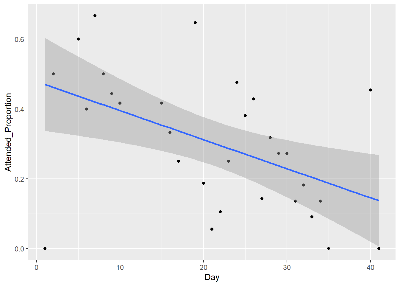
This plot is identical to the earlier one constructed using base R.
You can see that once you understand the syntax of ggplot, it is straightforward to create a scatter plot with a fitted line and 95% confidence interval. However, in many ways ggplot is less flexible than base R. It can be harder to tweak certain automatically specified elements of your plots when using this package. Both methods have costs and benefits, depending the particular application.
You can read more about ggplot by looking at the links in the ggplot2 help file.
3e. Prediction from Regression Equation
By looking back at the regression output we can see the fitted equation is:
\[\hat{y}=0.4786-0.00832 Day\]
Use this to predict the Attended_Proportion at the \(20^{th}\) and \(50^{th}\) days - are these predictions reliable?
Code
#day 20
haty20=0.4786-0.00832*20
haty20
Modify to calculate for the \(50^{th}\) day.
Code
#day 20
haty20=0.4786-0.00832*20
haty20
[1] 0.3122Code
#day 50
haty50=0.4786-0.00832*50
haty50
[1] 0.0626Attended proportion on the 20th day is predicted to be 0.3122. This is a fairly reliable prediction, the value is in the middle of the sample data used to fit the model.
Attended proportion on the 50th day is predicted to be 0.0626. This is not a reliable prediction, as the value is well outside our sample data. It is an extrapolation, and these should be interpreted with care.
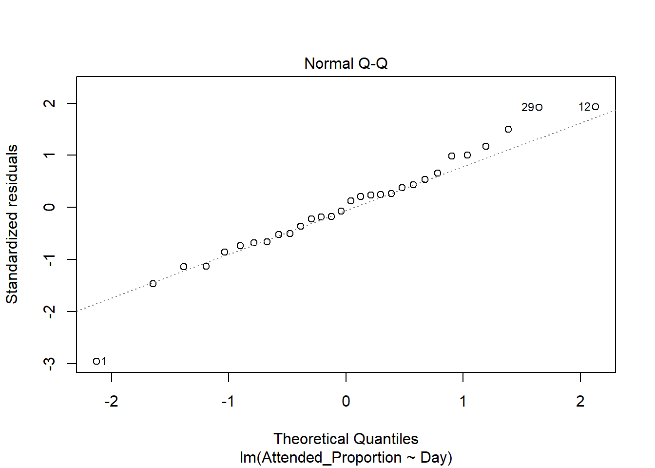
3f. Residual Plots
An important step in model fitting is to check the residuals. Generate the relevant plots and check for any indicators of concern.
The relevant residual plots are created by passing the fitted model object to the plot() function
Code
plot(transModel)Code
plot(transModel)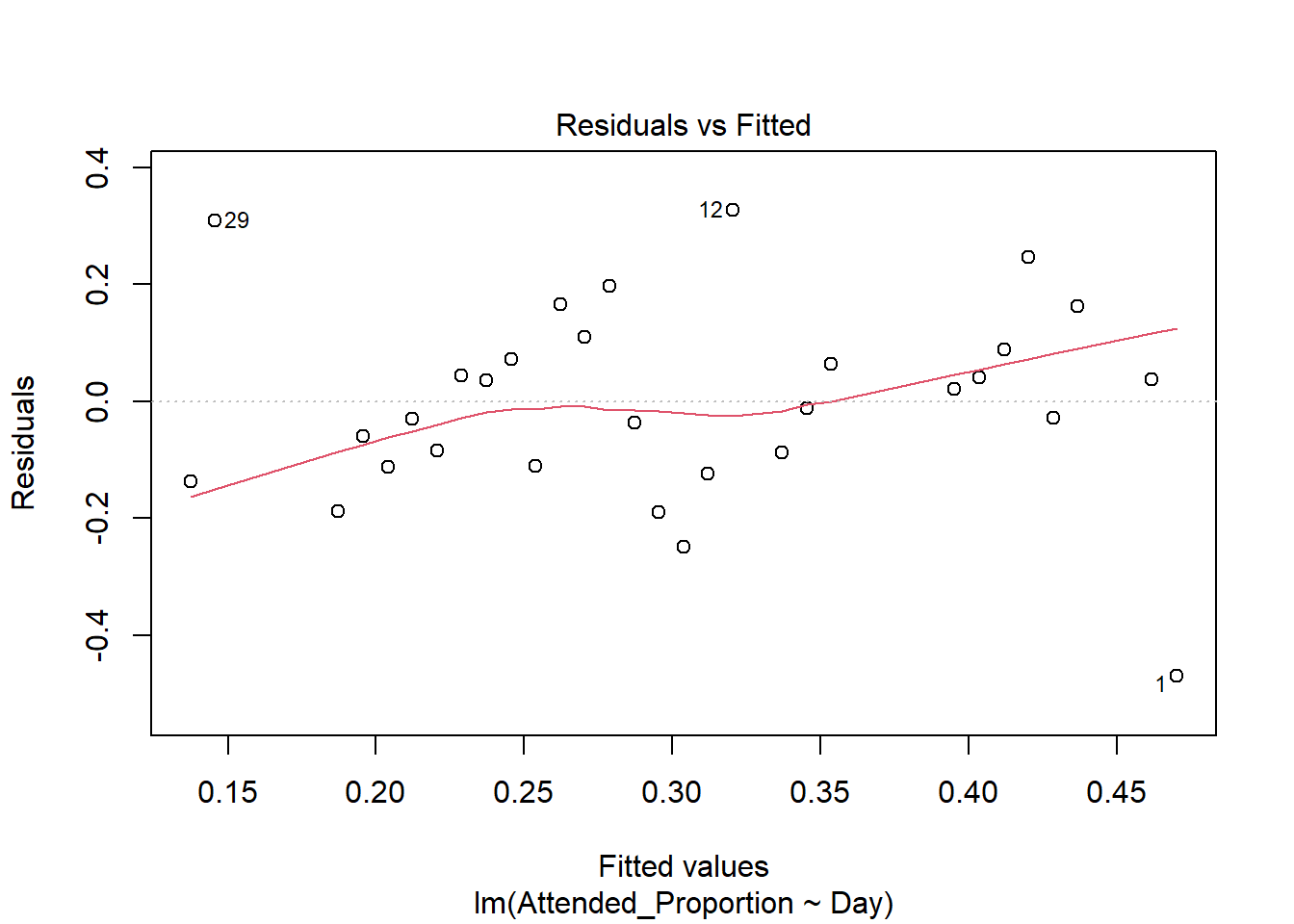
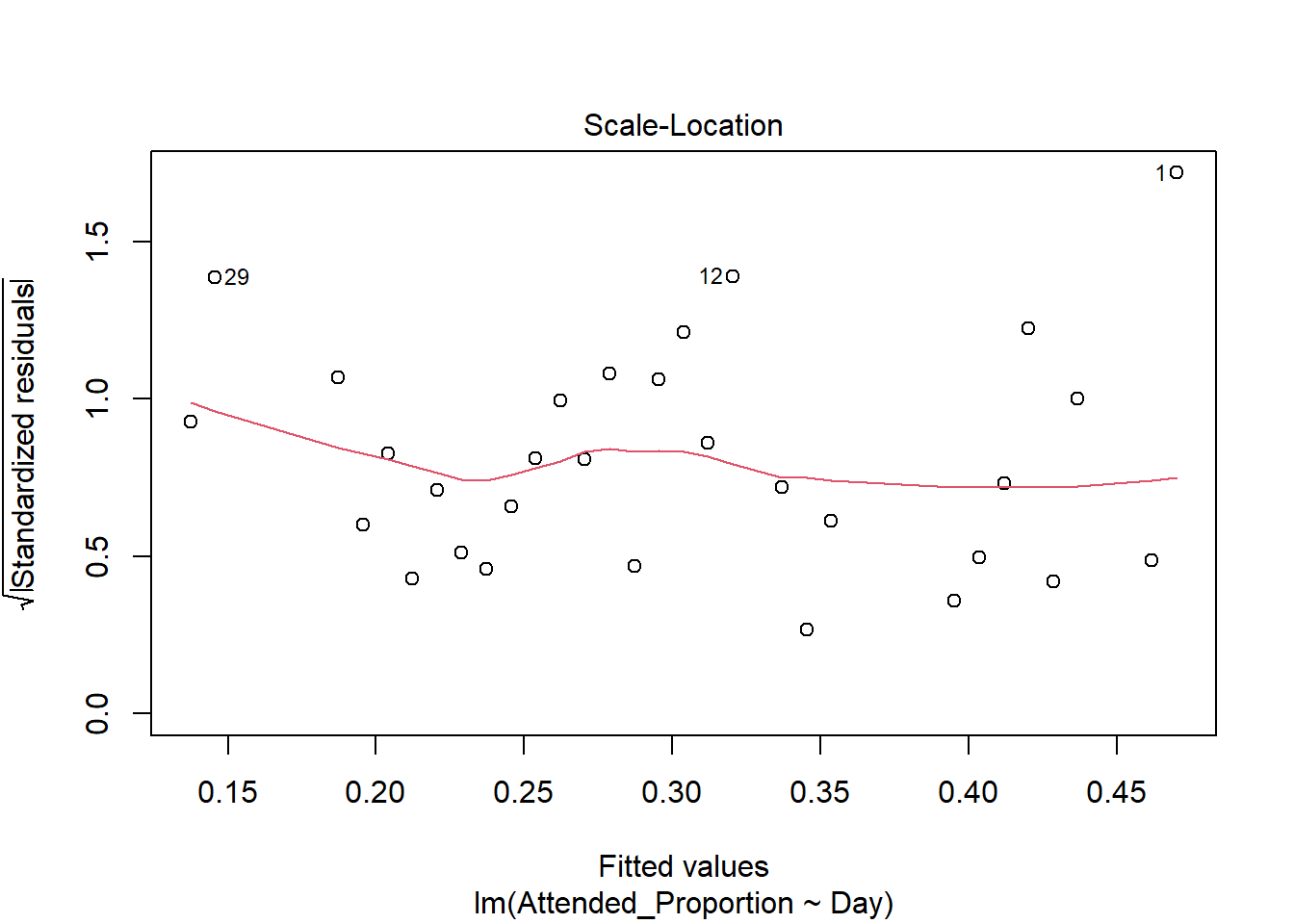
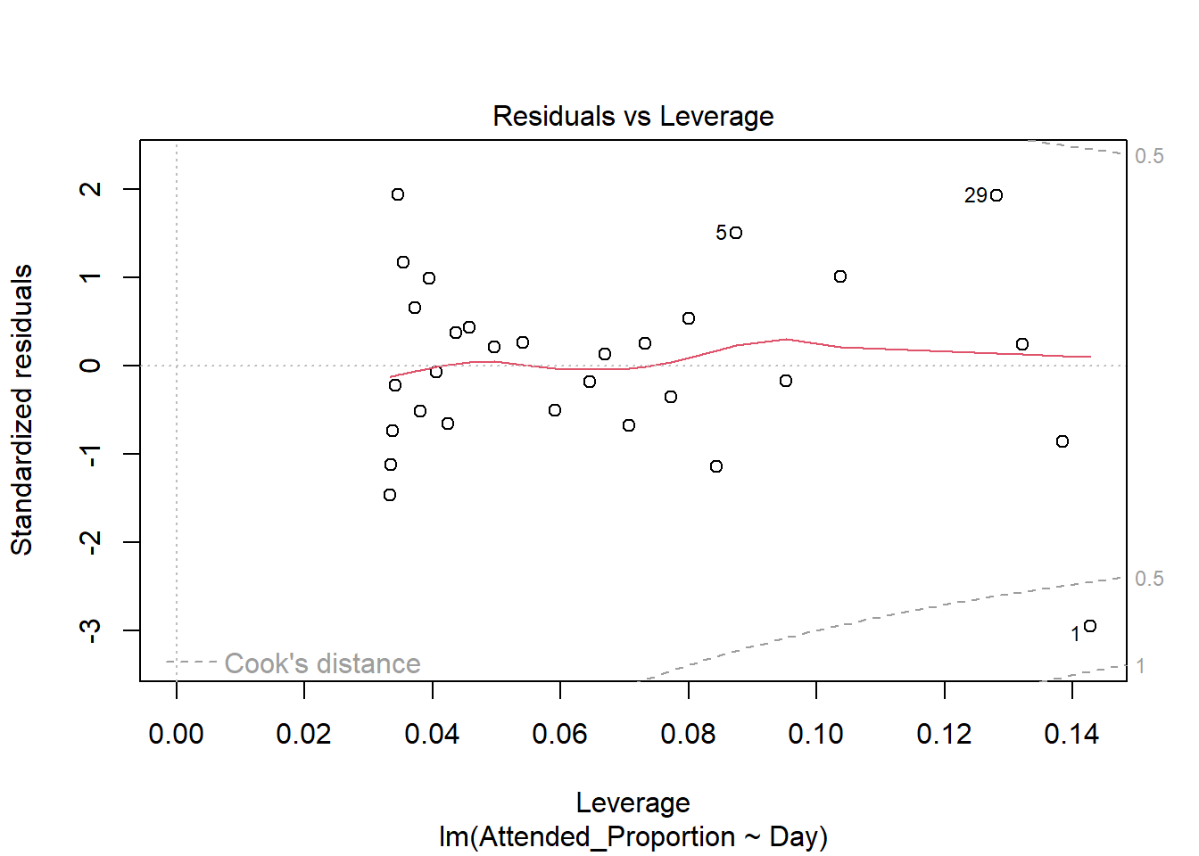
There are some slight curves in the red mean line through the residuals, but these are not dramatic enough to cause concern regarding non-linearity. There appears to be constant variance across the fitted values.
The standardised residuals on the normal qq plot relatively closely follow the standard normal quantiles, with departure only at the extreme quantiles.
There are a few outliers with square root standardised residuals around 1.5 (corresponding to 2.25 when squared).
The fourth plot indicates several influential points - observations 1, 5 and 29. All are influential due to a combination of large residual values and high leverage positions. Their large residuals may be due to measurement or transcription errors or simply additional natural variation that has not been accounted for by our model. 5 has the lowest leverage of the three so is slightly less influential. Observations 1 and 29 have the two biggest residual values and positions of high leverage so are considerably influential.
4. Extension: Scatter Plot, Linear Regression, ANOVA, Plot Fitted Line and Confidence Interval Limits (Base R vs. GGplot), Residual Plots
Analyse the notransmitter data (remember this is a separate data frame).
Create a scatter plot.
Perform a linear regression and ANOVA. Add the fitted line along with 95% confidence interval limits to your plot, to see if there is evidence of a trend for the noransmitter group.
If there is a trend, is it different from that shown by the transmitter group? Are there any outliers?
Construct and interpret residual plots to check model fit.
5. Confidence Intervals by Day
Another way to analyse the data is to directly compare the two groups on each of the 30 nights by looking at the differences in the Attended_Proportion.
This allows us to see which group had a higher rate of attendance on each day, and how large this difference was.
Add a new column to the transmitter data frame, calculated as the Attended_Proportion from the transmitter group minus the Attended_Proportion from the notransmitter group.
Following this we can plot Prop_Difference against Day and add 95% confidence limits to these differences, producing the plot below.
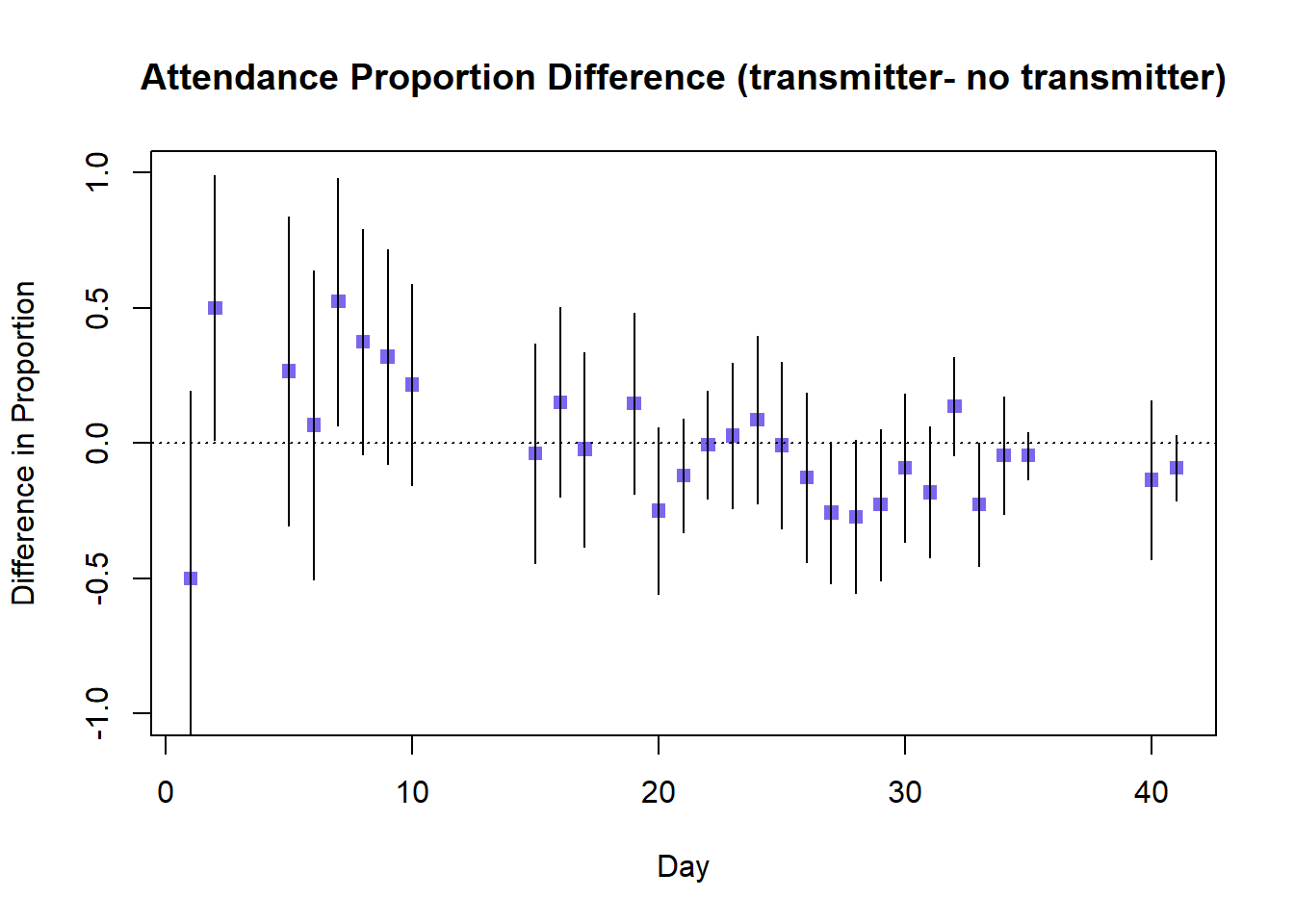
What can we conclude from this graph - what is the overall pattern, and what do the 95% confidence intervals tell us?
Calculate difference variable
Code
transmitter$Prop_Difference<-transmitter$Attended_Proportion-notransmitter$Attended_ProportionIf you wish to recreate the plot of confidence limits for the difference in proportions by day, work through the following code:
First we calculate the components of our 95% confidence interval - the estimate, the standard error, and the multiplier.
Code
 #estimated difference in proportion
est<-transmitter$Prop_Difference

#shortening the variable names for easier reference
p1<-transmitter$Attended_Proportion
p2<-notransmitter$Attended_Proportion

 #calculating the standard error for the difference in proportions
se<-sqrt(((p1*(1-p1))/transmitter$Burrows) + ((p2*(1-p2))/notransmitter$Burrows))

#multiplier for 95% ci for difference in proportion uses standard normal distribution
m<-qnorm(0.975)
Plot the scatter plot of differences.
We construct the 95% confidence limits for each Day, then use these values to specify the minimum and maximum of vertical lines around the corresponding estimated Prop_Difference.
Finally we add a line at 0, so we can check if these confidence intervals include a 0 difference.
Code
#scatter plot
plot(transmitter$Day,transmitter$Prop_Difference,xlab="Day",
ylab="Difference in Proportion",pch=15,col="slateblue2",ylim=c(-1,1),
main="Attendance Proportion Difference (transmitter- no transmitter)")

#calculate lower and upper ci limits for each day
ci1<-est-m*se
ci2<-est+m*se

#add lines to plot by specifying the day and lower and upper limits (coordinates)
segments(x0=transmitter$Day,y0=ci1,y1=ci2)

#horizontal line at 0, lty=3 is dotted
abline(h=0,lty=3)
Code
#difference variable
transmitter$Prop_Difference<-transmitter$Attended_Proportion-notransmitter$Attended_Proportion
Code
 #estimated difference in proportion
est<-transmitter$Prop_Difference

#shortening the variable names for easier reference
p1<-transmitter$Attended_Proportion
p2<-notransmitter$Attended_Proportion

 #calculating the standard error for the difference in proportions
se<-sqrt(((p1*(1-p1))/transmitter$Burrows) + ((p2*(1-p2))/notransmitter$Burrows))

#multiplier for 95% ci for difference in proportion uses standard normal distribution
m<-qnorm(0.975)
Code
#scatter plot
plot(transmitter$Day,transmitter$Prop_Difference,xlab="Day",
ylab="Difference in Proportion",pch=15,col="slateblue2",ylim=c(-1,1),
main="Attendance Proportion Difference (transmitter- no transmitter)")

#calculate lower and upper ci limits for each day
ci1<-est-m*se
ci2<-est+m*se

#add lines to plot by specifying the day and lower and upper limits (coordinates)
segments(x0=transmitter$Day,y0=ci1,y1=ci2)

#horizontal line at 0, lty=3 is dotted
abline(h=0,lty=3) 
The difference in attended proportion between transmitter and non-transmitter birds suggests that initially the fitting of a transmitter appears to increase burrow attendance, with several entirely positive confidence intervals (this is counter-intuitive to what we might expect). The difference appears to decrease over time, although there is considerable overlap in the confidence intervals of successive days so we cannot be confident of a true decrease. The majority of confidence intervals for the difference in attended proportion include 1, so there is no conclusive evidence of greater attendance by either transmitter or non-transmitter birds.
6. Issues with Small Datasets
What are some of the problems we should be aware of when dealing with proportions from small samples?
A small sample size gives us less information than a larger sample and has a greater risk of misrepresenting the characteristics of the wider population. For example the ages of Tītī, presence of injuries etc. in this sample may not be an accurate reflection of the entire population.
If multiple samples were taken (this should never be done in practice) and estimates of a value of interest are compared, these results will vary much more between small samples (that are easily influenced by extreme values) than larger ones.
A small sample size reduces the power of any statistical tests we perform, it limits our ability to detect a true effect if there is one. The plotted confidence intervals in Task 5 indicate no difference in burrow attendance for transmitter and non-transmitter birds, but this may be due to the small sample size rather than the lack of a true difference.
A small sample size can also increase the risk of concluding a true effect when one does not exist, as if extreme values happen to be sampled they will not be moderated by more common values (as they would in a large sample).
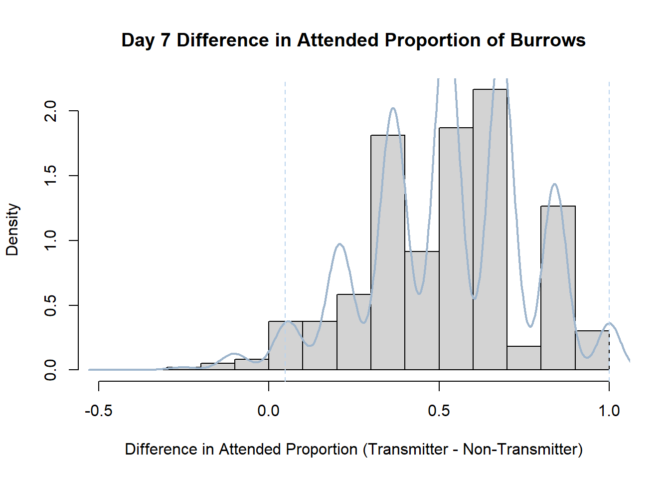
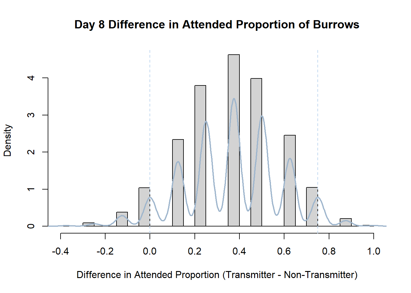
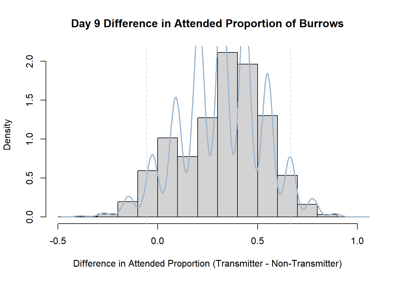
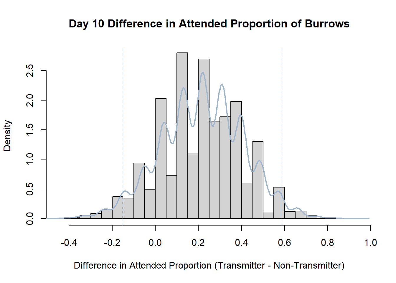
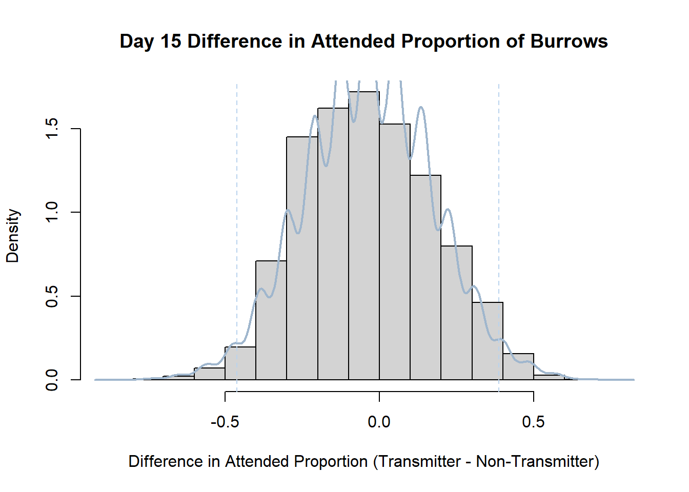
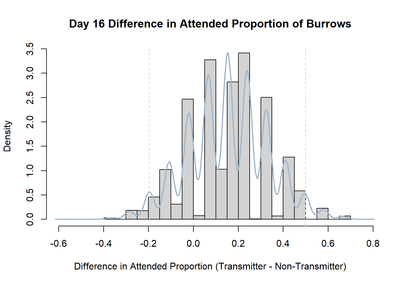
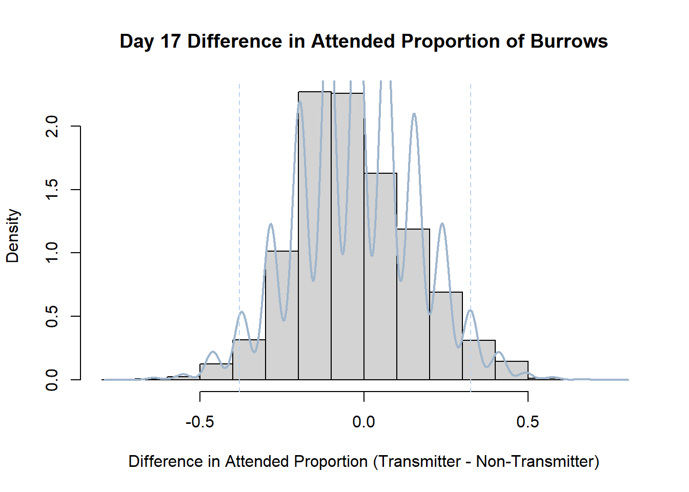
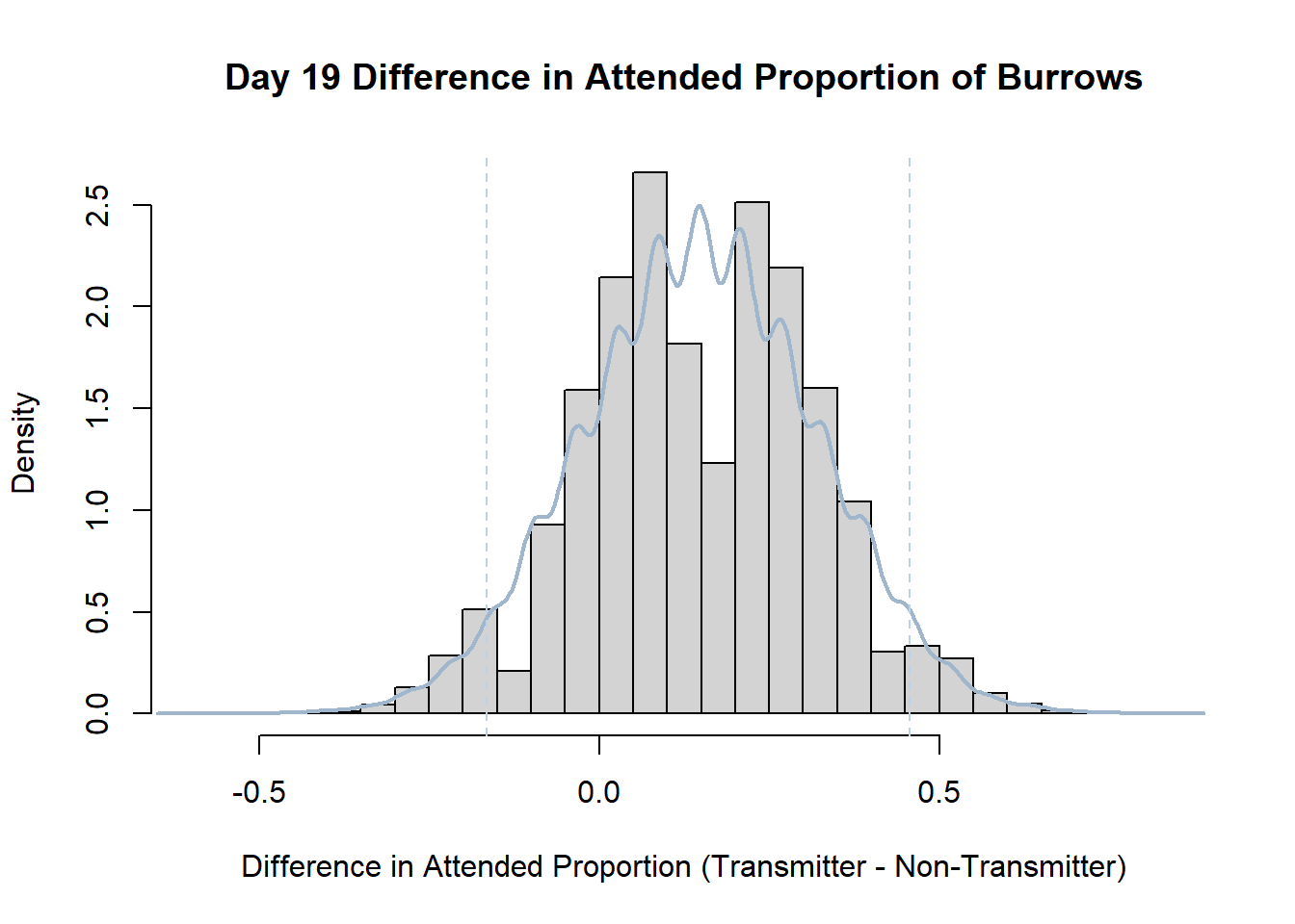
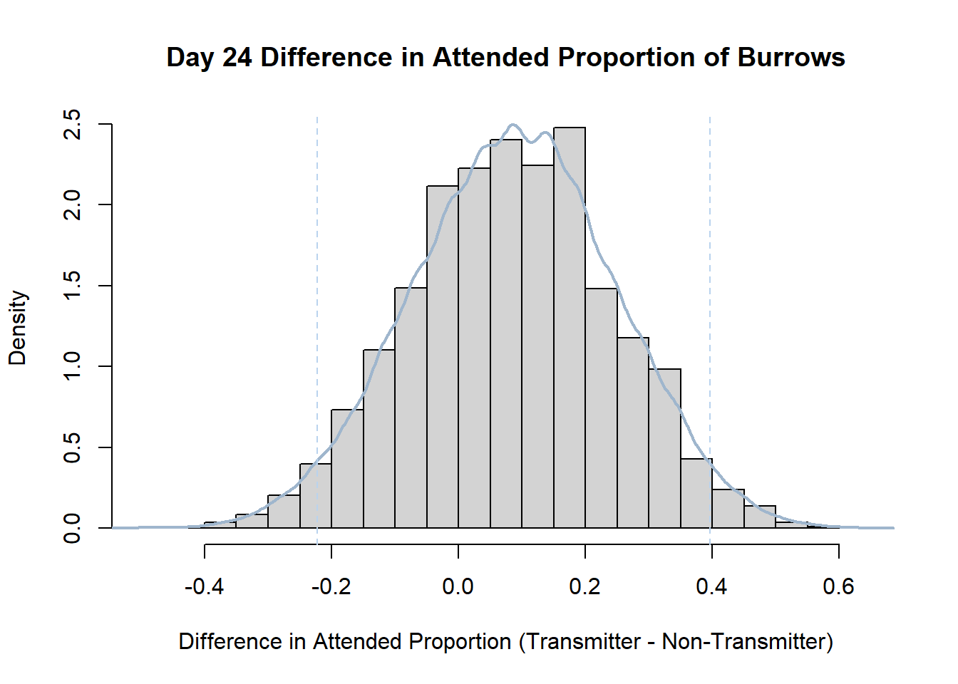
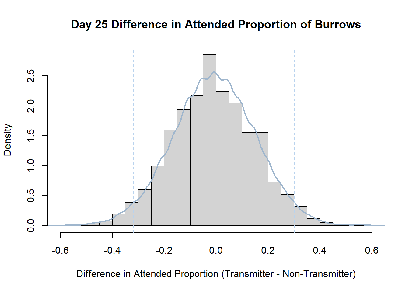
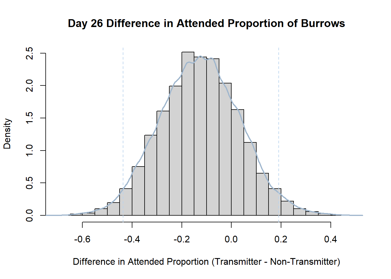
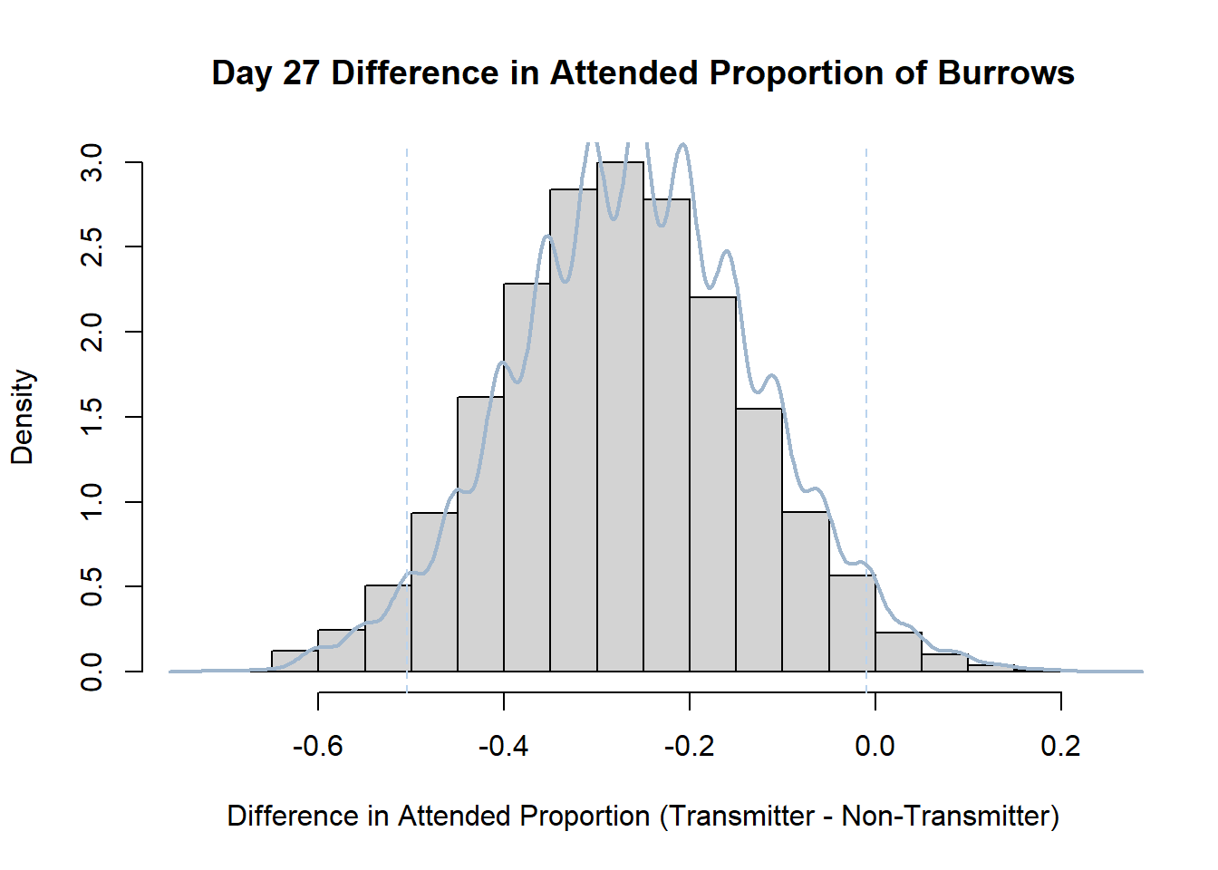
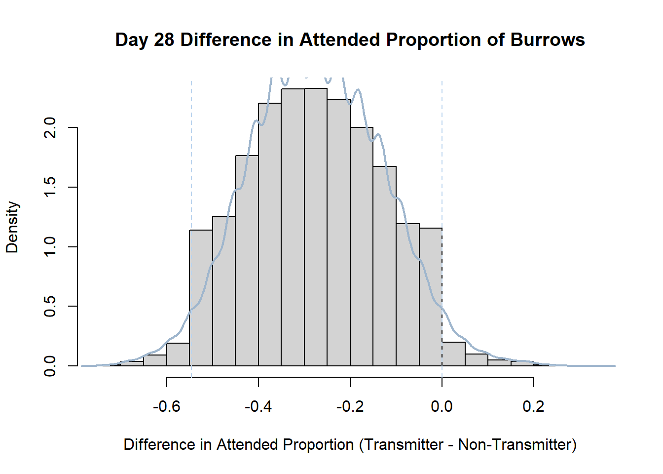
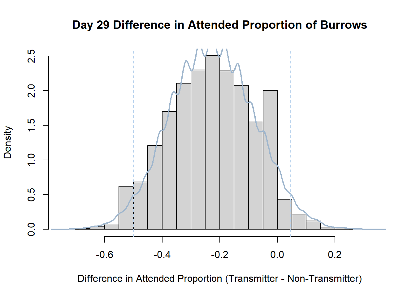
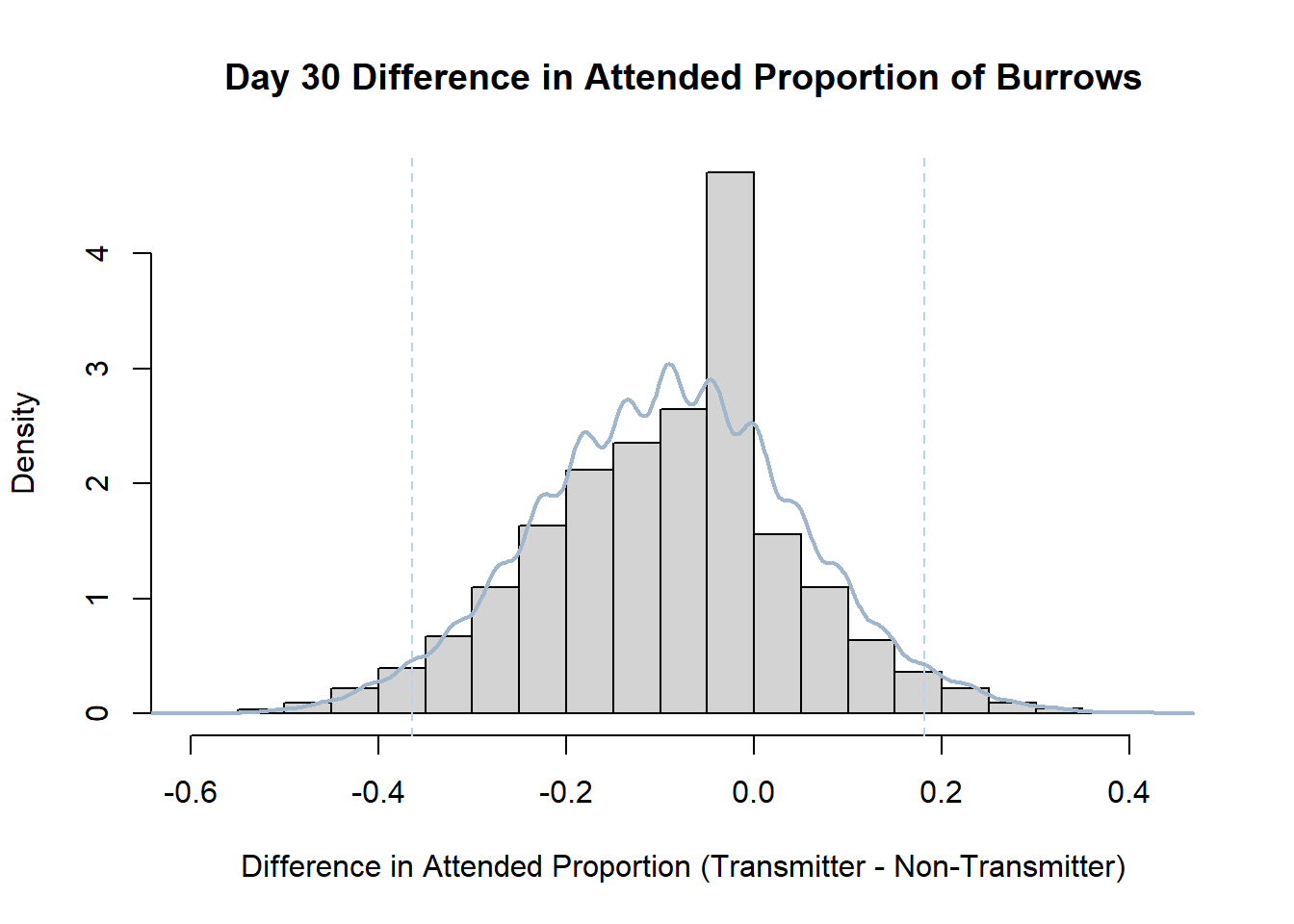
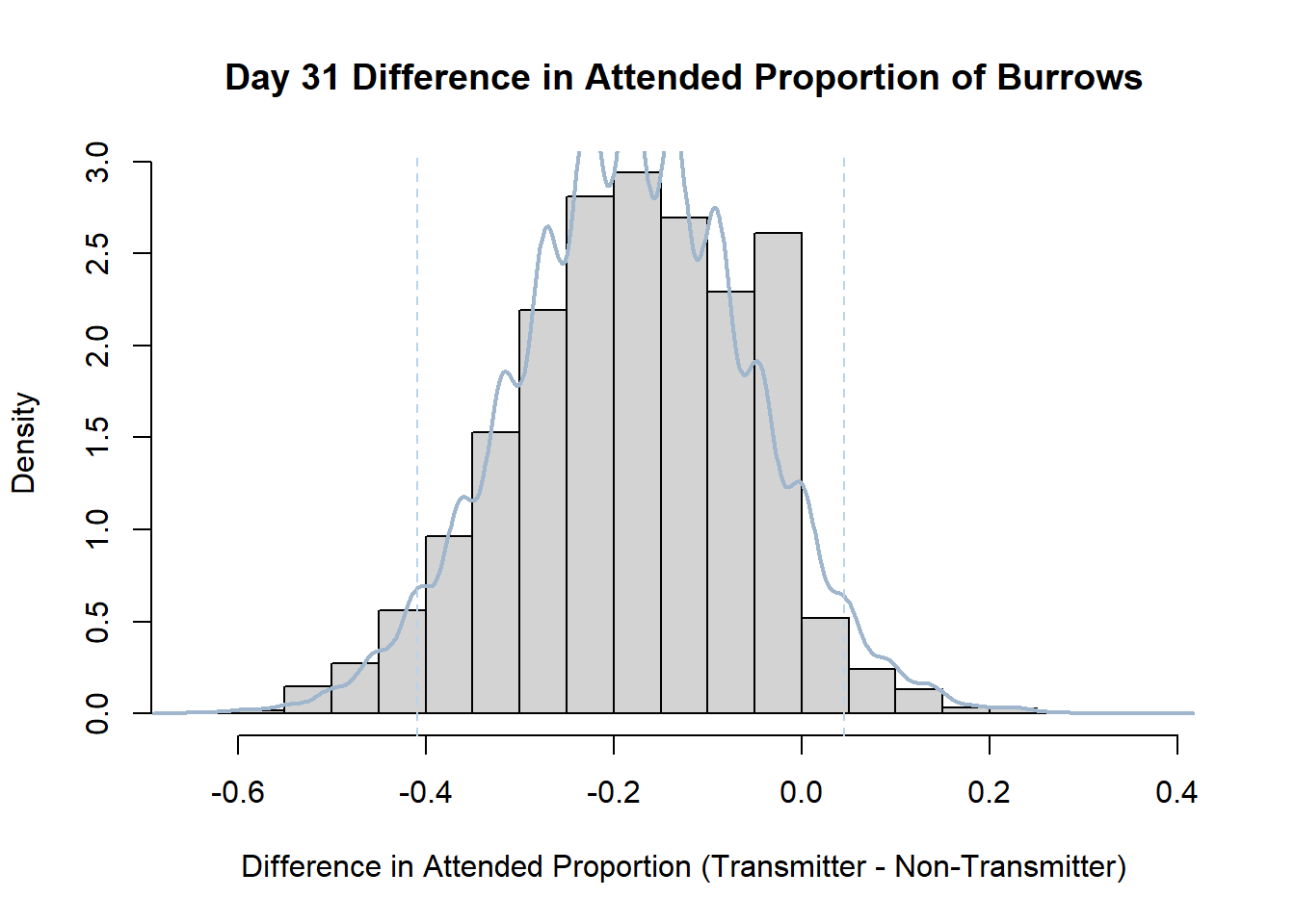
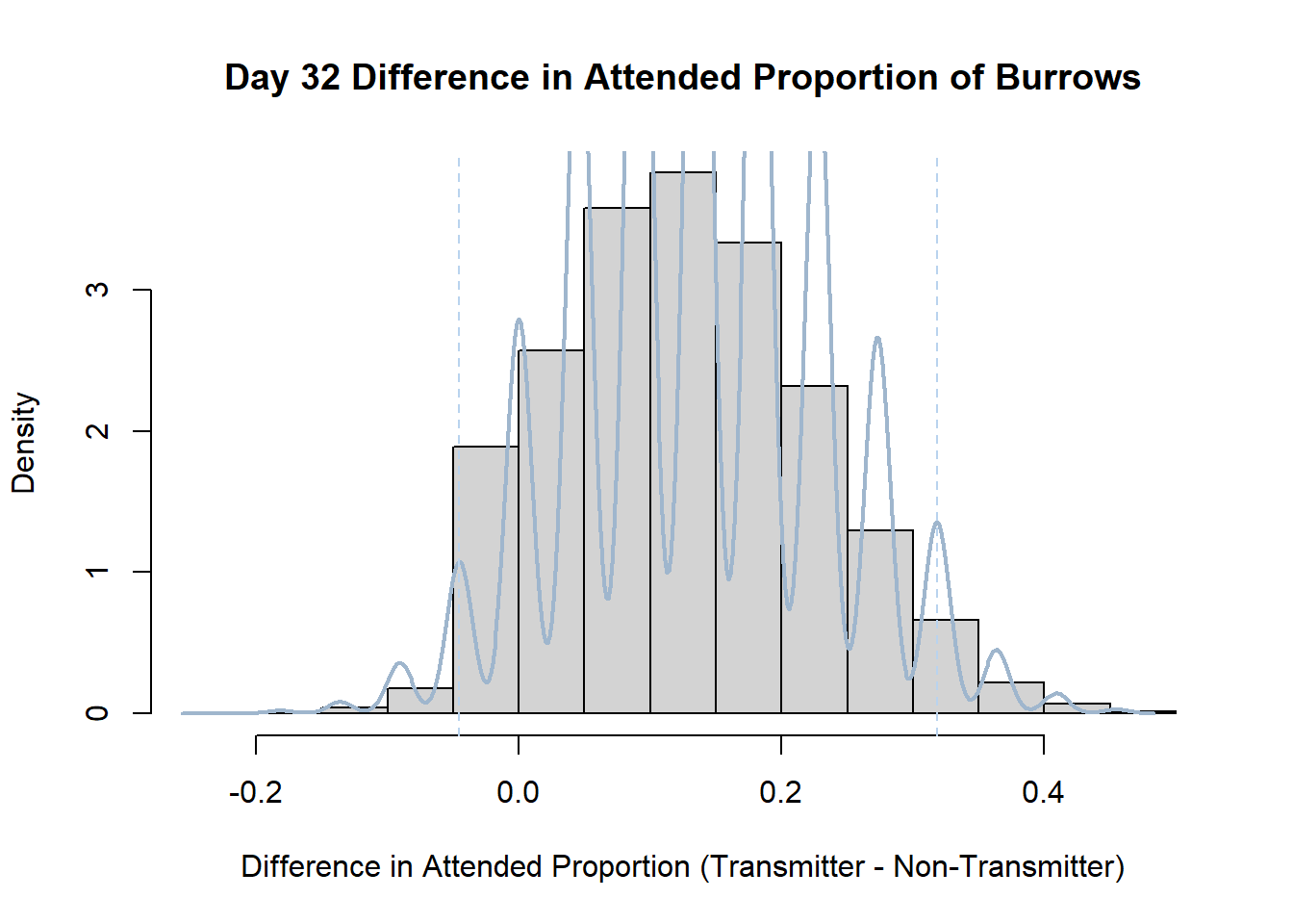
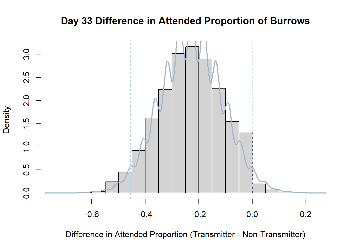
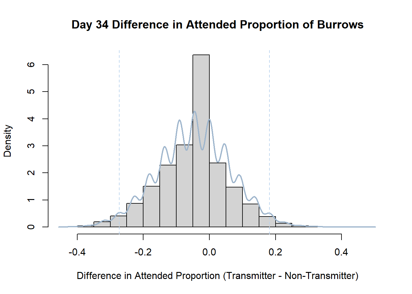
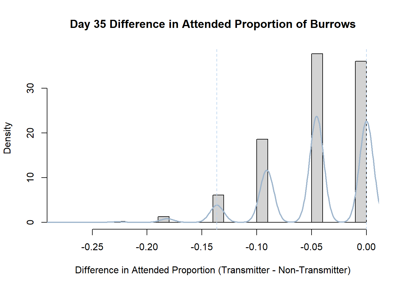
7. Bootstrap Confidence Interval by Day
An alternate method for creating confidence intervals for Prop_Difference is to use the bootstrap technique. In previous lessons we have used a non-parametric bootstrap, which involves directly re-sampling from the data. In this task we will perform a parametric bootstrap.
A parametric bootstrap involves resampling from a fitted model. By doing this several times, we get an estimate of the amount of variation that we might have seen had we performed the experiment multiple times. This gives us an estimate of the distribution of the statistic of interest.
Create a new data frame that contains both the transmitter and notransmitter Attended_Proportion for each Day.
Code
transmitterExpand<-data.frame("Day"=transmitter$Day,"Attended_Trans"=transmitter$Attended_Proportion,"Attended_Notrans"=notransmitter$Attended_Proportion,"Burrows_Trans"=transmitter$Burrows,"Burrows_Notrans"=notransmitter$Burrows)Write a function that draws samples from two binomial distributions (one for the transmitter and one for the notransmitter data) and calculates the difference in proportion of attended burrows.
Code
#function that calculates the difference in proportions for each day drawn from binomial distributions
propdiffFun<-function(data,indices){

  dataInd1<-rbinom(1,data$Burrows_Trans,data$Attended_Trans)

  dataInd2<-rbinom(1,data$Burrows_Notrans,data$Attended_Notrans)

    propdiff<-(dataInd1/data$Burrows_Trans)-(dataInd2/data$Burrows_Notrans)

  return(propdiff)
}
Perform the bootstrap. Note that we must do this separately for each day, so enclose the relevant code in a for loop.
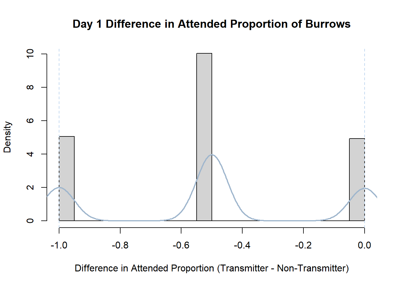
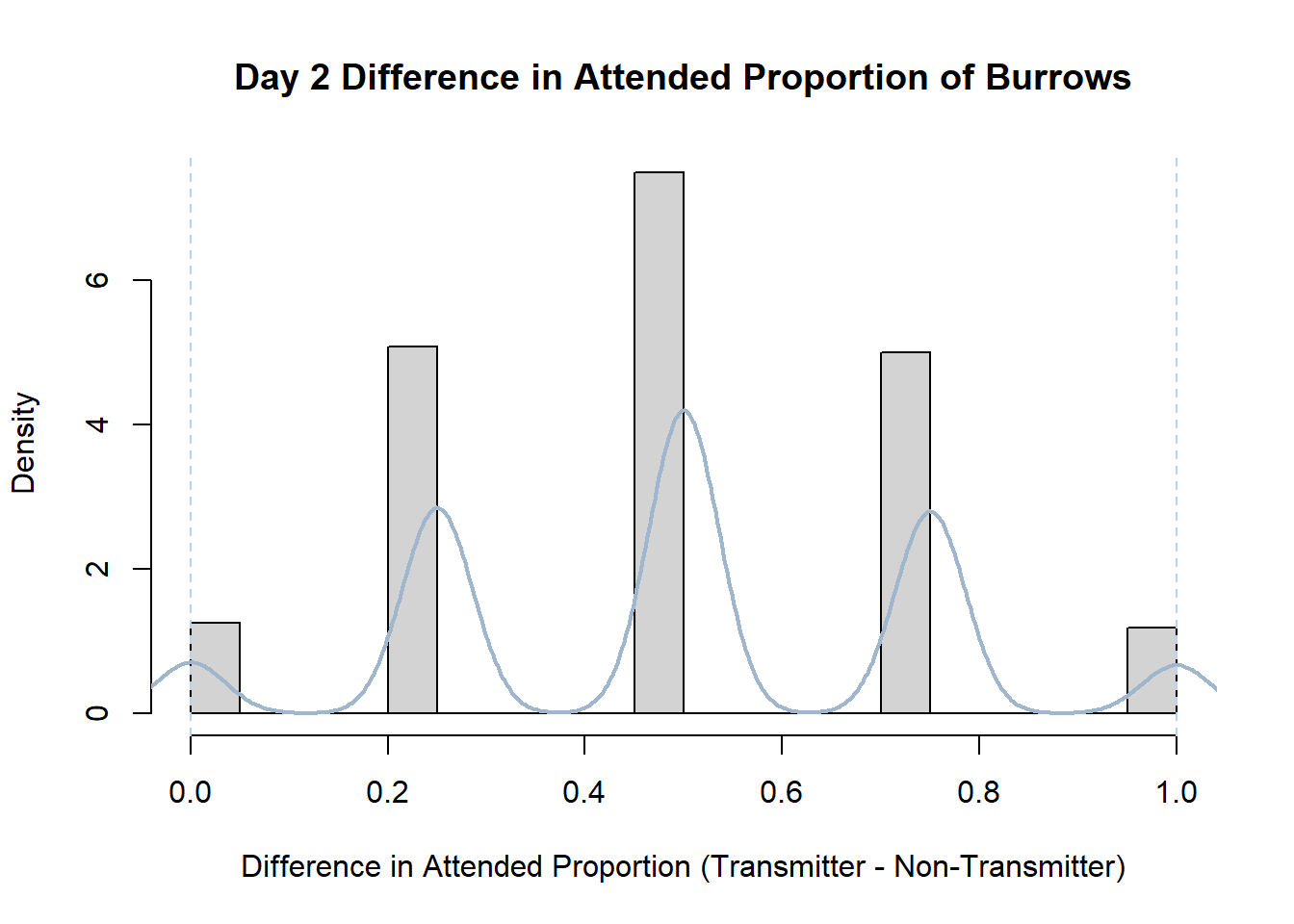
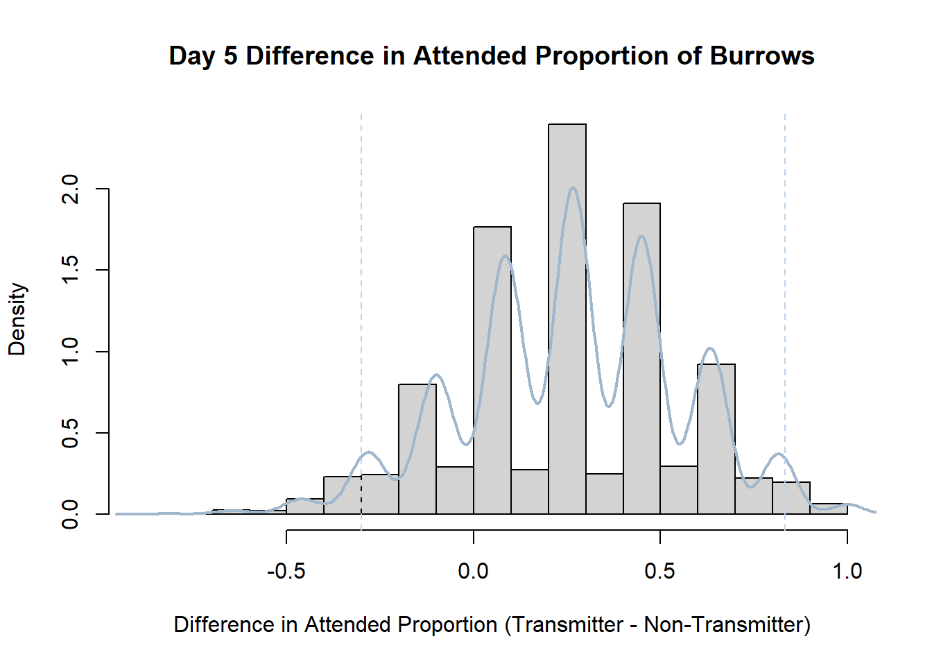
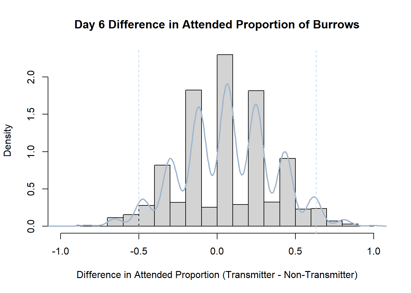
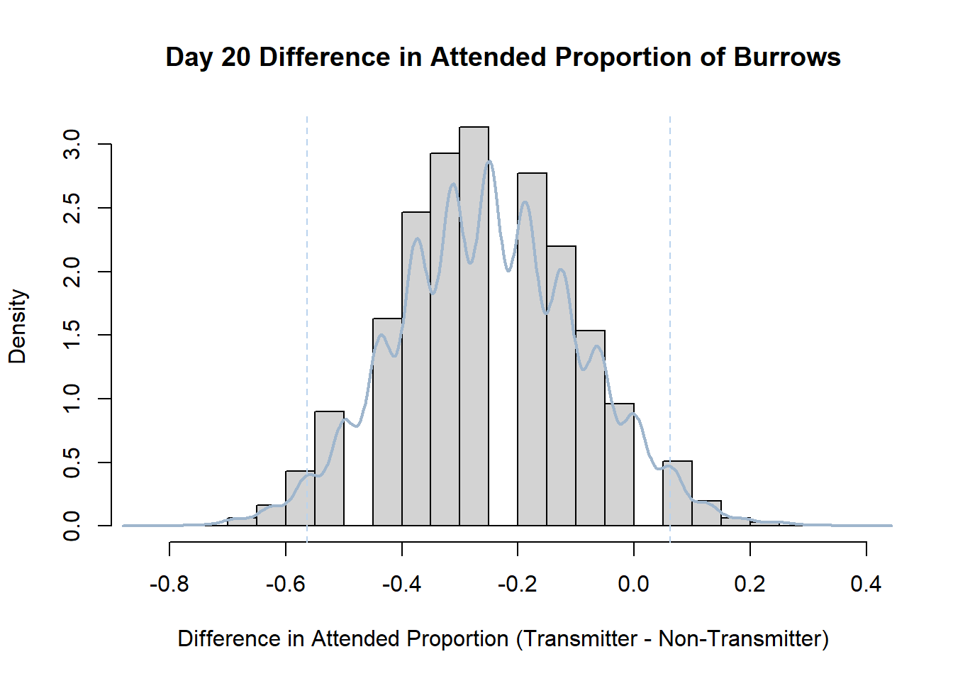
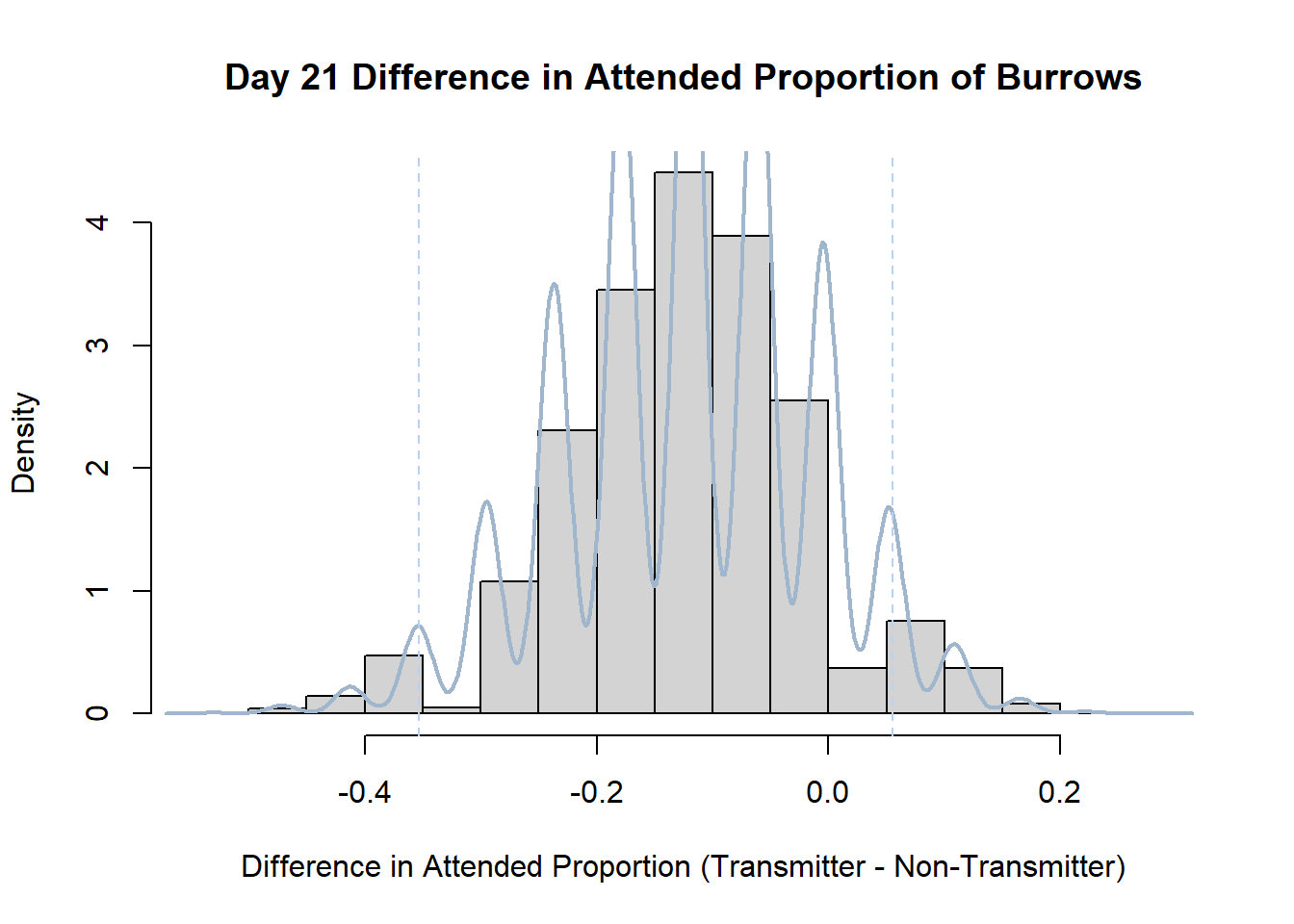
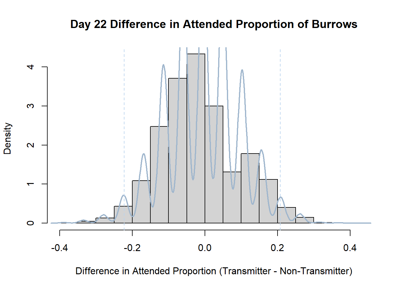
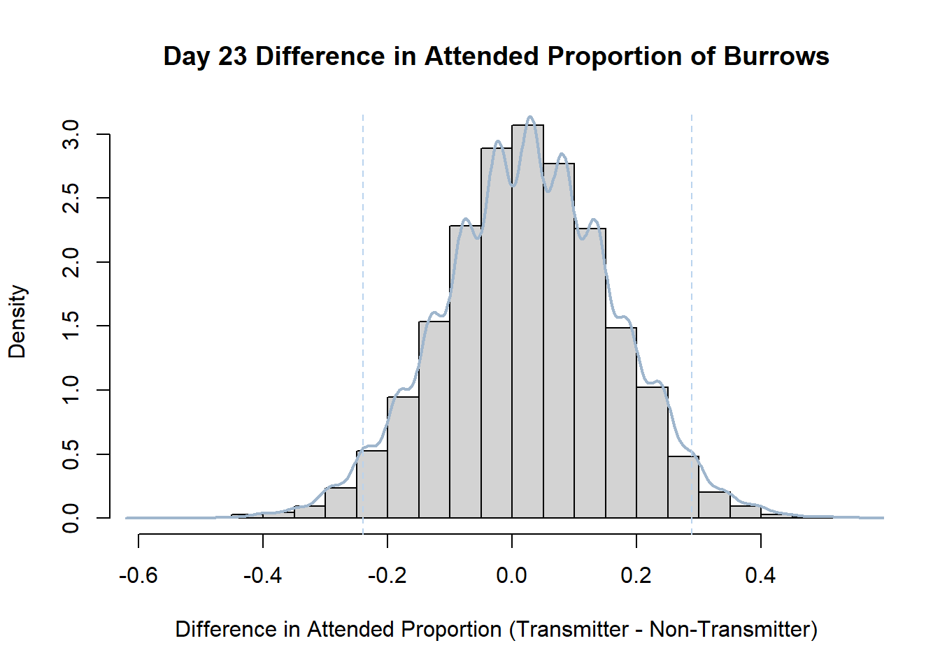
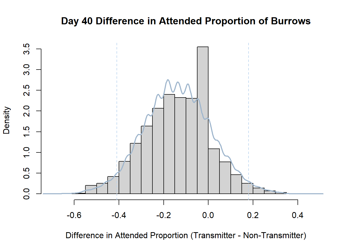
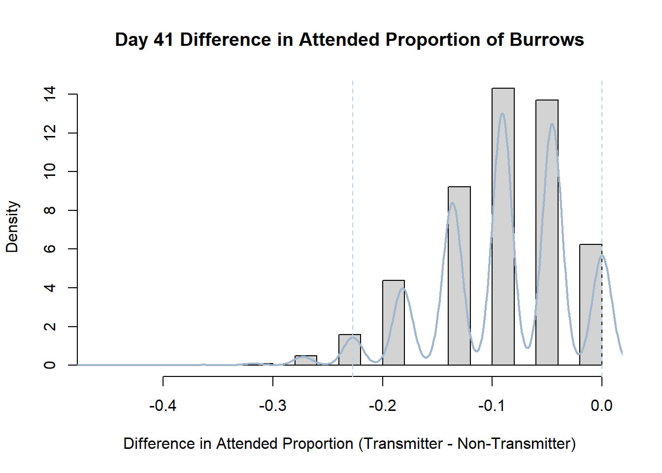
Code
#set seed so you get the same results when running again
set.seed(170)

library(boot)

#loop over each day within the data frame, perform the bootstrap and plotting the results
for(i in 1:nrow(transmitterExpand)){

#bootstrap difference proportion of burrows attended for Day i, note sim="parametric"
 propdiffBoot<-boot(transmitterExpand[i,],sim="parametric",statistic=propdiffFun,R=10000)

#percentile confidence interval
percCi<-boot.ci(propdiffBoot,type="perc")

#extract day for plot title
d<-transmitterExpand[i,]$Day
#plot density histogram of bootstrap results
hist(propdiffBoot$t,breaks=20,freq=F,xlab="Difference in Attended Proportion (Transmitter - Non-Transmitter)", main=paste("Day",d,"Difference in Attended Proportion of Burrows"))

#add a smoothed line to show the distribution
lines(density(propdiffBoot$t,na.rm=T), lwd = 2, col = "slategray3")
#add confidence limits
abline(v=percCi$percent[4:5],col="slategray2",lty=2)
}
Create a new data frame that contains both the transmitter and notransmitter Attended_Proportion for each Day.
Code
transmitterExpand<-data.frame("Day"=transmitter$Day,"Attended_Trans"=transmitter$Attended_Proportion,"Attended_Notrans"=notransmitter$Attended_Proportion,"Burrows_Trans"=transmitter$Burrows,"Burrows_Notrans"=notransmitter$Burrows)Write a function that draws samples from two binomial distributions (one for the transmitter and one for the notransmitter data) and calculates the difference in proportion of attended burrows.
Code
#function that calculates the difference in proportions for each day drawn from binomial distributions
propdiffFun<-function(data,indices){

  dataInd1<-rbinom(1,data$Burrows_Trans,data$Attended_Trans)

  dataInd2<-rbinom(1,data$Burrows_Notrans,data$Attended_Notrans)

    propdiff<-(dataInd1/data$Burrows_Trans)-(dataInd2/data$Burrows_Notrans)

  return(propdiff)
}
Perform the bootstrap. Note that we must do this separately for each day, so enclose the relevant code in a for loop.
Code
#set seed so you get the same results when running again
set.seed(170)

library(boot)
Warning: package 'boot' was built under R version 4.2.2Code
#loop over each day within the data frame, perform the bootstrap and plotting the results
for(i in 1:nrow(transmitterExpand)){

#bootstrap difference proportion of burrows attended for Day i, note sim="parametric"
 propdiffBoot<-boot(transmitterExpand[i,],sim="parametric",statistic=propdiffFun,R=10000)

#percentile confidence interval
percCi<-boot.ci(propdiffBoot,type="perc")

#extract day for plot title
d<-transmitterExpand[i,]$Day
#plot density histogram of bootstrap results
hist(propdiffBoot$t,breaks=20,freq=F,xlab="Difference in Attended Proportion (Transmitter - Non-Transmitter)", main=paste("Day",d,"Difference in Attended Proportion of Burrows"))

#add a smoothed line to show the distribution
lines(density(propdiffBoot$t,na.rm=T), lwd = 2, col = "slategray3")
#add confidence limits
abline(v=percCi$percent[4:5],col="slategray2",lty=2)
}