22 Natural Resource Accounts
We have a survey open right now that we invite you to fill out.
This lesson provides an opportunity to examine time series techniques for yearly data, building on the monthly and quarterly techniques introduced in Economic Analysis Chapter 21. The accompanying video features a skit with Paul and Kent about the Natural Resource accounts department of Statistics New Zealand (now known as Environmental-Economic accounts), motivating the study of economic trends within the context of their environmental impact. There is limited discussion of data analysis, but the associated time series provide a chance to gain confidence working with this kind of data.
Data
There are 2 files associated with this presentation, containing the data you will need to complete the lesson tasks. The first contains time series data for yearly asset values (in dollars and market percentage) of various species of fish between 1996 and 2003. The second contains time series data for yearly stock values of various minerals between 1994 and 2000.
Video
Objectives
Tasks
0. Read and Format data
0a. Read in the data
First check you have installed the package readxl (see Section 2.6) and set the working directory (see Section 2.1), using instructions in Getting started with R.
Load the data into R.
The code has been hidden initially, so you can try to load the data yourself first before checking the solutions.
Code
library(readxl) #loads readxl package
fish<-read_xlsx("Fish Species Asset Values.xlsx") #loads the data file and names it fish
head(fish) #view beginning of data frame
Code
minerals<-read_xlsx("NZ Mineral Values.xlsx") #loads the data file and names it minerals
head(minerals) #view beginning of data frame
Code
library(readxl) #loads readxl packageWarning: package 'readxl' was built under R version 4.2.2Code
fish<-read_xlsx("Fish Species Asset Values.xlsx") #loads the data file and names it fish
head(fish) #view beginning of data frame
# A tibble: 6 × 4
Year Species Dollars Percentage
<dbl> <chr> <dbl> <dbl>
1 1996 Hoki 642. 23.8
2 1996 Rock Lobster 368. 13.7
3 1996 Snapper 289. 10.7
4 1996 Orange Roughy 248. 9.20
5 1996 Paua 143. 5.30
6 1996 Squid 153. 5.66Code
minerals<-read_xlsx("NZ Mineral Values.xlsx") #loads the data file and names it minerals
head(minerals) #view beginning of data frame
# A tibble: 6 × 5
Mineral Year Stock Extraction Other_Changes
<chr> <dbl> <dbl> <dbl> <dbl>
1 Gold 1994 238. 13.0 103.
2 Gold 1995 328. 20.3 69.7
3 Gold 1996 377. 12.1 -63.8
4 Gold 1997 301. 1.43 -191.
5 Gold 1998 109. 0.477 -72.4
6 Gold 1999 36.1 2.82 43.30b. Format the data
The variables Species in the fish time series and Mineral in the minerals time series should be coded as factors. Their values are characters, but actually represent categories of Fish species and Minerals respectively.
Code
fish$Species<-as.factor(fish$Species)Code
minerals$Mineral<-as.factor(minerals$Mineral)Code
fish$Species<-as.factor(fish$Species)Code
minerals$Mineral<-as.factor(minerals$Mineral)1. Time Series Plots (Base R Loop vs. GGplot)
1a. Single Plot (for loop)
Display the fish values time series, by plotting Dollars against Year for each Species.
As there are many different Species to add to the plot, the most straightforward way to do this in Base R is with a for() loop.
Do you find this plot useful for comparing the changing asset values of fish species? Why/why not?
Begin by creating a vector of the different fish species values, and a vector of unique colours to use when plotting these
Code
#retrieve the levels of fish species to use for plotting lines
speciesL<-levels(fish$Species)

#simulate different colours for each species using the rainbow() function
speciesC<-rainbow(length(speciesL))
Create plot using a for loop
Code
#increase right side margin and set xpd=T to allow legend to appear outside the plot
par(mar=c(5.1,5.1,4.1,9.5),xpd=T)

#create empty plot (type="n") that has dimensions of the lines we want to plot and appropriate labels
plot(fish$Year,fish$Dollars,type="n",xlab="Year",
  ylab="Dollars (Million $)",main="Yearly Fish Asset Value",ylim=c(min(fish$Dollars)-50,max(fish$Dollars)+50))

#loop through levels of species
for(i in 1:length(speciesL)){
  #add lines() subsetting[] Year and Dollars for each Species.lwd=2 increases the thickness of the line so it is more visible, col takes different values for each Species
lines(fish$Year[fish$Species==speciesL[i]],fish$Dollars[fish$Species==speciesL[i]],lwd=2,col=speciesC[i])
}


#legend, position outside plot to avoid obscuring graph
legend(x=c(2003.5,2004.5),y=c(0,1000),legend=speciesL,col=speciesC,lwd=2)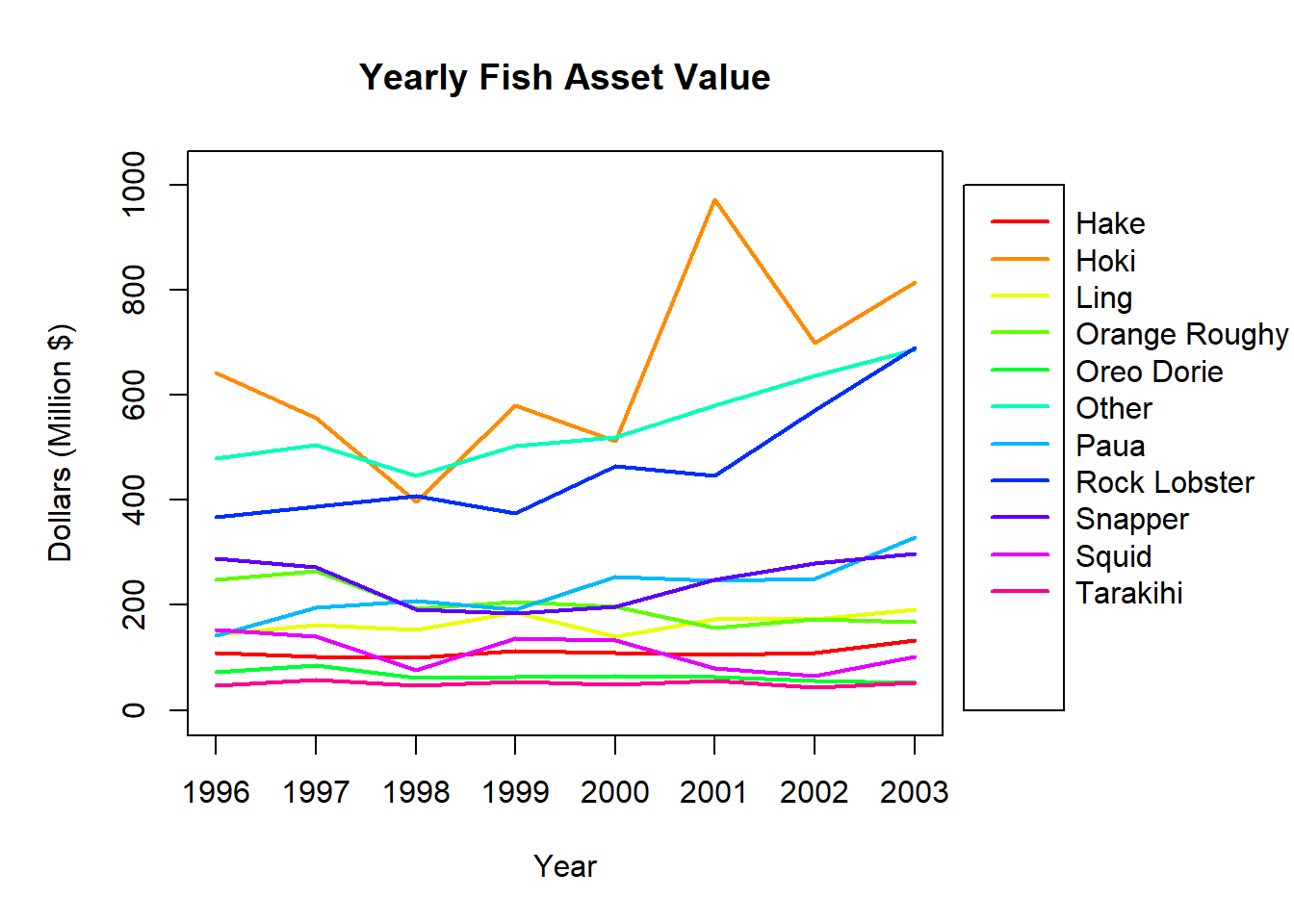
1b. Multiple Plots (for loop)
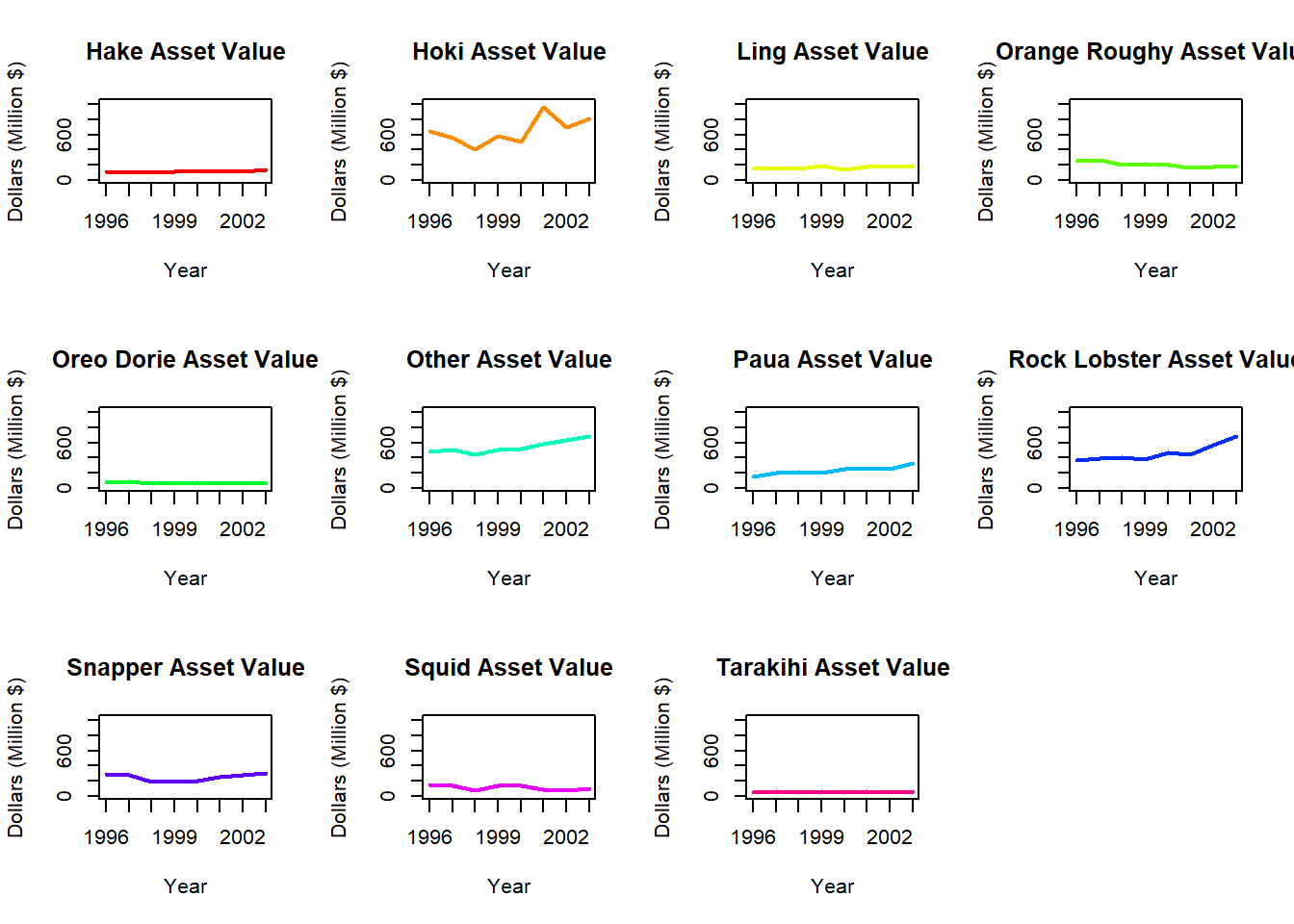
In order to better compare the asset values of different fish species across time, we can create an array of individual time series plots.
Compare this array of plots to the single plot in Task 1a. What are the benefits and drawbacks of each plot type?
Begin in the same way as for a single plot - by creating a vector of the different fish species values, and a vector of unique colours to use when plotting these
Code
#retrieve the levels of fish species to use for plotting lines
speciesL<-levels(fish$Species)

#simulate different colours for each species using the rainbow() function
speciesC<-rainbow(length(speciesL))
An array is achieved using the mfrow argument in the par() function introduced in the previous task. Some slight modifications to the code within the for loop will results in separate plots being created for each Species.
Code
#set up arrangement of 3 rows, 4 columns to fill with the 11 plots
par(mfrow=c(3,4))

#loop through levels of species
for(i in 1:length(speciesL)){
    #add plots() subsetting[] Year and Dollars for each Species. Remember appropriate labels. col takes different values for each Species
  plot(fish$Year[fish$Species==speciesL[i]],fish$Dollars[fish$Species==speciesL[i]],type="l",xlab="Year",
  ylab="Dollars (Million $)",main=paste(speciesL[i],"Asset Value",sep=" "),col=speciesC[i],lwd=2,ylim=c(min(fish$Dollars)-50,max(fish$Dollars)+50))
}
Code
#retrieve the levels of fish species to use for plotting lines
speciesL<-levels(fish$Species)

#simulate different colours for each species using the rainbow() function
speciesC<-rainbow(length(speciesL))
Code
#set up arrangement of 3 rows, 4 columns to fill with the 11 plots
par(mfrow=c(3,4))

#loop through levels of species
for(i in 1:length(speciesL)){
    #add plots() subsetting[] Year and Dollars for each Species. Remember appropriate labels. col takes different values for each Species
  plot(fish$Year[fish$Species==speciesL[i]],fish$Dollars[fish$Species==speciesL[i]],type="l",xlab="Year",
  ylab="Dollars (Million $)",main=paste(speciesL[i],"Asset Value",sep=" "),col=speciesC[i],lwd=2,ylim=c(min(fish$Dollars)-50,max(fish$Dollars)+50))
}
A single plot can be useful for examining the changes across time for multiple groups as it allows direct comparison without having to consolidate information from multiple plots. Potential drawbacks are overlapping lines that may be difficult to distinguish and a large scale making it harder to see changes within individual groups.
Multiple plots allow us to clearly see the variations within each group across time. Rather than matching the colour of lines to the legend (which can be difficult when there are many groups) we can directly see the relevant fish species. It is more challenging to compare between groups when they are plotted separately, and the plots are shrunken to fit into a single array.
1c. Single, Multiple Plots (GGplot)
It is possible to construct plots similar to those in Tasks 1a. and 1b. but with much less code. However, this involves installing a new package and thinking about plotting in a different way.
The ggplot2 package was designed for easily creating attractive plots. The information to be included on the plot is specified by layers of functions, which are joined by + signs. These functions correspond to certain components of the plot. We need to consider 3 components: data, aesthetics, and geometric objects, to replicate our time series plots.
The data component is the data we wish to include in the plot. The aesthetics component maps this data to the graphical objects, for example specifying the predictor (x), response (y), and additional grouping variables. These first 2 components are both included in the function ggplot(data= ,aes=). As we wish to separate Year and Dollars by fish Species, we include the argument col=Species within the aesthetics component.
The geometric object component indicates the actual plot to be created. Each type of plot or graphical object has its own function, beginning with geom_. We will use the geometric object lines, geom_line(), to draw the asset value lines. As we have already specified col=Species within the global ggplot() function, this will automatically be applied to the geom_line() function.
Ggplot automatically adds a legend, so we are saved the trouble of making one.
Code
library(ggplot2)

#ggplot of yearly fish value in dollars by species
ggplot(data=fish,aes(x=Year,y=Dollars,col=Species))+geom_line()
With some slight alternations to the code for a single plot we can instead create an array of plots by fish species. The function facet_wrap() facets the plots according to levels of the variable provided to it (in our case, Species). Adding col=Species to the aes() function helps make the lines stand out, as by default they are plotted in black.
Code
#yearly fish value in dollars, plotted individually by species
ggplot(data=fish,aes(x=Year,y=Dollars,col=Species))+geom_line()+facet_wrap(vars(Species))
The data component is the data we wish to include in the plot. The aesthetics component maps this data to the graphical objects, for example specifying the predictor (x), response (y), and additional grouping variables. These first 2 components are both included in the function ggplot(data= ,aes=). As we wish to separate Year and Dollars by fish Species, we include the argument col=Species within the aesthetics component.
The geometric object component indicates the actual plot to be created. Each type of plot or graphical object has its own function, beginning with geom_. We will use the geometric object lines, geom_line(), to draw the asset value lines. As we have already specified col=Species within the global ggplot() function, this will automatically be applied to the geom_line() function.
Ggplot automatically adds a legend, so we are saved the trouble of making one.
Code
library(ggplot2)

#ggplot of yearly fish value in dollars by species
ggplot(data=fish,aes(x=Year,y=Dollars,col=Species))+geom_line()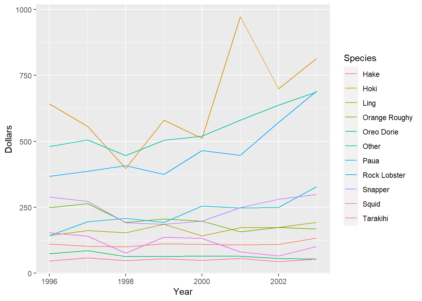
With some slight alternations to the code for a single plot we can instead create an array of plots by fish species. The function facet_wrap() facets the plots according to levels of the variable provided to it (in our case, Species). Adding col=Species to the aes() function helps make the lines stand out, as by default they are plotted in black.
Code
#yearly fish value in dollars, plotted individually by species
ggplot(data=fish,aes(x=Year,y=Dollars,col=Species))+geom_line()+facet_wrap(vars(Species))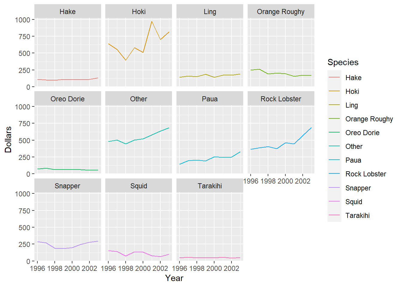
2. Change between Years
Suppose we are interested in the change in Hoki and Other fish asset values between the years 2000 and 2001.
2a. Indicate on Graph
Recreate the Hoki and Other species time series plots. Modify the code to add vertical lines (using the function abline()) to indicate the years we are interesting in comparing.
Code
#Hoki and Other have positions 2 and 6 in the speciesL vector
speciesL
Code
#2 plots next to each other
par(mfrow=c(1,2))

#only need to loop through Hoki and Other species
for(i in c(2,6)){
  plot(fish$Year[fish$Species==speciesL[i]],fish$Dollars[fish$Species==speciesL[i]],type="l",xlab="Year",
  ylab="Dollars (Million $)",main=paste(speciesL[i],"Asset Value",sep=" "),col=speciesC[i],lwd=2,ylim=c(min(fish$Dollars)-50,max(fish$Dollars)+50))


  #add lines, v=c() gives vector of vertical lines, lty=3 makes line dashed
abline(v=c(2000,2001),lty=3)
}
Code
#Hoki and Other have positions 2 and 6 in the speciesL vector
speciesL
[1] "Hake" "Hoki" "Ling" "Orange Roughy"
[5] "Oreo Dorie" "Other" "Paua" "Rock Lobster"
[9] "Snapper" "Squid" "Tarakihi" Code
#2 plots next to each other
par(mfrow=c(1,2))

#only need to loop through Hoki and Other species
for(i in c(2,6)){
  plot(fish$Year[fish$Species==speciesL[i]],fish$Dollars[fish$Species==speciesL[i]],type="l",xlab="Year",
  ylab="Dollars (Million $)",main=paste(speciesL[i],"Asset Value",sep=" "),col=speciesC[i],lwd=2,ylim=c(min(fish$Dollars)-50,max(fish$Dollars)+50))


  #add lines, v=c() gives vector of vertical lines, lty=3 makes line dashed
abline(v=c(2000,2001),lty=3)
}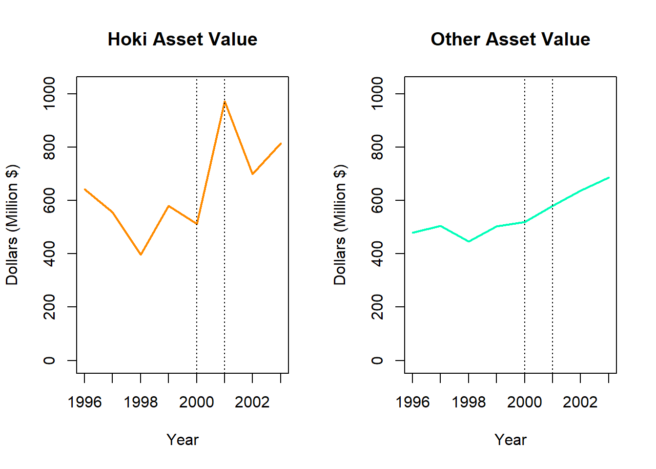
There appears to be a large positive change in the value of Hoki, and a slight positive increase in the value of Other fish.
2b.Subsetting
To carry out a numerical comparison between Hoki and Other fish assets in 2000 and 2001 we need to extract the the relevant values from the data frame. Try this using subsetting techniques.
Try this using the subsetting techniques you have learnt in other lessons, a solution is available by un-hiding the code chunk.
Code
#subset relevant rows of fish data frame. & indicates AND. | indicates OR
fish[(fish$Species=="Hoki"|fish$Species=="Other")&(fish$Year==2000|fish$Year==2001),]
Code
#subset relevant rows of fish data frame. & indicates AND. | indicates OR
fish[(fish$Species=="Hoki"|fish$Species=="Other")&(fish$Year==2000|fish$Year==2001),]
# A tibble: 4 × 4
Year Species Dollars Percentage
<dbl> <fct> <dbl> <dbl>
1 2000 Hoki 512. 19.4
2 2000 Other 520. 19.7
3 2001 Hoki 973. 31.1
4 2001 Other 580. 18.52c. Numerical Comparison
Calculate the percentage change in Dollars between 2000 and 2001 for Hoki. Compare this to the percentage change for Other fish.
This calculation can be performed by hand or in R.
Code
#Hoki asset value change
((972.75-511.75)/511.75)*100

#Other fish asset value change
((580.0452-519.6501)/519.6501)*100
Code
#Hoki asset value change
((972.75-511.75)/511.75)*100
[1] 90.08305Code
#Other fish asset value change
((580.0452-519.6501)/519.6501)*100
[1] 11.62226Hoki value increased by 90.1% from 2000 to 2001, while Other fish value increased by 11.6%. However, Hoki values appear to fluctuate quite dramatically and this increase is not indicative of exponential growth. Other fish have been steadily increasing in value since 2000.
3. Extension: Interpretation
Use the results of the plots and calculations you have carried out above to write a paragraph about the changes in fish asset values for different species between 1996 and 2003.
You should compare the overall trends of each species as well as addressing any large deviations from these, for example the jump in Hoki asset values in 2001. You can do some research to find out the underlying causes. Identifying the reasons for departures from the trend is important for understanding the driving factors behind time series data and predicting future values (although this requires additional advanced techniques not examined here).
4. Practice: Time Series Plots, Change between Years, Intrepretation
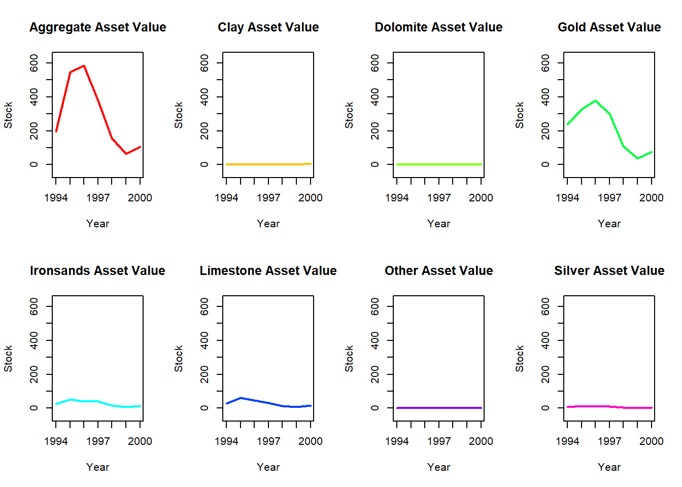
Carry out a time series analysis for the NZ Mineral values data.
4a. Plot Raw Data
Using either base R or ggplot, display the Mineral values time series by plotting Stock against Year for each Mineral. Construct both a single plot with the data series data for all minerals, and an array of individual plots for each mineral.
How does the mineral values time series compare to the fish values time series?
Using Base R for single plot:
Begin by creating a vector of the different fish species values, and a vector of unique colours to use when plotting these
Code
#retrieve the levels of mineral to use for plotting lines
mineralL<-levels(as.factor(minerals$Mineral))

#simulate different colours for each mineral using the rainbow() function
mineralC<-rainbow(length(mineralL))
Create plot using a for loop
Code
#increase right side margin and set xpd=T to allow legend to appear outside the plot
par(mar=c(5.1,5.1,4.1,9.5),xpd=T)

#create empty plot (type="n") that has dimensions of the lines we want to plot and appropriate labels
plot(minerals$Year,minerals$Stock,type="n",xlab="Year",
  ylab="Stock",main="Yearly Mineral Stock",ylim=c(min(minerals$Stock)-50,max(minerals$Stock)+50))

#loop through levels of mineral
for(i in 1:length(mineralL)){
  #add lines() subsetting[] Year and Stock for each mineral.lwd=2 increases the thickness of the line so it is more visible, col takes different values for each mineral
lines(minerals$Year[minerals$Mineral==mineralL[i]],minerals$Stock[minerals$Mineral==mineralL[i]],lwd=2,col=mineralC[i])
}


#legend, position outside plot to avoid obscuring graph
legend(x=c(2003.5,2004.5),y=c(0,1000),legend=mineralL,col=mineralC,lwd=2)
Using Base R for Multiple Plots:
Begin by creating a vector of the different fish species values, and a vector of unique colours to use when plotting these
Code
#retrieve the levels of minerals to use for plotting lines
mineralL<-levels(as.factor(minerals$Mineral))

#simulate different colours for each mineral using the rainbow() function
mineralC<-rainbow(length(mineralL))
An array is achieved using the mfrow argument in the par() function introduced in the previous task. Some slight modifications to the code within the for loop will results in separate plots being created for each Mineral.
Code
#set up arrangement of 3 rows, 4 columns to fill with the 11 plots
par(mfrow=c(2,4))

#loop through levels of mineral
for(i in 1:length(mineralL)){
    #add plots() subsetting[] Year and Dollars for each mineral. Remember appropriate labels. col takes different values for each mineral
  plot(minerals$Year[minerals$Mineral==mineralL[i]],minerals$Stock[minerals$Mineral==mineralL[i]],type="l",xlab="Year",
  ylab="Stock",main=paste(mineralL[i],"Asset Value",sep=" "),col=mineralC[i],lwd=2,ylim=c(min(minerals$Stock)-50,max(minerals$Stock)+50))
}
Using GGplot for Single Plot:
Code
library(ggplot2)

#ggplot of yearly stock value by mineral type
ggplot(data=minerals,aes(x=Year,y=Stock,col=Mineral))+geom_line()
Using GGplot for Multiple Plots:
Code
#yearly stock value plotted individually by mineral
ggplot(data=minerals,aes(x=Year,y=Stock,col=Mineral))+geom_line()+facet_wrap(vars(Mineral))
Using Base R for single plot:
Begin by creating a vector of the different fish species values, and a vector of unique colours to use when plotting these
Code
#retrieve the levels of mineral to use for plotting lines
mineralL<-levels(as.factor(minerals$Mineral))

#simulate different colours for each mineral using the rainbow() function
mineralC<-rainbow(length(mineralL))
Create plot using a for loop
Code
#increase right side margin and set xpd=T to allow legend to appear outside the plot
par(mar=c(5.1,5.1,4.1,9.5),xpd=T)

#create empty plot (type="n") that has dimensions of the lines we want to plot and appropriate labels
plot(minerals$Year,minerals$Stock,type="n",xlab="Year",
  ylab="Stock",main="Yearly Mineral Stock",ylim=c(min(minerals$Stock)-50,max(minerals$Stock)+50))

#loop through levels of mineral
for(i in 1:length(mineralL)){
  #add lines() subsetting[] Year and Stock for each mineral.lwd=2 increases the thickness of the line so it is more visible, col takes different values for each mineral
lines(minerals$Year[minerals$Mineral==mineralL[i]],minerals$Stock[minerals$Mineral==mineralL[i]],lwd=2,col=mineralC[i])
}


#legend, position outside plot to avoid obscuring graph
legend(x=c(2003.5,2004.5),y=c(0,1000),legend=mineralL,col=mineralC,lwd=2)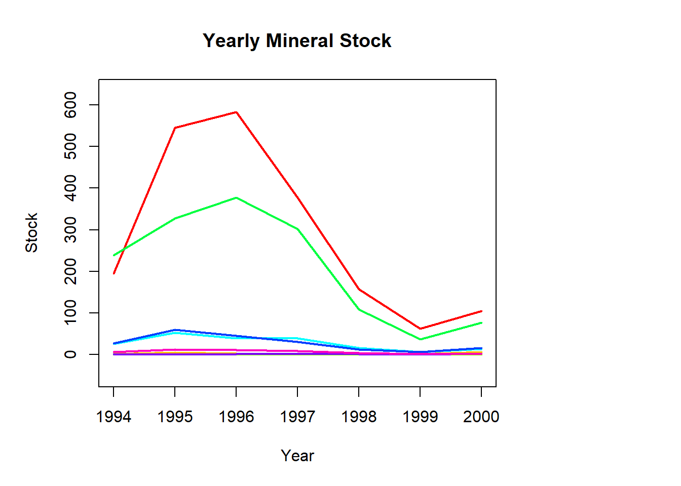
Using Base R for Multiple Plots:
Begin by creating a vector of the different fish species values, and a vector of unique colours to use when plotting these
Code
#retrieve the levels of minerals to use for plotting lines
mineralL<-levels(as.factor(minerals$Mineral))

#simulate different colours for each mineral using the rainbow() function
mineralC<-rainbow(length(mineralL))
An array is achieved using the mfrow argument in the par() function introduced in the previous task. Some slight modifications to the code within the for loop will results in separate plots being created for each Mineral.
Code
#set up arrangement of 3 rows, 4 columns to fill with the 11 plots
par(mfrow=c(2,4))

#loop through levels of mineral
for(i in 1:length(mineralL)){
    #add plots() subsetting[] Year and Dollars for each mineral. Remember appropriate labels. col takes different values for each mineral
  plot(minerals$Year[minerals$Mineral==mineralL[i]],minerals$Stock[minerals$Mineral==mineralL[i]],type="l",xlab="Year",
  ylab="Stock",main=paste(mineralL[i],"Asset Value",sep=" "),col=mineralC[i],lwd=2,ylim=c(min(minerals$Stock)-50,max(minerals$Stock)+50))
}
Using GGplot for Single Plot:
Code
library(ggplot2)

#ggplot of yearly stock value by mineral type
ggplot(data=minerals,aes(x=Year,y=Stock,col=Mineral))+geom_line()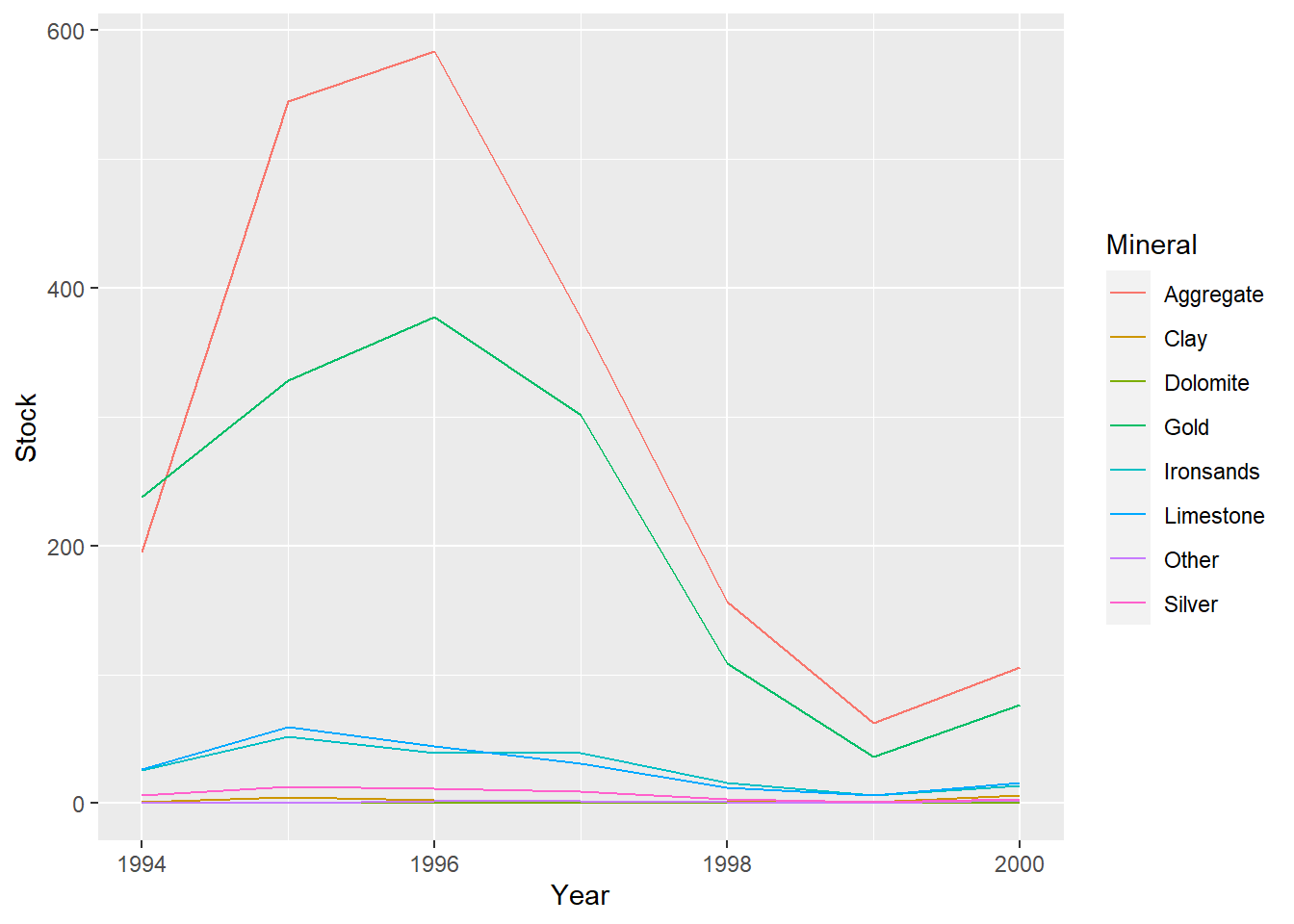
Using GGplot for Multiple Plots:
Code
#yearly stock value plotted individually by mineral
ggplot(data=minerals,aes(x=Year,y=Stock,col=Mineral))+geom_line()+facet_wrap(vars(Mineral))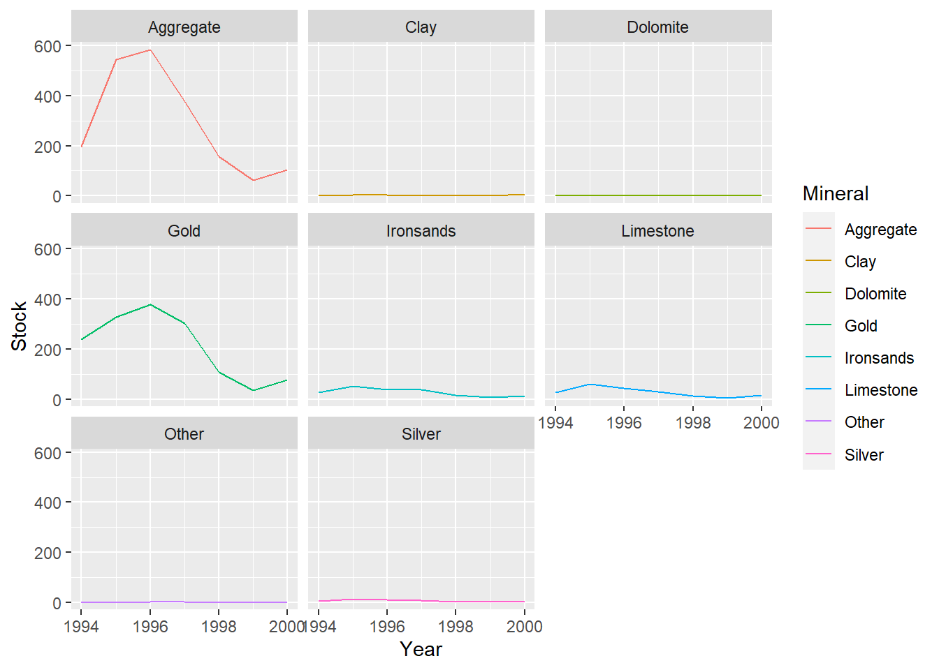
Both time series have several minerals/species that have notably higher values and also see the most fluctuation in value (Hoki, Rock lobster, Other fish and Gold, Aggregate).
The remaining minerals/species have consistent lower values with little variation throughout the time series.
There is a larger gap between these groups at the start of the mineral data compared to the fish data, but it tends to decrease in the mineral series and increase in the fish series over time.
4b. Examine Change Between Years
Investigate the change in Aggregate and Gold stock values between the years 1996 and 1997.
First visually indicate the times of interest on modified time series plots using the function abline().
Code
#2 plots next to each other
par(mfrow=c(1,2))

#repeat plot for Aggregate
plot(minerals$Year[minerals$Mineral=="Aggregate"],minerals$Stock[minerals$Mineral=="Aggregate"],type="l",xlab="Year",ylab="Stock",main="Aggregate Value",col="gold",lwd=2,ylim=c(min(minerals$Stock)-50,max(minerals$Stock)+50))


#add lines, v=c() gives vector of vertical lines, lty=3 makes line dashed
abline(v=c(1996,1997),lty=3)

#repeat plot for Gold
plot(minerals$Year[minerals$Mineral=="Gold"],minerals$Stock[minerals$Mineral=="Gold"],type="l",xlab="Year",ylab="Stock",main="Gold Value",col="gold",lwd=2,ylim=c(min(minerals$Stock)-50,max(minerals$Stock)+50))


#add lines, v=c() gives vector of vertical lines, lty=3 makes line dashed
abline(v=c(1996,1997),lty=3)
To carry out a numerical comparison between Aggregate and Gold values in 1996 and 1997 we need to extract the the relevant values from the data frame. .
Code
#subset relevant rows of minerals data frame. & indicates AND. | indicates OR
minerals[(minerals$Mineral=="Aggregate"|minerals$Mineral=="Gold")&(minerals$Year==1996|minerals$Year==1997),]
Calculate the percentage change in Stock between 1996 and 1997 for Aggregate and compare this to the percentage change for Gold.
Code
#gold change
((301.4971-377.4104)/377.4104)*100

#aggregate change
((377.0194-583.5026 )/583.5026)*100
Visually indicate the times of interest on modified time series plots using the function abline().
Code
#2 plots next to each other
par(mfrow=c(1,2))

#repeat plot for Aggregate
plot(minerals$Year[minerals$Mineral=="Aggregate"],minerals$Stock[minerals$Mineral=="Aggregate"],type="l",xlab="Year",ylab="Stock",main="Aggregate Value",col="gold",lwd=2,ylim=c(min(minerals$Stock)-50,max(minerals$Stock)+50))


#add lines, v=c() gives vector of vertical lines, lty=3 makes line dashed
abline(v=c(1996,1997),lty=3)

#repeat plot for Gold
plot(minerals$Year[minerals$Mineral=="Gold"],minerals$Stock[minerals$Mineral=="Gold"],type="l",xlab="Year",ylab="Stock",main="Gold Value",col="gold",lwd=2,ylim=c(min(minerals$Stock)-50,max(minerals$Stock)+50))


#add lines, v=c() gives vector of vertical lines, lty=3 makes line dashed
abline(v=c(1996,1997),lty=3)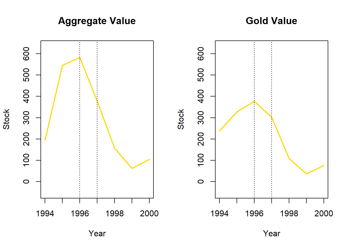
Extract the relevant values from the data frame. .
Code
#subset relevant rows of minerals data frame. & indicates AND. | indicates OR
minerals[(minerals$Mineral=="Aggregate"|minerals$Mineral=="Gold")&(minerals$Year==1996|minerals$Year==1997),]
# A tibble: 4 × 5
Mineral Year Stock Extraction Other_Changes
<fct> <dbl> <dbl> <dbl> <dbl>
1 Gold 1996 377. 12.1 -63.8
2 Gold 1997 301. 1.43 -191.
3 Aggregate 1996 584. 15.1 -191.
4 Aggregate 1997 377. 2.06 -218. Calculate percentage change in Stock between 1996 and 1997 for Aggregate and Gold.
Code
#gold change
((301.4971-377.4104)/377.4104)*100
[1] -20.11426Code
#aggregate change
((377.0194-583.5026 )/583.5026)*100
[1] -35.38685Aggregate value dropped by 35.4% and gold value dropped by 20.1% from 1996 to 1997. The direction of fluctuations displayed by aggregate and gold are similar across time, the larger increase in aggregate value from 1994 to 1995 is mirrored by a larger decrease in value from 1996 to 1997.
4c. Extension: Interpretation
Use the results of the plots and calculations you have carried out above to write a paragraph about the changes in mineral stock values for different minerals between 1994 and 2000, including trends and possible explanations for departures from these.