9 Trace Metals in Oysters
We have a survey open right now that we invite you to fill out.
Over a number of years, environmental chemists at the University of Otago have measured the trace metal content of New Zealand organisms. One such organism is the dredge (Bluff) oyster, which grows on the seabed and is found at a variety of sites around the country. Phytoplankton, a food source for the oysters, are able to absorb small amounts of trace metals, which leads to bioconcentration of the metals in the oysters.
As the concentration of the trace metals depends on the location of the oyster, it provides scientists the ability to characterise the area that the oysters were collected, and also allows them to determine the origin of ‘mystery’ oysters (such as those bought at a supermarket). This lesson will explore the use of such data to characterise the locations, and will show how to determine the origin of an oyster based solely on the trace metals it contains. The relevant research was conducted by Assoc. Professor Barrie Peak (Chemistry Department, University of Otago).
Data
There is 1 file associated with this presentation. It contains the data you will need to complete the lesson tasks.
Video
Objectives
Tasks
0. Read data
0a. Read in the data
First check you have installed the package readxl (see Section 2.6) and set the working directory (see Section 2.1), using instructions in Getting started with R.
Load the data into R.
The code has been hidden initially, so you can try to load the data yourself first before checking the solutions.
Code
 #| code-fold: true
#loads readxl package
library(readxl)

#loads the data file and names it oyster
oyster<-read_xls("OystersData.xls")

#view beginning of data frame
head(oyster)
Code
#loads readxl package
library(readxl)
Warning: package 'readxl' was built under R version 4.2.2Code
#loads the data file and names it oyster
oyster<-read_xls("OystersData.xls")

#view beginning of data frame
head(oyster)
# A tibble: 6 × 5
Site Zn Cu Cd Mn
<chr> <dbl> <dbl> <dbl> <dbl>
1 F1 141. 6.9 47.9 2
2 F1 254. 27 51.4 3
3 F1 186. 15 22.5 2.8
4 F1 242. 30.1 31.1 2.7
5 F1 187. 8.6 30.3 2.4
6 F1 255 21.9 39.3 3.5This data set contains trace metal levels (in µg per g of dry weight of oyster) for 111 oysters, sampled from 14 sites around the South Island. The metals measured were zinc, copper, cadmium and manganese, and their levels are stored in the Zn, Cu, Cd and Mn variables respectively. The location the oysters were collected from is stored in the Site factor, which takes the values F1 to F6 for the sites in Foveaux Strait, BH for Bluff Harbour, T1 and T2 for sites in Tasman Bay, OB for Oyster Bay, SB for Sawyers Bay in Otago Harbour, Ch for Chatham Islands, Fd for Fiordland (Chalky Inlet), and lastly PU for Port Underwood.
1. Summary Statistics
Start the analysis by calculating summary statistics for the Zn levels at each Site. Use tapply() to find the means and the corresponding standard deviations.
What trend can you see from the summary statistics - that is, which sites have similar levels of zinc?
Try to do this yourself first, then reveal the code for calculating the mean.
Code
#groups the zinc levels by site, and finds the mean of each
tapply(oyster$Zn,INDEX=oyster$Site,FUN=mean)
Modify this to calculate the standard deviations as well.
Code
#groups the zinc levels by site, and finds the mean of each
tapply(oyster$Zn,INDEX=oyster$Site,FUN=mean)
BH Ch F1 F2 F3 F4 F5 F6
1629.3750 150.3375 211.9125 268.5250 157.4625 139.7000 139.6500 195.0125
Fd OB PU SB T1 T2
591.0000 476.6375 975.3500 2538.4286 324.4556 374.0571 Code
 #groups the zinc levels by site, and finds the standard deviation of each
tapply(oyster$Zn,INDEX=oyster$Site,FUN=sd)
BH Ch F1 F2 F3 F4 F5 F6
464.17052 22.80131 50.16913 81.21089 20.14915 35.28480 26.14569 78.23186
Fd OB PU SB T1 T2
145.72913 232.84962 366.22473 669.32276 40.22652 86.39959 Sites within Foveaux Strait and the Chatham Islands all have similar levels of zinc, although there is reasonable variation in their standard deviations. Tasman sites also have comparable mean zinc levels, but the second site has a larger standard deviation. Bluff Harbour and Sawyers Bay have the highest mean zinc levels and greatest standard deviations.
Using summary tables, discuss trends (or the lack thereof) in Cu, Mn and Cd levels at the different sites.
2. Box Plot
Another way to determine the trend in Zn levels at the different Sites is to explore the data visually using a box plot. Make sure to label appropriately.
Code
boxplot(oyster$Zn~oyster$Site,main="Zinc level of Oysters by Site",ylab="Zinc")Code
boxplot(oyster$Zn~oyster$Site,main="Zinc level of Oysters by Site",ylab="Zinc")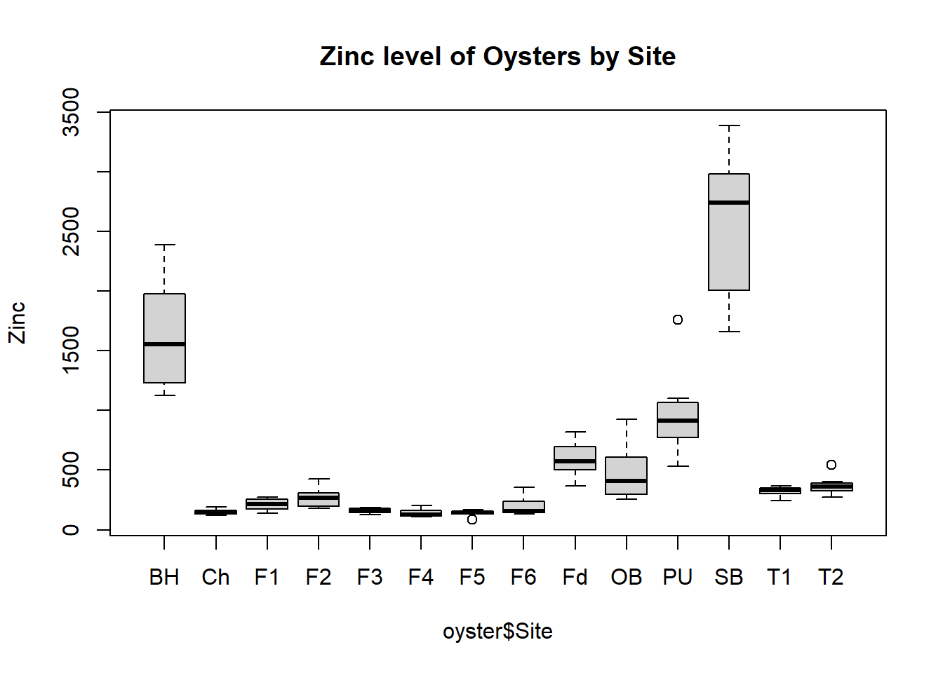
Using box plots, discuss trends (or the lack thereof) in Cu, Mn and Cd levels at the different sites.
3. Scatter Plot
Explore relationships between the levels of the trace metals at the different sites. Begin with a scatter plot of Cd and Zn, making sure to add informative labels.
Discuss the pattern shown in the graph.
How does this pattern reflect the results obtained from the box plots in the previous task?
Code
plot(oyster$Cd,oyster$Zn,xlab="Cadmium",ylab="Zinc",main = "Trace Metal levels in Oysters",pch=10)Code
plot(oyster$Cd,oyster$Zn,xlab="Cadmium",ylab="Zinc",main = "Trace Metal levels in Oysters",pch=10)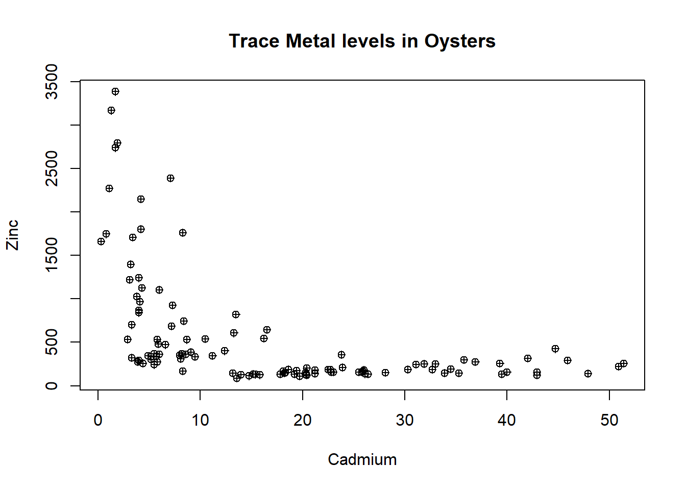
The scatter plot shows that at low levels of Cadmium (less than 15) there is a roughly linear negative relationship with zinc. At cadmium levels greater than 15 there are consistent low levels of zinc.
This reflects the results from the box plots in that most sites have low levels of zinc (less than 500) without much variation.
Explore the relationships between some of the other pairings of metals, and report your findings.
4. Simple Linear Regression, ANOVA, Plot Fitted Line
Suppose we want to model the relationship between the copper and manganese levels, and believe the relationship is linear.
Fit a linear regression to the data, with Cu as the Response Variate and with Mn as the Explanatory Variate.
Does the regression line successfully capture the trend in the data?
Does the line’s fit seem adequate? If not, why not?
Attempt to fit a linear model by modifying code from previous lessons first, then reveal the code below to check.
Code
#fit linear model
CMModel<-lm(oyster$Cu~oyster$Mn)
#model parameters
summary(CMModel)
#anova
anova(CMModel)
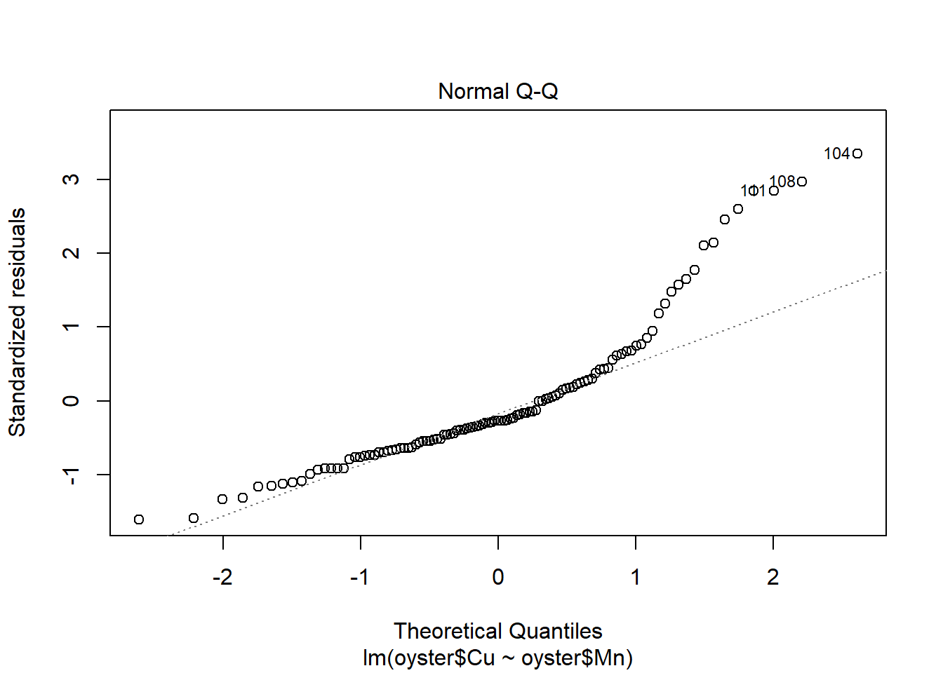
#residual plots
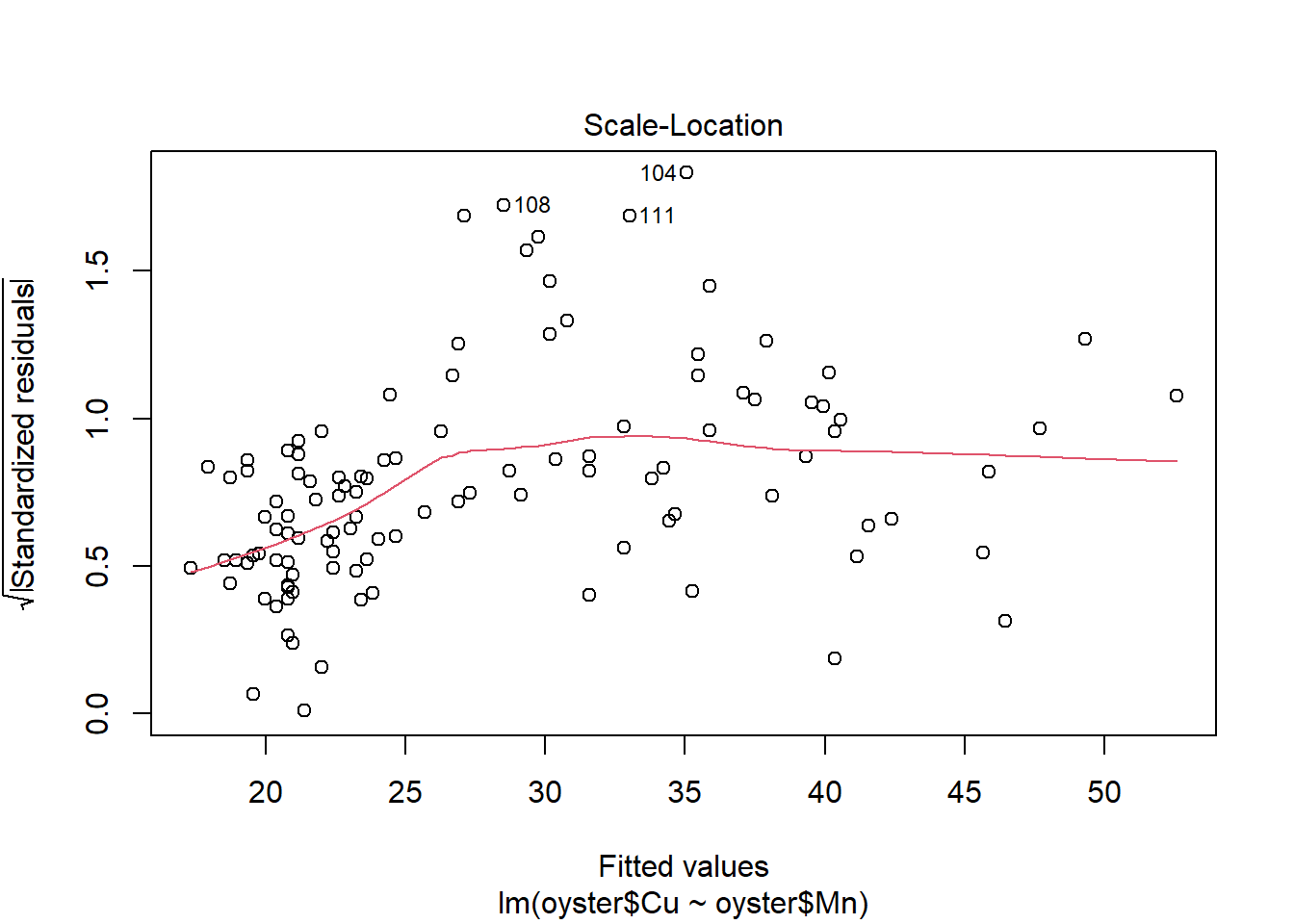
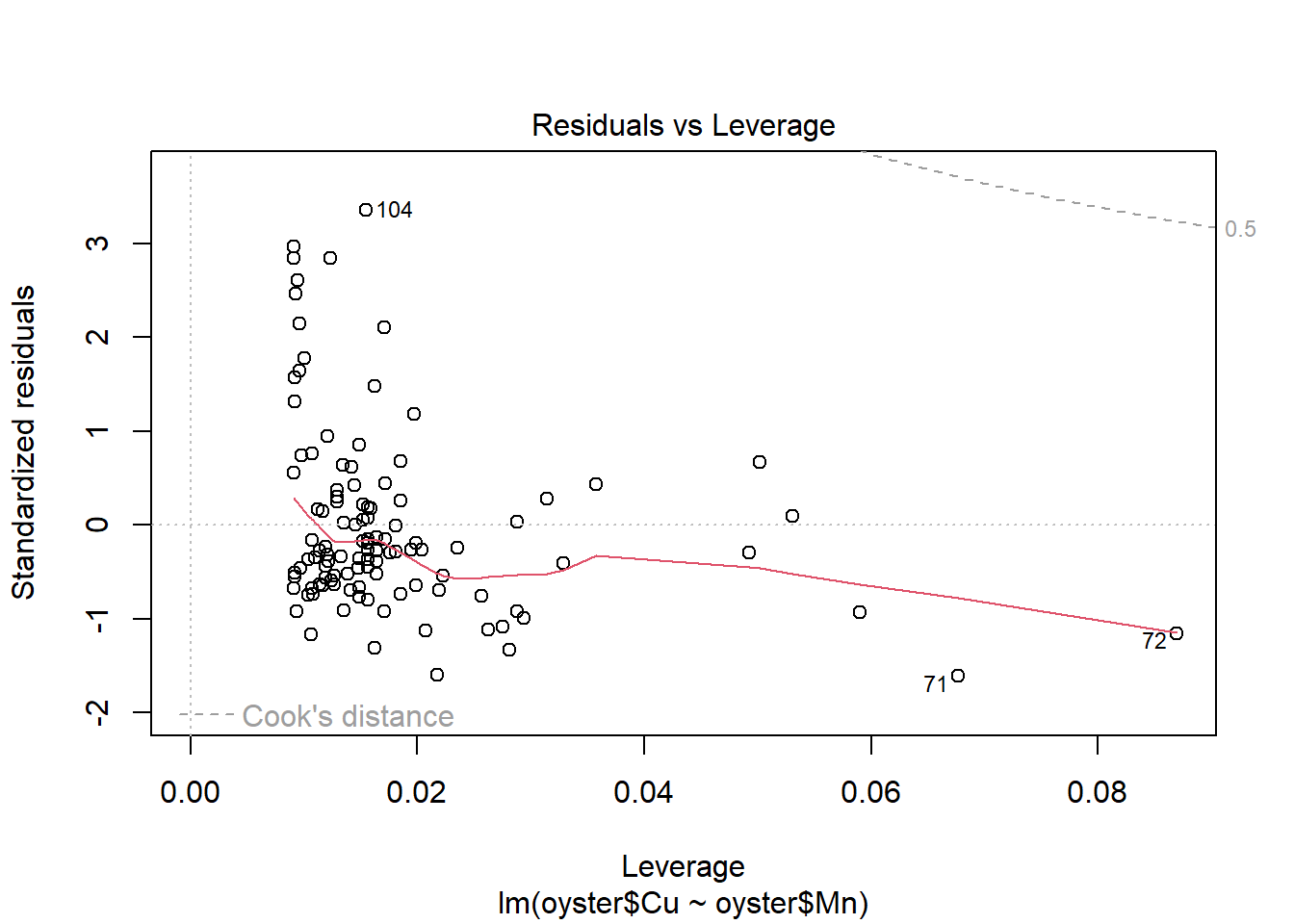
plot(CMModel)Plot the relationship with a fitted trend line.
Code
#plot
plot(oyster$Mn,oyster$Cu,pch=17,col="navyblue",xlab="Manganese",ylab="Copper", main = "Trace Metal levels in Oysters")

#add fitted regression line. lwd=  controls the thickness of the line
abline(CMModel,col="violetred3",lwd=2)

#add legend
legend("topright",legend=c("Fitted line"),lwd=2,lty=1,col=c("violetred"))
Code
#fit linear model
CMModel<-lm(oyster$Cu~oyster$Mn)

#model parameters
summary(CMModel)
Call:
lm(formula = oyster$Cu ~ oyster$Mn)

Residuals:
    Min      1Q  Median      3Q     Max
-25.201 -10.139  -4.284   4.610  53.251

Coefficients:
            Estimate Std. Error t value Pr(>|t|)
(Intercept)  13.8656     2.9707   4.667 8.73e-06 ***
oyster$Mn     2.0369     0.3693   5.516 2.36e-07 ***
---
Signif. codes:  0 '***' 0.001 '**' 0.01 '*' 0.05 '.' 0.1 ' ' 1

Residual standard error: 15.98 on 109 degrees of freedom
Multiple R-squared:  0.2182,    Adjusted R-squared:  0.211
F-statistic: 30.42 on 1 and 109 DF,  p-value: 2.362e-07
Code
#anova
anova(CMModel)
Analysis of Variance Table
Response: oyster$Cu
Df Sum Sq Mean Sq F value Pr(>F)
oyster$Mn 1 7773.3 7773.3 30.423 2.362e-07 ***
Residuals 109 27850.5 255.5
---
Signif. codes: 0 '***' 0.001 '**' 0.01 '*' 0.05 '.' 0.1 ' ' 1Code
#residual plots
plot(CMModel)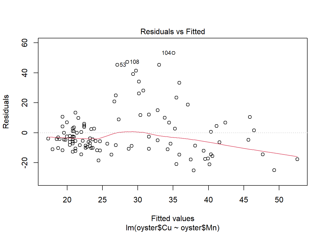
Plot the relationship with a fitted trend line.
Code
#plot
plot(oyster$Mn,oyster$Cu,pch=17,col="navyblue",xlab="Manganese",ylab="Copper", main = "Trace Metal levels in Oysters")

#add fitted regression line. lwd=  controls the thickness of the line
abline(CMModel,col="violetred3",lwd=2)

#add legend
legend("topright",legend=c("Fitted line"),lwd=2,lty=1,col=c("violetred"))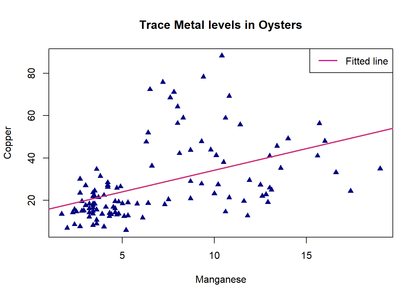
It seems from this fitted model plot that the regression successfully captures the positive upwards trend in the data. However, there is a lot of variation around the line for Oysters with high values of Copper.
5. Transform Variables for Linear Regression, Plot Fitted Line
5a. Transform Variables then Perform Linear Regression
Return to the relationship between the zinc and cadmium levels. The inverse relationship displayed by the scatter plot does not appear to be linear, but a non-linear curve may fit the data well. Suppose we want to fit a power curve to the data, that is a model of the form
\[(Zn) = a(Cd)^b\]
A bit of algebra can show that this is equivalent to fitting a linear regression to the logs of both variables, that is, fitting a model
\[\log(Zn) = c + d[\log(Cd)]\]
To fit this power curve model take the logs of both Zn and Cd.
Then fit a linear regression , using logZn as the Response variate and logCd as the Explanatory variate.
Comment on the fit of this model, then, using the relationship between the constants from the linear regression on the log-transformed data and the constants from the power curve, write the equation for the relationship between zinc and cadmium levels in power curve form.
Code
#create log-transformed variables
oyster$logZn<-log(oyster$Zn)
oyster$logCd<-log(oyster$Cd)
In the folded code below, an alternative to specifying the data frame for each model variable (e.g. oyster$ ) is shown by using the argument data=Oyster. This is available for other functions too e.g. boxplot(), it’s personal preference whether you would like to use it.
Code
#fit linear model
ZCModel<-lm(logZn~logCd,data=oyster)

#model parameters
summary(ZCModel)

#anova
anova(ZCModel)

#residual plots
plot(ZCModel)
Code
#create log-transformed variables
oyster$logZn<-log(oyster$Zn)
oyster$logCd<-log(oyster$Cd)
We introduce an alternative to specifying the data frame for each model variable (e.g. oyster$ ) by using the argument data=Oyster. This is available for other functions too e.g. boxplot(), it’s personal preference whether you would like to use it.
Code
#fit linear model
ZCModel<-lm(logZn~logCd,data=oyster)

#model parameters
summary(ZCModel)
Call:
lm(formula = logZn ~ logCd, data = oyster)

Residuals:
    Min      1Q  Median      3Q     Max
-1.2783 -0.4492 -0.1098  0.4667  1.6233

Coefficients:
            Estimate Std. Error t value Pr(>|t|)
(Intercept)  7.49376    0.14815   50.58   <2e-16 ***
logCd       -0.68283    0.05656  -12.07   <2e-16 ***
---
Signif. codes:  0 '***' 0.001 '**' 0.01 '*' 0.05 '.' 0.1 ' ' 1

Residual standard error: 0.6047 on 109 degrees of freedom
Multiple R-squared:  0.5721,    Adjusted R-squared:  0.5682
F-statistic: 145.8 on 1 and 109 DF,  p-value: < 2.2e-16
Code
#anova
anova(ZCModel)
Analysis of Variance Table
Response: logZn
Df Sum Sq Mean Sq F value Pr(>F)
logCd 1 53.297 53.297 145.76 < 2.2e-16 ***
Residuals 109 39.857 0.366
---
Signif. codes: 0 '***' 0.001 '**' 0.01 '*' 0.05 '.' 0.1 ' ' 1The ANOVA returned p-value of <2.2e-16 for the log cadmium variable, indicating a significant decrease in variance explained if this is removed from the model. This indicates that the model for log zinc is significantly improved with the inclusion of the log cadmium variable.
The linear fitted model can be written as follows
\[log(ZINC) = 7.4937 - 0.6828_{log(CADMIUM)}\] For each one unit increase in log cadmium, mean log zinc decreases by 0.6828 µg/g. This is not particularly meaningful so we will convert the model to its power curve form.
\[ ZINC = 7.4937 (CADMIUM) ^ {- 0.6828}\] Mean zinc is estimated by the cadmium level to the power of -0.6828 multiplied by 7.4937 µg/g. As this is a negative power, zinc will decrease most dramatically with increasing cadmium of low values and more slowly for higher increasing values of cadmium. For values between 0 and 1 (exclusive) mean zinc can be greater than 7.4937, for values greater than 1 mean zinc will be decreasingly less than 7.4937
Code
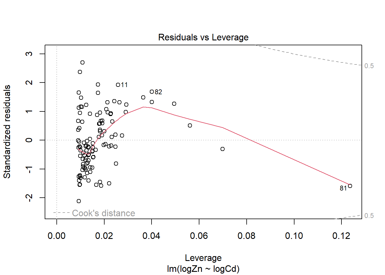
#residual plots
plot(ZCModel)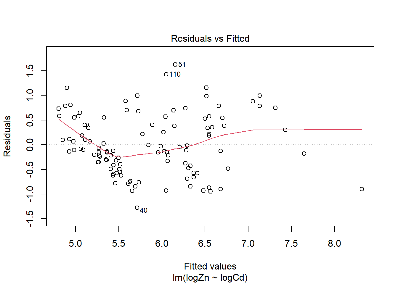
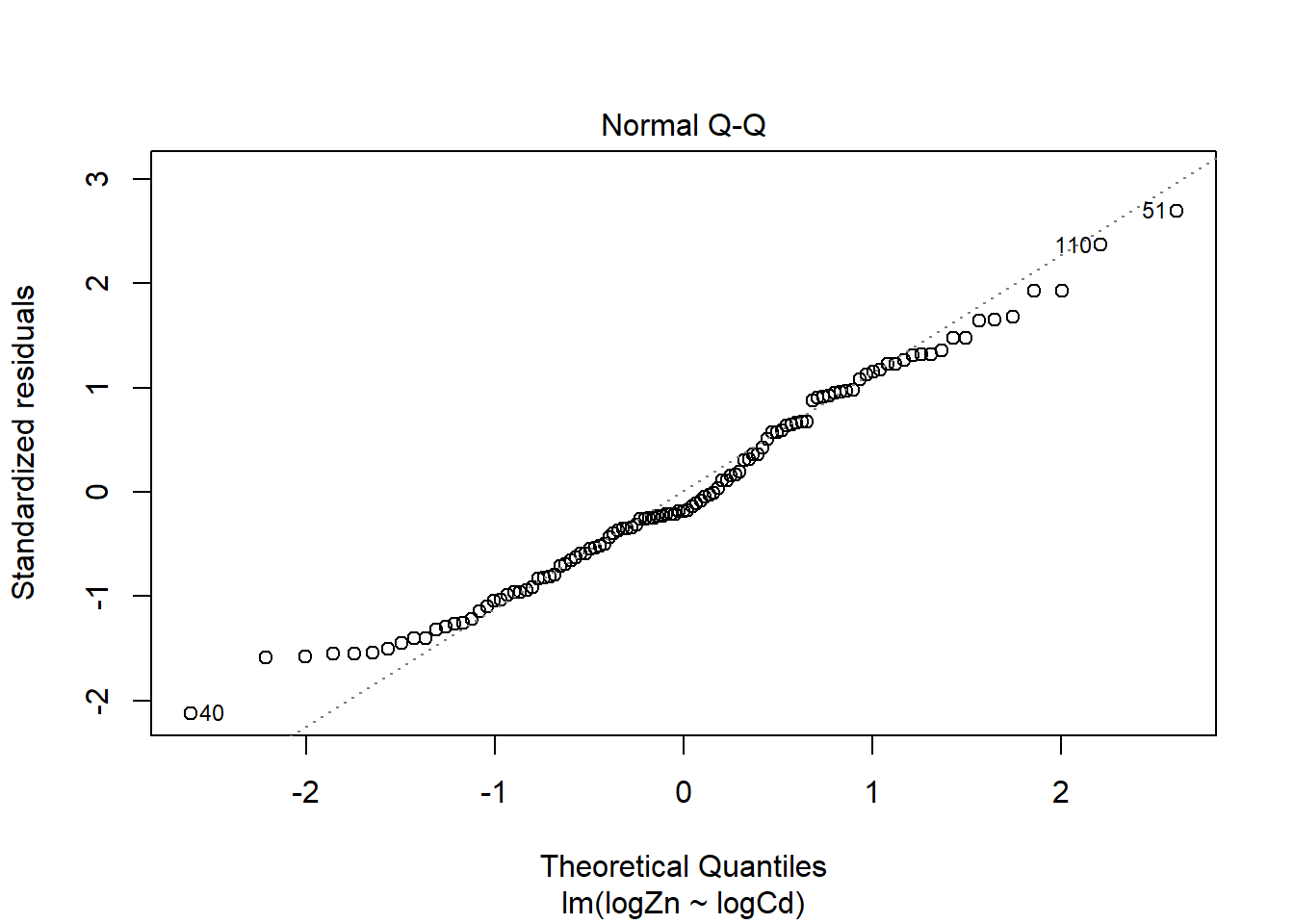
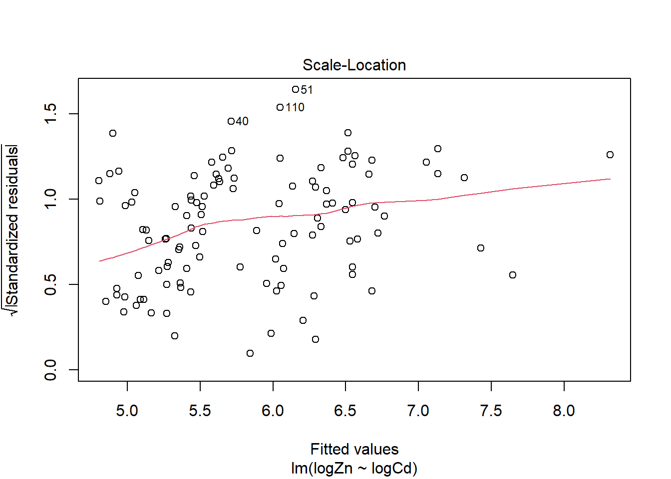
There is evidence of a non-linear relationship between log(Zn) and log(Cd), as the red mean line through the residuals is curved. Aside from this, there appears to be relatively constant variance.
The normal qq plot looks ok, the standardised residuals are fairly close to the standard normal quantiles. There is some separation at the more extreme quantiles but this is typically expected.
There are a few outliers with square root standardised residuals around 1.5 and slightly higher (corresponding to 2.25 to 3 when squared).
The fourth plot indicates a couple of highly influential points - observations 11, 81 and 82. The influence of points 11 and 82 is due to large standardised residual values (they are outliers). This may be due to measurement or transcription errors, however their values are not dramatically different from the other observations. It is more likely that there is additional natural variation that has not been accounted for by our model. Observation 81 has quite a large negative residual value, and has the position of highest leverage within the data set so is likely the most influential point.
Recall the power curve model:
\[(Zn) = a(Cd)^b\]
And the linear model using log transformed variables:
\[\log(Zn) = c + d[\log(Cd)]\]
Show the relationship between the power curve model and the linear regression on the log transformed variables.
Discuss the relationship between constants \(a\) and \(c\), and between constants \(b\) and \(d\).
5b. Plot Fitted Model with Confidence Limits.
Plot the data with a fitted line and 95% confidence limits.
Code
#plot
plot(oyster$logCd,oyster$logZn,pch=17,col="navyblue",xlab="log(Cadmium)",ylab="log(Zinc)", main = "Trace Metal levels in Oysters")

#add fitted regression line. lwd=  controls the thickness of the line
abline(ZCModel,col="violetred3",lwd=2)

#add lower and upper ci boundaries

#generate a fine sequence of values for Mn
cdSeq<-seq(min(oyster$logCd),max(oyster$logCd)+5,length.out=200)

#confidence interval corresponding to these values using the fitted model
ci<-predict(ZCModel,newdata=data.frame(logCd=cdSeq),interval="confidence")

#lower limit, lty=  controls the line type (e.g dashed)
lines(cdSeq,ci[,2],lty=2,col="violetred")

#upper limit
lines(cdSeq,ci[,3],lty=2,col="violetred")

#add legend
legend("topright",c("Fitted line","Lower 95% CI","Upper 95% CI"),lwd=c(2,1,1),lty=c(1,2,2), col=c("violetred","violetred3","violetred3"))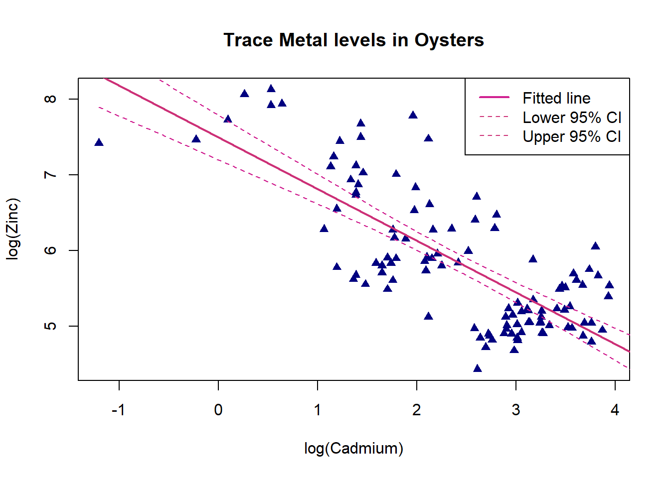
There is a moderate negative linear relationship between log cadmium and log zinc, as log cadmium increases log zinc decreases. The confidence interval limits are widest for log cadmium values between -1 and 1 as there are only a few observations here. They become much narrower for larger log cadmium values where there is lots of data.
6. Principle Components Analysis, Plot Results, Predictions
Clearly there is a relationship between the levels of the trace metals. One way to proceed is to perform Principal Component Analysis (PCA). This is beyond the school syllabus, but in essence it involves developing two new variables that combine the effects of the concentrations of the 4 metals. These two variables can be then be used to classify new sites.
6a. Calculate and Interpret Principal Components
Use the prcomp() function to perform principal components analysis.
Then plot the data points according to their values on each of the 2 principal components.
Code
#include only predictor variables, no response
oysterPred<-oyster[,2:5]

#calculate principal components with prcomp() function, use scale() to make results easier to interpret
oysterCom<-prcomp(scale(oysterPred))
oysterCom
Code
#plot components
plot(oysterCom$x[,1],oysterCom$x[,2],xlab="Principal Component 1",ylab="Principal Component 2", pch=20,col=rgb(0,1,0,alpha=0.25))
Code
#include only predictor variables, no response
oysterPred<-oyster[,2:5]

#calculate principal components with prcomp() function, use scale() to make results easier to interpret
oysterCom<-prcomp(scale(oysterPred))
oysterCom
Standard deviations (1, .., p=4):
[1] 1.5904803 0.8038917 0.7073333 0.5690432
Rotation (n x k) = (4 x 4):
PC1 PC2 PC3 PC4
Zn 0.4703601 -0.6289833 -0.58602201 0.19929777
Cu 0.4858784 -0.3760981 0.78884251 -0.01414027
Cd -0.5361889 -0.3342288 0.18440346 0.75285322
Mn 0.5051585 0.5926393 -0.01735112 0.62713035Code
#plot components
plot(oysterCom$x[,1],oysterCom$x[,2],xlab="Principal Component 1",ylab="Principal Component 2", pch=20,col=rgb(0,1,0,alpha=0.25))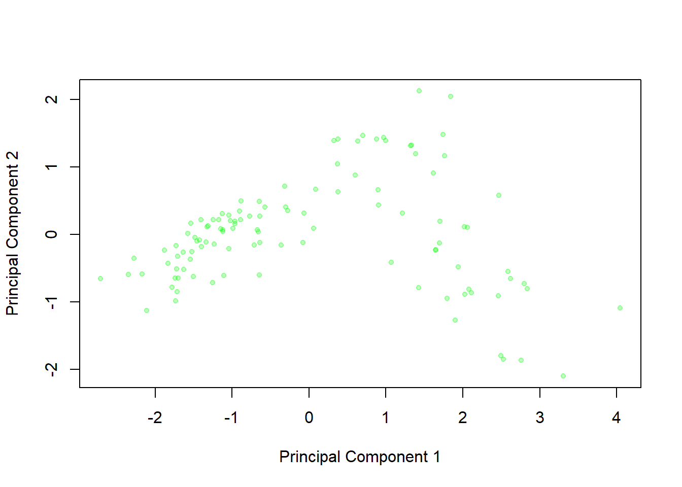
This graph displays the principal component scores for the 111 oysters - that is, the values on the two new variables that are created from the original four readings. We can see little clusters in the graph of oysters from the same location, which suggests that these two principal components are able to distinguish between the groups effectively.
The graph constructed in the previous task is a little cluttered, so it is preferential to plot the mean principal component scores for each group to see the picture more clearly:

Based on this graph, oysters from which regions are similar to one another? Does this agree with your conclusions from the box plots of the metal levels you produced earlier?
Oysters from sites in the Foveaux Strait and the Chatham Islands are similar, with negative weightings on the first principal component and neutral on the second. Sites in Tasman Bay have moderate positive weightings on the first principal component and strong positive on the second, this is also displayed by the Oyster Bay site. Bluff Harbour, Sawyers Bay and Port Underwood are somewhat grouped with strong positive weightings on component 1 and strong negative on component 2.
This matches up with what we can see on the box plots in Task 2.
6b. Advanced Plot of Principal Components
For a challenge, you can reproduce the more complicated plot above.
The first step is to identify the unique() levels of Site and assign them to a vector. Then construct an empty matrix() of NAs, with a row for each unique site and 3 columns. 2 of these columns will be filled with the mean values of each of the 2 principal components later, and we can fill the third column of the matrix with the unique Site names now.
Code
#specify which variable we want the unique levels of
location<-unique( )

#specify the appropriate no. of columns and rows
pca<-matrix(NA,ncol= ,nrow= )

#fill this column with the unique site names
 pca[,3]<-
Using the for() loop skeleton provided below (which will loop through each of the unique sites i stored in the vector location), specify the relevant rows and columns of oysterCom$x (the principal components) to calculate the colMeans() of.
The result should be a matrix of characters giving the means of the 2 principal components for each site.
Code
for(i in 1:length(location)){

  #specify the relevant rows and columns for pca and oysterCom$x
 pca[ , ]<- colMeans(oysterCom$x[ , ])

}

#check your for loop output
pca
In order to use our character matrix more easily, we convert this object to a data frame with the columns for the principal component means specified as numeric values as.numeric().
Code
#fill in the columns of the data frame, remembering to make the mean principal component columns numeric
pcaData<-data.frame( )
We can then plot() the first principal component against the second principal component.
Code
plot( ,col=rainbow(14))Finally, we can add some text() to the points specifying which sites they represent. Give the coordinates of the labels using the same x and y variables as in your original plot. Specify labels= the column of your data frame with the site names. The arguments cex= and pos= help to make the size and position of the text more readable, and we use the rainbow(14) function again to make the text and point colour match.
Code
text( , cex=0.7, pos=4,col=rainbow(14))Code
location<-unique(oyster$Site)
pca<-matrix(NA,ncol=3,nrow=length(location))

 pca[,3]<-location
for(i in 1:length(location)){
 pca[i,1:2]<- colMeans(oysterCom$x[oyster$Site==location[i],1:2])

}


pcaData<-data.frame(as.numeric(pca[,1]),as.numeric(pca[,2]),pca[,3])

plot(pcaData[,1],pcaData[,2],col=rainbow(14),pch=20,xlab="Principal Component 1", ylab="Principal Component 2")
text(pcaData[,1],pcaData[,2] ,labels=pcaData[,3], cex=0.7, pos=4,col=rainbow(14))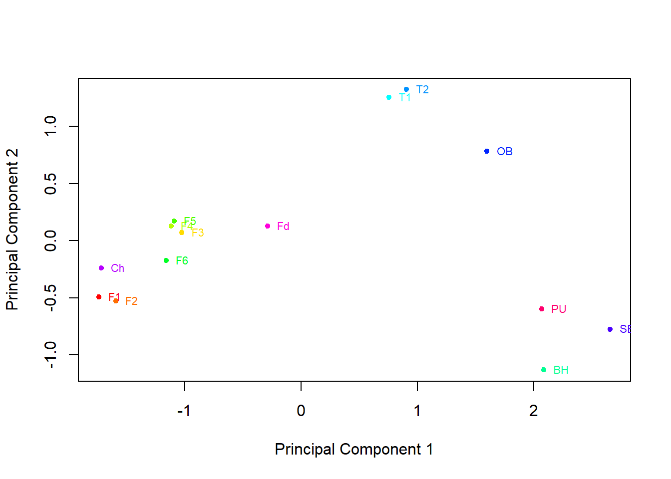
6c. Predictions from Principal Components
We can use our graph and the principal components to predict the origin of an oyster based solely on its trace metal levels.
First examine the output from prcomp() in more detail. What do the \(\verb!percentage variation!\) numbers (calculated and displayed at the top of the output) tell us?
The rotation matrix allows us to interpret the principal components by discussing which trace metals they are related to. What do you conclude from this?
Suppose you buy an oyster from the supermarket and want to know where it is from, so you have the trace metal content of the oyster analysed. It turns out the oyster has 45µg/g of cadmium, 7µg/g of copper, 7µg/g of manganese, and 152µg/g of zinc.
Calculate the principal component scores and use the previous graph to help determine where is the oyster likely to be from.You can calculate the mean and standard deviation of Zn,Cu,Cd and Mn to help with this.
Examine the output from prcomp() in more detail. What do the \(\verb!percentage variation!\) numbers (calculated and displayed at the top of the output) tell us?
Code
#calculating the percentage variation
cumsum(oysterCom$sdev^2)/sum(oysterCom$sdev^2)
The rotation matrix allows us to interpret the principal components by discussing which trace metals they are related to. What do you conclude from this?
Code
#pca object from Task 6a
oysterCom
Suppose you buy an oyster from the supermarket and want to know where it is from, so you have the trace metal content of the oyster analysed. It turns out the oyster has 45µg/g of cadmium, 7µg/g of copper, 7µg/g of manganese, and 152µg/g of zinc. Calculate the principal component scores and use the graphs from earlier in the task to help determine where is the oyster likely to be from. (You can calculate the mean and standard deviation of Zn,Cu,Cd and Mn to help with standardising the measurements for this).
Code
#mean of each trace metal column
apply(oyster[,2:5],MARGIN=2,FUN=mean)

#sd of each trace metal column
apply(oyster[,2:5],MARGIN=2,FUN=sd)
Code
#calculating the percentage variation
cumsum(oysterCom$sdev^2)/sum(oysterCom$sdev^2)
[1] 0.6324069 0.7939673 0.9190475 1.0000000The percentage variation numbers indicate the percentage of total variation that is explained by including that many principal components. For example, nearly 80% of the variation is explained by including 2 principal components, and 100% of the variation is explained when 4 principal components are used. 80% is typically a good cut-off to avoid over-fitting.
Code
#pca object from Task 6a
oysterCom
Standard deviations (1, .., p=4):
[1] 1.5904803 0.8038917 0.7073333 0.5690432
Rotation (n x k) = (4 x 4):
PC1 PC2 PC3 PC4
Zn 0.4703601 -0.6289833 -0.58602201 0.19929777
Cu 0.4858784 -0.3760981 0.78884251 -0.01414027
Cd -0.5361889 -0.3342288 0.18440346 0.75285322
Mn 0.5051585 0.5926393 -0.01735112 0.62713035We will focus on the first 2 principal components from the output. These are:
\[Z1 = −0.536(Cd∗) + 0.486(Cu∗) + 0.505(Mn∗) + 0.470(Zn∗) \]
\[Z2 = - 0.334(Cd∗) - 0.376(Cu∗) + 0.593(Mn∗ )- 0.629(Zn∗) \]
Where \(Cd∗\), \(Cu∗\), \(Mu∗\) and \(Zn∗\) are the standardised trace metal measurements (standardised by subtracting away the mean and then dividing by the standard deviation).
Principal component 1 negatively weights Cadmium, but positively weights Copper, Manganese and Zinc. Principal component 2 has slight negative weights for Cadmium and Copper, and a stronger negative weight for Zinc. It positively weights Manganese.
Standardising the trace metal measurements using the means and standard deviations.
Code
#mean of each trace metal column
apply(oyster[,2:5],MARGIN=2,FUN=mean)
Zn Cu Cd Mn
565.650450 27.953153 16.772973 6.916216 Code
#sd of each trace metal column
apply(oyster[,2:5],MARGIN=2,FUN=sd)
Zn Cu Cd Mn
692.537162 17.995903 13.325635 4.127062 Code
ZnStar<-(152-565.650450)/692.537162
CuStar<-(7-27.953153)/17.995903
CdStar<-(45-16.772973)/13.325635
MnStar<-(7-6.916216)/ 4.127062
An oyster with 45µg/g of cadmium, 7µg/g of copper, 7µg/g of manganese, and 152µg/g of zinc has the following principal component scores
Code
pc1<-(-0.536*CdStar + 0.486*CuStar + 0.505*MnStar + 0.470*ZnStar)
pc2<-(- 0.334*CdStar - 0.376*CuStar + 0.593*MnStar- 0.629*ZnStar)
pc1
[1] -1.971724Code
pc2[1] 0.1180307Based on these principal component scores we would predict this oyster was harvested from the Foveaux Strait or Chatham Islands, as it would fall nearest this cluster on the plot.